https://media.giphy.com/media/1y0CobcB8EQcE/giphy.gif
Lots of energy and mischief. Changing perspective looks like it's scanning the room and there's three scenes being spliced together, like it's super chaotic. The ellipsis and cropping of info means you have to guess what's in between and the mind has to piece the room together and work out how each scene is connected (i.e. how far away the beds are). Expressions could be developed further, a laugh doesn't just mean an open mouth. Also, there's little definition between each character and they all look more or less the same.
https://media.giphy.com/media/3o6fDxUHmOThkYGHUk/giphy.gif
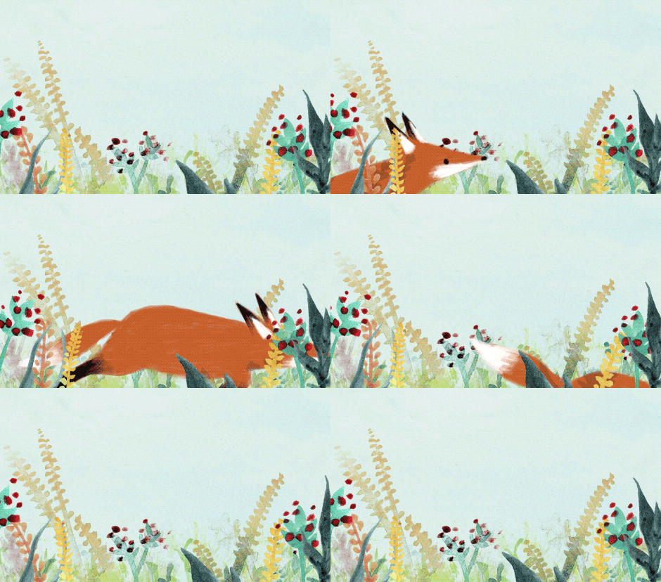
Very simple. A little fast? But that's how fast a jump occurs so it's probably accurate, just annoying to watch because I want to slow down and see the details! Nice movement of the plants and foliage, a sort of ripple effect through the scene. Works well as a loop. Playful and cheery.
https://media.giphy.com/media/ZisrKp96yLmco/giphy.gif
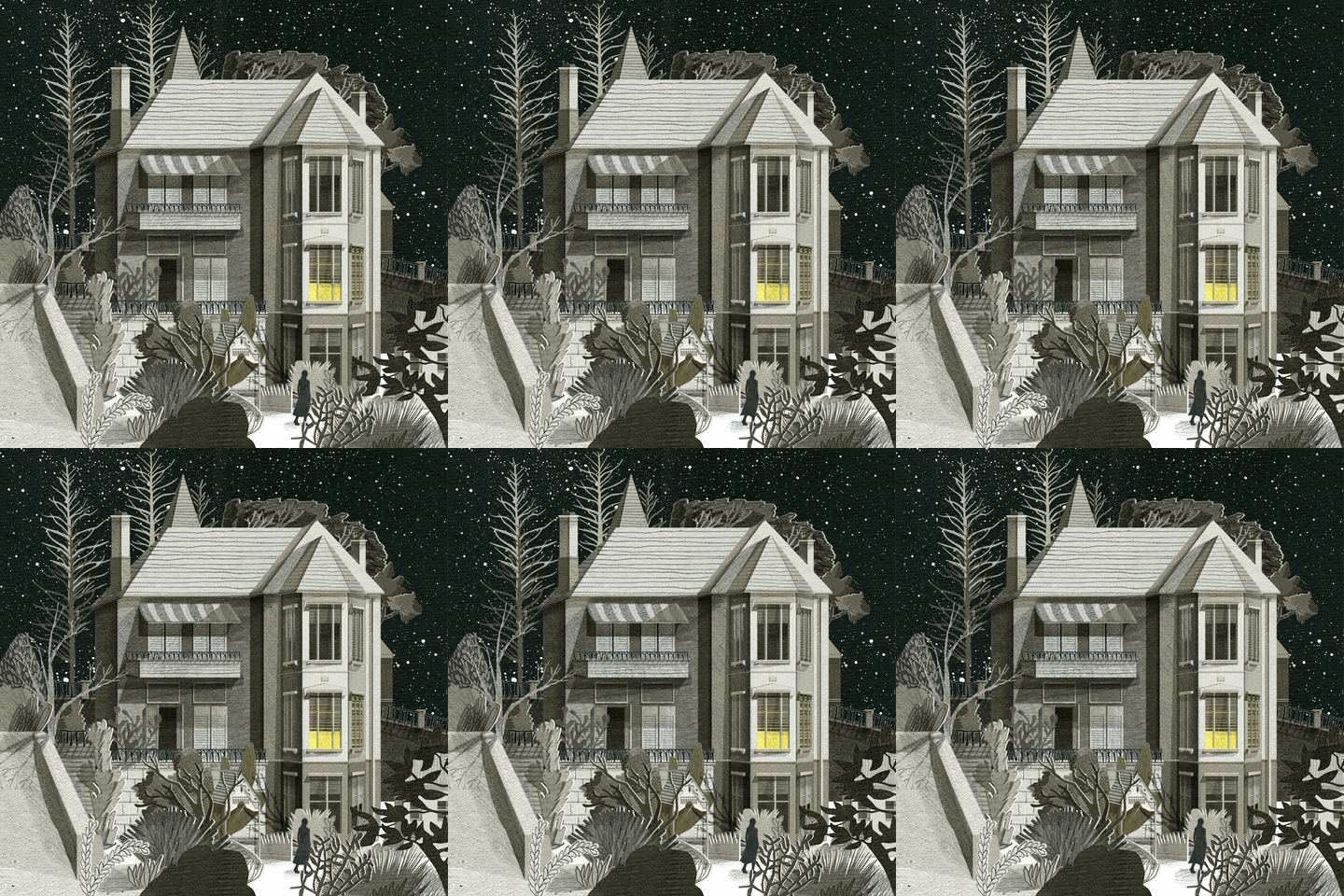
An eerie tone. Only a couple of moving parts, but that's all it needs to make this quiet, cold atmospheric setting. Not a character GIF, but a lovely scene. Perhaps I could use similar techniques of wind-swept foliage in a background? The trees look like they've been made from cut paper, but I could be wrong. Has some depth with overlapping elements and consideration of scale.
https://media.giphy.com/media/X3JN1comv06vS/giphy.gif
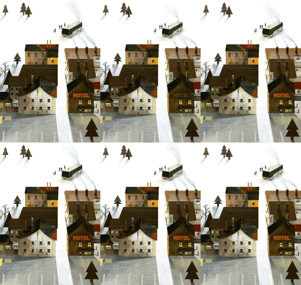
The flashing light on that MOTEL sign is beautiful and haunting. It flickers, doesn't just flash. Changes the shadowing too, just really well made. Mite needs a similar flicker on his headlight.


No comments:
Post a Comment