Friday, 27 November 2015

Shape and Collage

Although fuzzy felt was a great way to construct images and re-arrange features easily, I wanted to move back to paper because of the colours and textures that I can achieve with this.
Felt is always a block colour, and I was restricted to only one specific shade.
All of the felt was the same thickness, whereas I can alternate card and paper stock to describe the heights of troughs and peaks in a face (nose peaks, neck troughs).

Starting by looking at shape and not focussing on the outfits as much. I want to learn how to use shape before I tackle the relevance of the outfits I choose.


Developing characters and personalities through shapes.
The way that the eyes open, the posture of the body all suggest things about the portrait and create character. I often rely on lines and I am impressed that the same result can be obtained just using shapes.


Starting to integrate outfits but I don't know much about them! How do they move? How do they fit?
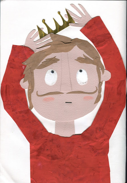
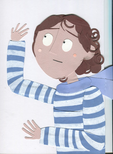
The above portrait describes how clothes and hair move in the wind, in response to observation
(this week has been way too windy-gross).


I'm just choosing subjects at random! Should I stick to a theme? Should all of the three portraits connect? I need to carry out more research into kings to produce an accurate and interesting outfit.
I picked a king because it's a recognisable outfit, a costume and an occupation. Should I use the same character and show it trying on different costumes?
Dressing up?


Using paper cutting tools and hole punches to create standardised shapes.
I have a spiral cutter which helped me to produce lots of curls for hair.
Is this cheating? I really like the consistency of this and the simplicity of cutting pre-made shapes. The creative freedom is how they are used and what paper they are cut from.

Holographic card crown looks really shiny and resembles the material of the actual 3-dimensional object.
Can I use paper to mimic the folds and creases of fabric? Does it need more depth and layers?

I don't like this image. I wanted her to be a dancer.
I was lazy and didn't even look at dancers and their costumes. Don't try and cut corners because it just wastes time. I'm now going to have to revisit this image and reproduce it.
I'm disappointed in the way I have conducted this task because although I've put a lot of time into making images, I've done this half-heartedly and I've not invested my mind into the concept.

Find something that excites you! Feed this into your work. It will transform these vacant, empty images into informed and interesting illustrations.

Next Step: RESEARCH OUTFITS

Wednesday, 25 November 2015

Screen Printing

Printing Issues/Problems:

I did not enjoy this morning.
I think that it was due to the rush and strain of making a book in such a short amount of time rather than the fact that it was group work, but I do also know that if I did it my way, the positives would have been ready the day before printing. I hate last-minute deadline chaos and having to share the burden of this last-minute production with a team did not help to minimize this stress.

The First Nail-Biting Frustration of Wednesday Morning:
Not enough china graph markers! The china graph pencils were all in-use.
WE WERE THE FIRST GROUPS TO PRINT but we couldn't get hold of a china graph pencil. Grr.
I used my Stabilo Woody black pencil crayon instead which made a really dark black positive, whilst the rest of my group used marker pens which weren't strong enough when we took the positives to expose. We wasted time by having to re-colour.
Lesson Learned:
At least we have learned to make positives AS BLACK AS BLACK CAN BE in the future. We will not make this mistake again.


I HATE BEING LATE:
I can trust myself to never be late, but in a group of people, it's guaranteed that people won't be as time-conscious as I am. At 5 minutes to 1, I would have liked to be down in the print room, ready and waiting for the session; at 5 minutes past one today, we were still trying to finish the positives.
In the end, Lyndon understood why we were 10 minutes late to the workshop and we managed to catch up but I just really hated the experience of being late.
Lesson Learned:
Prepare and plan. Most of the time it took to prepare the positives was spent waiting for other people to draw their bit, waiting for your turn. Maybe we should have cut up the codatrace and split the panels so that we could draw up the positives at the same time.

Seeing Megan's group next to us working so well together and collaborating at every point made me really quite sad. We were all just so tense and determined to make a great book that it ruined the team bond. While their group stood huddled around their positives, drawing at the same time, we were counting the minutes we'd been waiting for our turn to draw. I tried so hard to be a good team member and I think I've learned a lot about the management of such a collaborative task, but I do think I've let myself down in not pulling the team together. I should have made more of an effort to keep the peace and to ensure that everyone was happy.
Don't be so self-centred. This is our challenge, not just your's.


Technical Difficulties
 Being too small for the printing beds, I couldn't reach! Alex struggled with this too. I think that this could have affected our prints because we didn't manage to push the squeegee all the way to the end of the screen, thus failing to make a good 'flood'.
Lesson Learned:
Ask for help if you need it. The print dudes are so lovely and when working in a team, there's bound to be someone who can lend a hand.
ALSO, I kept forgetting to pay attention to the paper. I printed on the wrong side of the newsprint TWICE.
Lesson Learned:
WAKE UP!

Printing Success
This afternoon went so much better than the morning. 
Once we got into the print room, we were a dream team again and we produced something amazing.
We did it! We knew that we had to buckle down today and finish our book, but we did get there in the end. There was no squabbling, just powering on through with the task at hand.

Mmmm...yummy printing medium and acrylic mixes! We discovered that it is so easy to mix lovely shades and that the overlayed result in print forms a gorgeous purple. Really impressed with our colour choice. When I've screen printed before, I'd just used colours that matched my subject but I've witnessed how this decision changes the whole aesthetic of the print. Bold colours look so vibrant and intense.
We saw other groups choose less high-contrast shades, such as two very similar blues, which had a very different finish to ours. It wasn't as eye-catching but it was much more pleasing and quiet.
THINK ABOUT THE TONE of the story.

The prints came out so beautifully. All of the illustrations look fantastic and they work so well together. Printing gives a textured, rich value that cannot be achieved digitally. You can feel the image and the overlays of colours is a feature that we were really happy with.

IT WAS TOTALLY WORTH THE TENSION AND THE ANXIETY AND THE STRAIN.
We did it and I am so proud! Look at the beautiful book. I can't stop looking at it.
Such a simple idea. Executed so well. Go team!


Looking at other books made in the studio, it was obvious that some positives had been really carefully constructed and were very intricate prints. We'd opted for a very basic, lofi vibe. Although I admired the delicate drawings of other groups, I think that our aesthetic suited the zine format. The illustrations are bold and funny, clear and direct.


I'm so glad that this week is over, I just want to begin something new and put the stress of this week behind me. I've enjoyed working with my group and I'm really happy with what we produced together but it's just been much too close for comfort.

I need Jayspace.

Tuesday, 24 November 2015

Book Ideas

I didn't want to take over and be bossy, but I naturally do take quite a directive approach to tasks like this. Not domineering or pushy, just organising the situation and acting more as a tutor. I attempted to manage the group and to keep notes of all the ideas we came up with.
I think that I'm quite easy going in that unless I have a really strong opinion about something, I am willing to make compromises and follow other people's ideas. This is both a blessing and a curse:
I'm easy to work with and I won't be argumentative in this process. I'll take a seat on the fence, thanks.
I hate making decisions and often rely on the guidance of others (HELP!  WHAT DO YOU THINK?)

Initial Ideas:
James had come in with a full story planned out. He'd obviously spent a lot of time formulating this idea, and I personally really loved it.

I tried to prompt alternative ideas in the team. We had several thoughts drafted up on paper, but none that we really connected to as a team.

We liked the idea of character and started to construct a narrative about David Bowie getting lost in an oriental super market… Fictitious, imaginative and really odd. I liked it, but we had to find something that everyone liked. This was the only solid idea we had so far. I just wanted to get something, ANYTHING finished at this point.

As we are all interested in colour, some really lovely and experimental colour tests were produced.
We easily settled the decision of which two colours to use as everyone agreed on blue and red.


Problems Encountered:
Lots of strong personalities in our group. Everyone wanting to show THEIR SKILLS and THEIR IDEAS, but we had to solve this task together.

I knew that group work would be difficult, but I imagined that coming up with ideas would be the easier part. We're all creative - surely there should be 5 lots of amazing thoughts not just a couple?

People contribute differently. While some students worked quietly, working away at concepts and reflecting in writing, others had much louder voices. It was difficult to balance this and make sure that everyone felt they were being heard.

Having our inductions at different times throughout the day meant that there was always a member of the group missing when a decision was being made. I felt awful when members of the group did not get a chance to submit their opinion before a change was made, but it had to be this way and by summarising upon their return, I think this made the task a little less cruel. When you came back to the group, we told you what you'd missed and asked you what about the next step.
We did the best we could in these circumstances.

After consulting with the tutors, we realised that our 'narrative' should be based on the REAL WORLD and most importantly, informed by our experiences on Monday. We scrapped all of the abstract concepts and looked back on our field trip.

When I returned to the group after my induction, the table was silent. There had been some disagreement over ideas, mostly in that individuals felt protective over their own roughs and refused to compromise by working towards any other book idea.
Matt said he could feel the tension in our group. I was so disappointed by this comment.
We needed to get sorted and stop being so childish. Work professionally.
Lose your pride and make some pictures.

Solutions:
We were joined by our tutor, Matt, to find a way of solving this issue.
Alix had an idea of a real-life theme rather than an abstract concept. Her idea centred on hands: possibly transactions of money between hands or of the many uses of our hands throughout the day.
Matt suggested a process that would encourage us to work together - a game of adding to each other's drawings. Boys drew a blue hand, girls drew red - then swap to add details in the other colour.
Alien at first, but it proved really effective in accepting the theme and producing images quickly.


By the end of this task, we'd produced more work that we had all morning. We'd made more progress in terms of ideas collectively that we had since Monday.
This was beginning to look like a book that we all had some input into, that we all felt at least marginally proud of.


Plan:
We only have tonight and tomorrow morning to prepare ourselves for Wednesday afternoon! We have so much to do and such little time to prepare.
Divide pages into equal (there are five of us and 8 pages, not so fair!) amounts for each member of the group.
Take your idea home and rough it up tonight in two colours.
Draw up onto the coda trace tomorrow after the lecture and be ready to print!


Monday, 23 November 2015

Visual Narratives - Visual Research


One Week Book
I was quite apprehensive about the impending week. Group work always ends in tears.
Group 1: James, Josh, Alix and Alex
ALL LOVELY, AMAZING PEOPLE, so I felt a lot better about the prospect of working with these folk. I know them and feel really pleased with this result; although there is no one that I don't get on with on the course, I know already that these people share similar interests to me which will make the week a lot easier and more fun.

In Reaction to the Briefing:
YOU ARE ABOUT TO EMBARK ON THE MOST INCREDIBLE JOURNEY (despite the impending doom of group week, this statement in the briefing automated my Bill and Ted mode and I felt a lot brighter about going out into the world with this mantra under my arm)
You assume a photograph is real - with a drawing you cannot be sure that it is the truth.
HAVE NO ASSUMPTIONS
BE A FLANEUR
We are Urban Wanderers
REPORTAGE ILLUSTRATION
"I'm an art student" is a great excuse for almost anything

Group Intentions
Group discussion, highlighting tasks that we found most interesting and practical. Definitely want to go to charity shops and the market. How much can we achieve in this time? Aiming for achieving as many outcomes as possible.


Outcomes
Try something you've never eaten before:
Fortune Cookies
Satay Jellyfish
Buy a cup of tea:
Alix bought a homeless man a cup of tea. Who deserves tea today? Who needs it the most? Very cold day. Didn't want to record this with photographs because it seemed selfish and silly.
We heard people passing Alix, saying positive things about her act of kindness.
Go to the Kirkgate Market:
I bought a Bowie Vinyl for £1
Lots of weird stalls...
Man trying to sell junk, saying odd things in an attempt to persuade an old lady "You could buy these nice cufflinks for your son-in-law who you don't talk to anymore." ODD THING TO SAY. Made us wonder if the two had spoke before or if he was just assuming.
Antique Shop:
Lots of lovely junk! So many stories told by the items in this little room.
I found Post Cards - in Dutch… All to a woman named Karen.
Tea Pots and curious items that captured our interest.
Record Shops:
Personal interest of most of the group. Free posters! Bowie poster - I'VE NOT EVEN BEEN LOOKING FOR BOWIE TODAY, HE JUST KEEPS FINDING ME.
Charity Shops
James bought a book - Harry Potter? The poetic act of buying someone else's discarded reading matter. The height of successful authorship, J.K.Rowling, is ending up in Oxfam for £1.99.


The Downfall of Jay
It was a cold, long day and I was feeling very tired.
I eventually collapsed outside a shop and an ambulance was called.
I woke up fairly quickly but I was feeling much too anxious and low to continue with the task, so we walked back to uni.
I feel like I have ruined the day and let down everyone on my team.
My group was really helpful and understanding but I can't shake the feeling that they would have done better without me.

End of the day
Different experiences from the groups in the class.
Girls went to the roughest pub in Leeds, the Duncan. A really comical and amusing point that provided them with some amazing stories.
People had found some really interesting things that would normally go unnoticed, mundane elements of Leeds that we all walk past.
Some groups talked to people and found some interesting opinions/thoughts from these normal people.
I wish we'd talked to more people

I think that our group became wrapped up in what we enjoy and focussed on enjoying the day rather than experiencing it. We stuck to what we have done before, where we know is good and what we think we know about Leeds.
We should have been more experimental. We should have taken risks.
We became engrossed in the act of 'looking', which in an urban environment such as this, led us to explore as consumers. We were just looking for things to buy.

Friday, 20 November 2015

Fuzzy Felt

I FOUND THE FUZZY FELT.
I also found a right b-b-bargain: 8 sheets of A4 coloured felt for £2?! Yass! This is why I love The Works (sometimes) and why I miss being across the road from the Merrion centre at Vernon Street.
Note to self: BUY THE FELT WHILE IT IS STILL IN STOCK. GET ALL THE COLOURS.
Anyway. Fuzzy felt.

I was sure we had more than one box but I could only find one in the pantry. It was definitely the coolest fuzzy felt subject though: FUZZY FELT MONSTERS. CAN IT GET ANY BETTER?
Why yes, yes it can.

It gets better because I found that all the boxes had been tipped into this one monster box - several fuzzy felt sets in one. Boo-yah.

All the fuzzy felts! I am really excited to have a play with this and make my own. I wonder if the boards are just felt too? Could I make my own board?

Tuesday, 17 November 2015

Shape

Aim:
To produce 3xA4 PORTRAIT ILLUSTRATIONS
Using Shape
Focusing on the theme 'Nice Outfit'. The illustrations should feature some form or costume or outfit.
Perhaps characters sporting their favourite outfit?

I use shape a lot in my work already. I enjoy building pictures through cutting and layering colours. I love the way that this simplifies my drawings and discourages me from relying on lines and thick outlines.


I collect papers and scraps of fabric. I rooted through my stash to find useful samples.
Above is a peach toned card stock with a wove texture. I only had a few sheets of this and I have no clue where it came from, so I have scanned it for future reference!
FIND SOME MORE


Just having a play with shapes and character!
What a coincidence that it ended up looking oddly like Mozza…
Moving the shapes just slightly altered the entire face and character. I liked how easy it was to change this, whereas with drawing it is a permanent decision when a line is placed down.
The process of laying shapes next to each other reminded me of fuzzy felt.
Perhaps this would be a good way of creating an illustration that I don't have to stick down and commit to?
Get the fuzzy felt down! Buy some more felt.
Maybe I could set up a fuzzy felt system that means I can change the expression or movement of the character continuously? I could photograph this and make an animation, or make the illustrations interactive.


I lack that 'passion for fashion' (lol Bratz).
More interested in costume. Maybe continue my circus theme? Study Victorian circus fashion.

When does line become shape?

When does shape become object?

I considered making a model again for this task, creating garnets for my dolls to wear and pose in.
IS THIS SHAPE OR OBJECT?
I'm enjoying making models but I have already done it a lot! Don't just fall back on your dolls, explore first. Make a model if you like, but don't do it the same way. Be experimental before you decide.


Full bleed images - how can I do this? Will I stay completely analogue?
Should I scan and then print?
Should I actually present it as a fuzzy felt?!

Monday, 16 November 2015

End of Module Self Evaluation

1. Which practical skills and methodologies have you developed within this module and how effectively do you think you are employing them within your own practice?

  • I've adopted a symbiotic approach in which the skills I learn feed into my work across the modules.
  • Learning about drawing from observation and reference in visual language has improved my drawing skills and was particularly useful in visual skills Studio Brief 2 (drawing dogs from reference). This has also helped me gain confidence in drawing.
  • I've tried to be experimental and expose myself to media/techniques I've not used before (gouache), thus making me a more versatile artist and my work more visually exciting.
  • I applied Photoshop skills learned in visual language to V.S. briefs, I found Photoshop really useful in V.S. Studio Brief 3 for adding text and constructing the book jacket template.
  • Ideas generation was previously a cognitive task for me, but using sketchbooks has pushed me to create visual ideas on paper. This has helped me to formulate and present my ideas. I exhausted multiple sketchbooks in preparing ideas for V.S. Studio Brief 1.
  • Investigating artists in PPP provided me with new ways of making images. In exposing myself to a range of artists (Pinterest), I've broadened my knowledge of artists. I have directed my work by analysing what makes other illustrations successful and using these elements in my own practice.
  • Blogging has been really handy to keep my work structured and navigate strategically through each brief. I'm using this regularly to reflect upon my progress.

2. Which principles/ theories of image making have you found most valuable during this module and how effectively do you think you are employing these within your own practice?

  • I found roughing valuable because it provides a mock-up of each idea, meaning that once a rough has been chosen there is a plan to work from. I'd never used roughing before this module and I'm now using it in every brief.
  • I've found experimenting useful because it's encouraged me to be playful and have fun, resulting in solutions I've enjoyed making. Studio Brief 3 is an example of my curiosity dictating a playful approach to the task.
  • Research underpinned the majority of my briefs; I've found research valuable because it bestows reference and inspiration. In particular, Studio Brief 1 required a large amount of research into David Bowie that sparked my creative response.
  • I've used my sketchbook as a visual diary every day to document ideas. This has been a constant tool for me and I've found it extremely useful in recording my responses.
  • I've been challenged by the restrictions and formats of each brief, but think I've benefited from the experience of following instructions and attempting to solve problems. Working with a limited colour palette was a difficult task but I now know that an effective end result can be achieved. These restrictions simplify otherwise complex illustrations and I have transferred this theory across to my work in visual language.


3. What strengths can you identify within your submission and how have you capitalised on these?

  • I'm a punctual student and working to deadlines is a strength that I pride myself on. The amount of work I've produced reflects the time and effort I've put into this module.
  • I think my passion for illustration is evident in the work I've submitted. I fully engage with every brief because it's what I enjoy doing. My excitement and love of making things/world-building is ever-present.
  • I've used my blog consistently and attempted to reflect on my progress throughout this module. 
  • 'A willingness to learn' was a peer comment made about my work in the first week. I've made this my mantra and tried to let go of any apprehensions. I've jumped into tasks, even when I've found them challenging.
  • I think my submission demonstrates strengths in character design. This is an area of illustration I'm particularly interested in and something that I have explored in several briefs.

4. What areas for further development can you identify within your submission and how will you address these in the future?


  • I'm a perfectionist, sometimes I spend way too long worrying instead of making. I'm tackling this issue because I know I could produce much more work if I stopped being precious about it/ripping out pages that I'm not happy with.
  • I write in quite a formal tone when blogging when but I should be having an informal conversation with myself. This consumes more time than it should and by shortening my posts I could create more practical work.
  • I'd like to move on to work in A3 sketchbooks because I think A4 has restricted my freedom and the scale of my drawings.
  • I need to continue to experiment with media and not settle in my comfort zone.
  • I worry about anyone seeing my work. I need to overcome this anxiety because it prevents me from being able to participate properly in group crits.

5. In what way has this module introduced you to the Ba (Hons) Illustration programme?

  • I've got to grips with blogging. It seemed complicated to begin with but I know what I am doing with it now and can continue doing this for the rest of the programme.
  • I've settled into the routine of University and of using eStudio. I've been inducted to using the college resources and the Library.
  • I've learned basic skills that I'll have to use regularly in future modules, I've been provided with the foundations on which to build my skills as I progress through the course.
  • I've been introduced to briefs. This process will run through my degree and also prepare me for professional illustration practice post LCA.
  • Working in the studio has helped me to feel comfortable and settled. We've also been encouraged to have peer reviews with students we don't normally speak to, so this has helped me to get to know my peers who I'll be spending the next 3 years with.

Book Cover Presentation

I was so impressed by all of the book covers in the room! Some books looked really professional, others were very delicate and obviously hand-crafted. I think that the new designs on the books have improved the old covers and I'd love to purchase several of these books thanks to their new and exciting covers.

People had been so creative:
Paper cuts
Monoprinting
Creating Stencils

The best books, to me, were the ones that were intriguing. I was drawn to the ones that were abstract and unusual and I wanted to find out more by reading them.
The ones that ignite curiosity.
The ones that re-imagine the subject and translate the old cover into something new.

My favourite book covers today:
Marni's tea book - delicate paper cuts which look like they have taken a long time to construct! Hand-made and really well crafted.
I'm not sure who made it, but I saw a lovely book about pasta! A combination of stencil prints and paper cut lettering - impressive because it was made by hand, not relying on digitised type or brushes.
Megan's Incredible Molluscs book took the lessons that she learned in previous projects: limited colour palette, using shape and line - and made a visually effective book cover that I couldn't help but pick up and touch.

Feedback to my work:
Clever, intriguing concept
A Beautiful little book
Without reading the content inside, it's very hard to tell what the image relates to
Quite dark, thought provoking
Lovely bunny
Looks amazing
Monochrome works really well with the title and the more I look, the more it makes sense
I like the wrap around the image and the way the authors name is part of the picture
Old time feel of The Wizard Of Oz/Alice in Wonderland
Dead nice, proper dark
So different to anything I'd ever consider for a book cover + is all the more amazing for it!
I like the layering of images
A long process, very well made but why is it two pages stuck together?
Text could be less pixelated although it kind of suits the textures of the image
Fracture splitting the text makes it look as if its from another world
Also reminds me of an old black and white T.V.

It achieved its purpose of intriguing my audience!

I received some great feedback and I'm really happy with the book I showed today. I didn't feel too nervous because I know that I had finished the task and created something that I'm proud of.
Always finish the task before the weekend
It was such a relief to know that I didn't have any finishing off or printing to do before monday. By book was ready to go, all I needed to do was bring it. This relieved me of a lot of stress, even though I still worried about the time I could be using to improve my book.


Friday, 13 November 2015

The World Beyond Your Head

Reading is my favourite hobby and I spend a great deal of time looking at books, so this project appealed to me instantly.
I did worry about the level of design skills required in this task, because that's an element of image making that I think a lot of illustrators overlook. We focus on detail and concept rather than composition and graphic quality. I have some understanding of graphic design but I know that it's never my first priority.
The focus of this task being designing a product, I started to look at the world differently. 
I've found myself becoming increasingly interested in typography and layout, noticing and appreciating designs in mundane objects all around me.
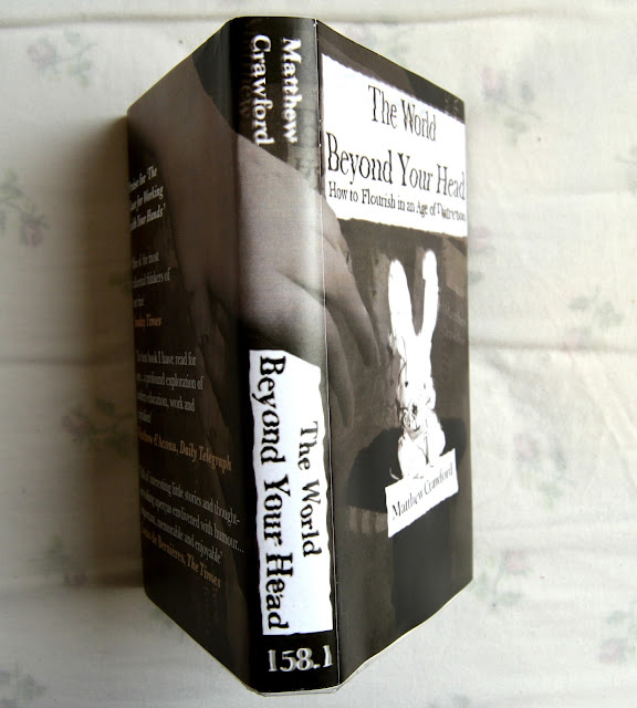
I'm impressed with the final product that I have created. It has a professional finish and looks like a real book cover, so I'm happy with how it has turned out. I have surprised myself because I didn't think that I would be able to make something 

I would have liked to make an even better rabbit, something more realistic and textured. I also think that I should have used more time to develop my own hand-written lettering so that I could have used that in the cover too. Although I said that the computer generated type works better, I don't think I experimented enough first to make that decision. I moved away from hand-written lettering because I didn't think I could do it. I gave up.
FIND A WEAKNESS AND GET BETTER AT IT. LEARN HOW TO DO IT.


Thursday, 12 November 2015

Silly Jay

I am a fool.
I am writing this as a matter of urgent Jay intervention.
I have done something very, very silly.

I flattened a Photoshop file...
and closed it.

MY LAYERS HAVE BEEN DELETED FOREVER!

Never do this again.
All progress lost.


Managed to salvage using content-aware and I was aiming for a messy, collaged aesthetic anyway but I lost a lot of time by having to redo the image.

Wednesday, 11 November 2015

Book Cover Brief Solution

After the Crit on Monday, I decided to move forward with the design that I enjoyed making the most: the rabbit illusion.
I put a great amount of time and effort into constructing the rough, including making the model rabbit and considering media, so I didn't have as much work to do as some other people this week. Lots of my peers were re-drafting or making the decisions I'd already thought about before this stage.
I still had a lot of work to do on making a professional book jacket, but I think I had a good start and foundation based on my roughs.

Aims for this week
Finish the book jacket! A good quality and professional finish.
Make a book cover that is attractive and enticing.
Make a book jacket that suits the tone of the discourse.
Make the text legible but keep elements of distortion.
Collect feedback before presenting the final cover. Make sure that it solves the brief.

Plan for this week
Revisit typography - handmade and digital. Make a decision as to which is the most appropriate.
Revisit rabbit, rephotograph and possibly remake?
Play with backgrounds and colour overlays. I'm quite taken with the black and white, but how would other colours look? Still as mysterious?  
Apply distortions.
Print! Construct jacket.
Collect some Feedback, ask your peers.

Is the rabbit too childish? Perhaps using a character adds too much fiction and fantasy to the serious subject that my book explores. Not appropriate?
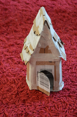
Made a spooky Hansel and Gretel house, a story about distraction and temptation as an alternative... I like how spooky it is and it's less figurative than the rabbit but the rabbit and magician's hat has direct relevance to the word 'distraction'.


My peers really liked the rabbit, so I should stick with that. Don't get lost and change direction. 
If it ain't broke, don't fix it!

Maybe my rabbit just needs to be less cute. Less childish...

Hat wasn't obvious last time, but it is a really strong symbol for magic. Make sure it is focal and bold this time.

I said that I didn't want to go digital.
However, I'm now wondering whether I should... The finished product would look much more professional if I constructed and printed it digitally, but I do want to keep the analogue, handmade feel of 'cutting and pasting' that I used in my first draft.
Solution:  Still using analogue processes and featuring my completely handcrafted rabbit, but putting together and printing using Photoshop. NO DIGITAL DRAWING OR COLOURING. Only use for typography, construction, distorting and printing.

 
Awful background, too neat and too clean… scanned chalkboard texture instead.
Adding text: Eventually decided on Baskerville font - old style serif type reflecting the vintage, creepy tone. Hand drawn type just didn't have the same professional finish. 
For some people's projects, that didn't matter - a handwritten typeface suited the abstract subject. I felt that the tone of my book was formal and required a serious font to juxtapose the blurry distortion occurring around it.
I thought I'd have to print the cover in order to manually distort and chop up the text, but after playing with Photoshop, I discovered some really useful filters and techniques for creating a similar illusion.


Photoshop doesn't notice spelling mistakes... ALWAYS PROOF READ!
Couldn't decide which colour filter to choose. I asked my peers and family which one they preferred.
Favourites were murky colours, greyish tones of greens and blues because they encapsulated mystery and atmosphere whilst also standing out on a shelf amongst boring greyscale books.
The number one choice though was a sepia brown. They liked how it suggested an old, classic book.

Making mock-up prints. Make sure that you use bleeds and guides. In the above test I made the font too big and it wrapped over the spine and legs. I learned a vital lesson in measuring correctly and designing the template to work on the actual book! I wouldn't have known if I didn't try it out on the book.