After the Crit on Monday, I decided to move forward with the design that I enjoyed making the most: the rabbit illusion.
I put a great amount of time and effort into constructing the rough, including making the model rabbit and considering media, so I didn't have as much work to do as some other people this week. Lots of my peers were re-drafting or making the decisions I'd already thought about before this stage.
I still had a lot of work to do on making a professional book jacket, but I think I had a good start and foundation based on my roughs.
Aims for this week
Finish the book jacket! A good quality and professional finish.
Make a book cover that is attractive and enticing.
Make a book jacket that suits the tone of the discourse.
Make the text legible but keep elements of distortion.
Collect feedback before presenting the final cover. Make sure that it solves the brief.
Plan for this week
Revisit typography - handmade and digital. Make a decision as to which is the most appropriate.
Revisit rabbit, rephotograph and possibly remake?
Play with backgrounds and colour overlays. I'm quite taken with the black and white, but how would other colours look? Still as mysterious?
Apply distortions.
Print! Construct jacket.
Collect some Feedback, ask your peers.
Is the rabbit too childish? Perhaps using a character adds too much fiction and fantasy to the serious subject that my book explores. Not appropriate?
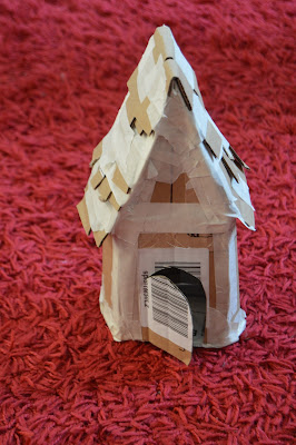
Made a spooky Hansel and Gretel house, a story about distraction and temptation as an alternative... I like how spooky it is and it's less figurative than the rabbit but the rabbit and magician's hat has direct relevance to the word 'distraction'.
My peers really liked the rabbit, so I should stick with that. Don't get lost and change direction.
If it ain't broke, don't fix it!
Maybe my rabbit just needs to be less cute. Less childish...
Hat wasn't obvious last time, but it is a really strong symbol for magic. Make sure it is focal and bold this time.
I said that I didn't want to go digital.
However, I'm now wondering whether I should... The finished product would look much more professional if I constructed and printed it digitally, but I do want to keep the analogue, handmade feel of 'cutting and pasting' that I used in my first draft.
Solution: Still using analogue processes and featuring my completely handcrafted rabbit, but putting together and printing using Photoshop. NO DIGITAL DRAWING OR COLOURING. Only use for typography, construction, distorting and printing.
Awful background, too neat and too clean… scanned chalkboard texture instead.
Adding text: Eventually decided on Baskerville font - old style serif type reflecting the vintage, creepy tone. Hand drawn type just didn't have the same professional finish.
For some people's projects, that didn't matter - a handwritten typeface suited the abstract subject. I felt that the tone of my book was formal and required a serious font to juxtapose the blurry distortion occurring around it.
I thought I'd have to print the cover in order to manually distort and chop up the text, but after playing with Photoshop, I discovered some really useful filters and techniques for creating a similar illusion.
Photoshop doesn't notice spelling mistakes... ALWAYS PROOF READ!
Couldn't decide which colour filter to choose. I asked my peers and family which one they preferred.
Favourites were murky colours, greyish tones of greens and blues because they encapsulated mystery and atmosphere whilst also standing out on a shelf amongst boring greyscale books.
The number one choice though was a sepia brown. They liked how it suggested an old, classic book.
Making mock-up prints. Make sure that you use bleeds and guides. In the above test I made the font too big and it wrapped over the spine and legs. I learned a vital lesson in measuring correctly and designing the template to work on the actual book! I wouldn't have known if I didn't try it out on the book.


No comments:
Post a Comment