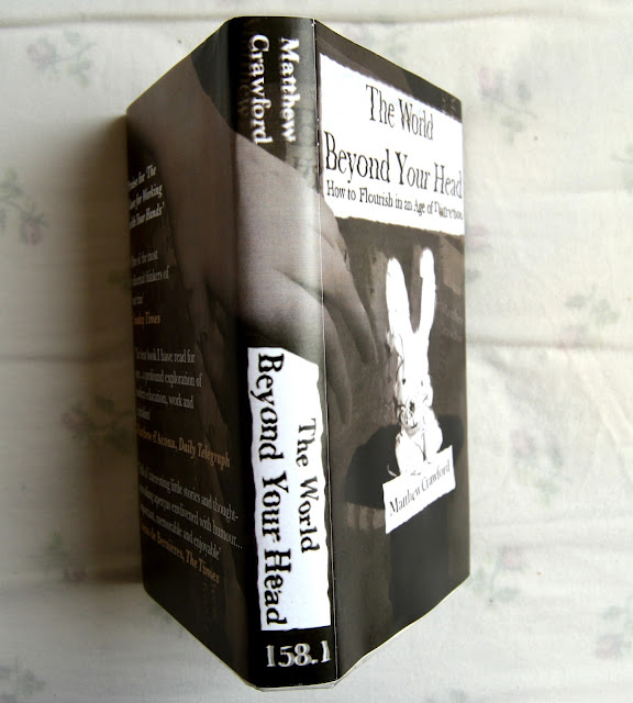
Reading is my favourite hobby and I spend a great deal of time looking at books, so this project appealed to me instantly.
I did worry about the level of design skills required in this task, because that's an element of image making that I think a lot of illustrators overlook. We focus on detail and concept rather than composition and graphic quality. I have some understanding of graphic design but I know that it's never my first priority.
The focus of this task being designing a product, I started to look at the world differently.
I've found myself becoming increasingly interested in typography and layout, noticing and appreciating designs in mundane objects all around me.
I'm impressed with the final product that I have created. It has a professional finish and looks like a real book cover, so I'm happy with how it has turned out. I have surprised myself because I didn't think that I would be able to make something
I would have liked to make an even better rabbit, something more realistic and textured. I also think that I should have used more time to develop my own hand-written lettering so that I could have used that in the cover too. Although I said that the computer generated type works better, I don't think I experimented enough first to make that decision. I moved away from hand-written lettering because I didn't think I could do it. I gave up.
FIND A WEAKNESS AND GET BETTER AT IT. LEARN HOW TO DO IT.


No comments:
Post a Comment