Showing posts with label OUIL 404 Visual Language Studio Brief 1. Show all posts

Tuesday, 5 January 2016

Collage 2


After trying out several collaging techniques, I revisited my favourite one - cutting out pieces of people to be used as textures and colours for a completely new image. The faces on the top right are made from Olly Murs' chin...

This is a combination of the skills I learned in SHAPE, building an image from independent shapes before fitting them together, and sourcing images from found materials as collage. There's something creepy about these faces being cut out of real people.

Printing on different coloured paper and using random bits of found type.
Using a stock other than white printer paper made my poster much more vibrant and unusual. I could have used an older or handmade paper to authenticate the age of the poster.

 I need to consider composition more and controlling the viewer's attention because I didn't really put much thought into that, more just putting things down where they fit!


Looking at other people's posters in the studio, there were some really inventive and funny posters.
Lots of people have skills in humour and making the audience laugh.


Collage

Brought in collected ephemera for the collage task - I collect far too many things.
I had loads of old SHOUT! magazines from my sister and made some characters using these, but felt that they were too generic.
Anyone could find these tacky images. I want something more directly related to the circus.
It's hard to make contemporary teen fashion suit a Victorian Freakshow poster!

SOLUTION
Use more interesting images!
Look in library books.
I have lots of negatives and super 8 film bought from car boots, maybe I could use there?
Scanning in one of the packs of negatives I had in my drawer at uni already:


I've no clue what these negatives are of, where they were shot, who the people are and when they were taken. The plot thickens...
Groovy girl. Black and white is spooky and could be used to age my poster, making it look more authentic as an old fashioned circus.


This one is a blank and it is so grungy and beautiful. I could use this texture to make a background.


Wednesday, 16 December 2015

TEXTURE

I've loved working with shape and approaching image making with a collage process.
I like to build images and characters on the page, rather than directly interpret from observation. Cutting and arranging items on paper feels much more natural and fluid than that of structured drawing from life, although I have learned that this too is a valuable illustrative skill.

I enjoyed the work I made during SHAPE, but I don't think that it is an example of my best work. Even though I put in extra time to re-make the images a second time, I don't think that I committed to the brief enough for that to show in the work I produced. When I look at those images, I just see characters spooled out of my head, I don't see outfits or shapes being showcased there.
This week I am trying to stick solidly to the task at hand and not zone out into Jayland. So what if you're not interested in fashion? FIND FASHION THAT INTERESTS YOU.

Looking back on the work I made for LINE, I really don't like that either. I didn't push myself. I stuck to what I know and I wasn't very experimental. Line is a basic but really powerful tool. If I have time over Christmas I would like to revisit LINE.

Shape can help to simplify and reconstruct the basic elements of a subject, and texture is a way of bringing information (about light, material and surface) back into the frame.


Making Collections of Marks and Textures: 
(my favourites are marked in bold)
Dry brush,
Acrylic paint,
ink,
brusho dyes,
crayon,
half-dead felt tip pens,
AND several actions using each media:
Scratching
stabbing
scrawling
scribbling
scraping
dabbing
dotting
dragging

I became quite fond of the rough textures achieved through applying a little Quink to a dry brush and dragging this across the page. Using paper with lots of surface fibre (bumpy, not smooth!) allowed the dark media to find these lumps'n'bumps and show them off.

Self Portrait
I hate the feeling of sugar paper. It soaks up water much too quickly and it's so flimsy. I like a sturdier stock that ain't so gross to touch. It's got to be bumpy, but not quite as dry and grainy as sugar paper next time, hmm...

other people in the studio were making really funny portraits of themselves, using shape to convey humour and skew proportions.
I had a go at this. I made my hair, which I was wearing in a ponytail, much shorter than it really is, but to reflect the way that I see myself. A silly hairstyle and a stupid expression on my face. A big nose and a noisy background.


SECOND ATTEMPT
Desperately trying to be funny was pulling me away from the focus of texture. I took this task home and concentrated on the challenge of TEXTURE in my room, where I couldn't worry about what other people may be doing in relation to the task.
IT DOESN'T MATTER WHAT THEY ARE DOING! HOW THEY INTERPRET THE TASK IS NOTHING TO DO WITH YOU.
CRAYON! I love my Stabilo Woody pencils - these hugeass pencil crayons that are also water soluble and smudgeyable. I made several more pages full of textures using this pencil and then chopped them up to make a second attempt at a self portrait.

It doesn't look like me.
But it does feature several different textures; it is an image bursting with information - but too much? Is there a limit to how much texture should be described before it begins to take AWAY from the image?

I'm pretty proud of myself for having another go, even when I have a lot on schedule already and it wasn't mandatory to do anymore work. I feel productive for doing so, but what I've done still isn't good enough.

Goddam hate being a perfectionist. It'll never be PERFECT but it's got to be up to Jaystandards, and by Jaystandards, Jay's work doesn't cut it.
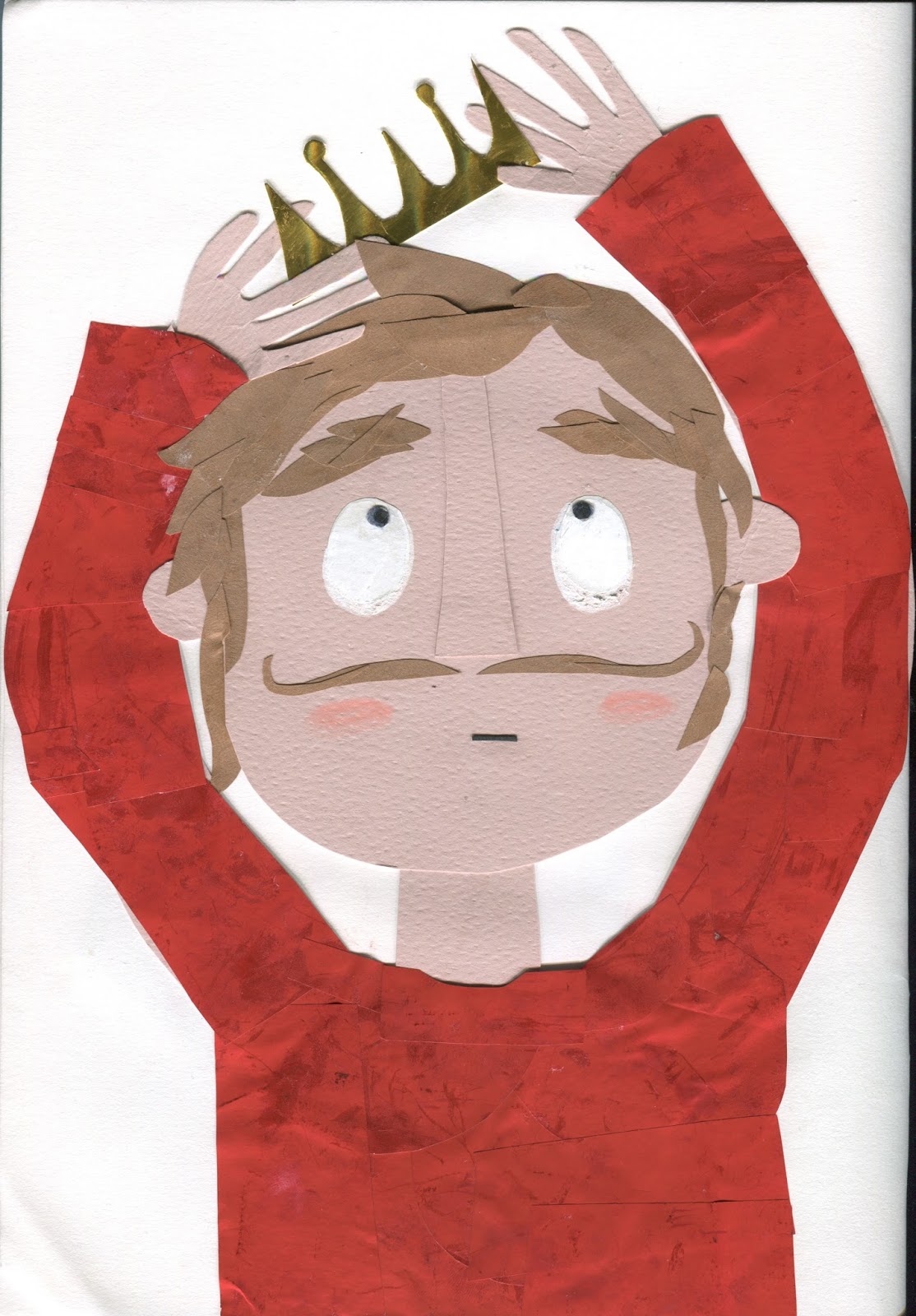
THIRD ATTEMPT

this time using pre-made textures too. The black background is black carbon paper.
Having a stronger contrast between foreground and background/light and dark has made this image much stronger than the previous attempt, since it is easier to look at and the shapes are much more defined against their constrasting neighbours. Blacks are shadows and whites are highlights, rather than shades of grey (although these are still present and have power too, I prefer the image to have the perfect balance of tone and levels).

The outfit needs much more attention, it is flat and ugly. There is no suggestion of posture or body shape. Zoom out the composition to see a little more of the arms?

LEAVING OUT THE MOUTH WAS A MISTAKE. I dropped the fragment of paper I'd cut for her mouth, but liked how this mouth-less face seemed so confused. 
I'M NOT HAPPY AND I'M NOT SAD. 

Wednesday, 9 December 2015

Shape Continued

Returning to the circus theme because I know I work better with a theme. 
I'd got in a rut trying to make images and not thinking about fashion at all.
I NEED DIRECTION.
I want some kind of grounding to base my SHAPES upon. I wanted to do more research:
Victorian circus
Victorian fashion
Steampunk style

http://www.vam.ac.uk/content/articles/v/victorian-circus/


This was rushed. I should have done more sketches in response the the photograph first, but instead I jumped straight into making the SHAPES. I don't think this is a very good way to work because it wastes time when you realise that this FINAL you've spent hours making isn't what you wanted. We've learned about the importance of roughing in Vis.Skills, I need to bring that into Vis.Lang!

Although I enjoy the freedom of SHAPE, I think that good illustration requires an element of planning and preparation.

The Musz Sisters, http://lenorelovelace.wordpress.com/2011/08/24/carny-style-introduction-part-i/

Ew. I hate this one.
I hate the shape of that hand - WHAT EVEN IS THAT?
I hate the skirt. WHY DID I THINK SQUARES COULD BE USED TO RECREATE THAT SKIRT? THINK ABOUT THINGS FIRST, DUDE. AIN'T NO WAY A SQUARE IS GONNA MAKE IT.

I'm more interested in the characters than the costumes. I always seem to place the character in the same place on the page too, I haven't really been very experimental with the composition of these illustrations. I should have varied the poses a little more to make the portraits more exciting, rather than the conventional 'head and shoulders' snapshot.

Snake lady, http://sisterwolf.tumblr.com/post/19046078106/snake-lady

I think what I'm struggling with in these Vis Lang tasks is that they have no real purpose or context. Other than improving our own skills and practising processes, these illustrations won't be used in the 'real world', such as in a book or an article. 
I need a little more of a brief in order to take the tasks seriously and to feel productive in what I create. I want to have an end product and a purpose for making the work that is more than just to improve my illustration practice, but I know that this is the whole point of this module.
Maybe I need to twist these tasks into mini briefs for myself.
Maybe I'm just being an idiot.

FEEDBACK:
My peers commented that I had created charming characters, that have consistency when viewed as a series. I was a little worried by this comment in that we are trying to avoid having a distinct 'style' at this point in the course. I have been avoiding sticking to a specific way of drawing and wanted my work to be versatile. I don't want to be pinned down to one specific thing.
I would agree that these illustrations have a distinctive characteristic about them, but I think that this is not always a bad thing or something to avoid.
These characters are my children and they are recognisable as my own.
Having a consistent 'style': raised eyebrows, skinny limbs and big smiles brings a stamp of the author's hand.

What I saw:
CHARLOTTE'S COMPOSITION. Charlotte had made really lovely, slick and trendy illustrations, but the main thing that I liked about her SHAPES is her use of the A4 page. She didn't cram everything into one frame, she thought carefully about how the character would be posed to make the most of this format.
She told us how she had taken reference photos of herself in these poses to work from, which was a clever way of planning her illustrations.

Simplicity is key
Around the room, there were lots of different approaches to SHAPE demonstrated. Some people used Photoshop and others stuck to digital. I preferred the analogue approach because it allowed for real textures and raised areas of relief.
Shape has taught me that simplicity is key and that line is not always necessary.

Alex used felt, but in a different way to how I had intended to with my 'fuzzy felt'. She cut the felt and stuck them to the page, enabling her to work with a lot more texture than is possible with flat paper.
People were drawn to Alex's illustrations because they were so different and such an experimental use of media. Alex is also the Queen of colour, so had found some gorgeous pastel shades of felt to use in her outfits.
I WISH I HAD FINISHED MY FELT IDEA. I would like to revisit this.

Tuesday, 1 December 2015

Mr Benn


The same character, completely transformed by a costume!
Mr Benn was created by David Mckee and I wanted to revisit this childhood classic in search of how I could use outfits to create stories and characters. Mckee hasn't just invented these costumes - they need to be identifiable to the young child audience as a specific occupation, e.g. 'chef' or 'astronaut'.


There has obviously been some research into the costumes that Mr Benn wears.
The costume design and historical information is what gives Mr Benn a firm grounding and makes the stories exciting. 

'that was very influential, that feeling of the back streets and the cobbles, on the drawing of Mr Benn in the early books. And even the costume shop; there was a second-hand shop – it wasn’t a costume shop – between the Barbican and the art college, so we passed it all the time. There were always lots of things in the window which never seem to change, and very dusty. And there was no interest in selling if you asked the price. And we always thought, this must be a front for something, because there was no idea of money, rather like the costume shop in Mr Benn.'
-David Mckee (3 March, 2009, at the Illustration Cupboard)


Yes, the idea of trying on a costume and going to a fantasy world is abstract, but the real-life costumes, jobs and experiences are what make these scenes realistic (this is not the right word…. not realistic at all! But based in the real world. Believable as far as cartoons go…).

Friday, 27 November 2015

Shape and Collage

Although fuzzy felt was a great way to construct images and re-arrange features easily, I wanted to move back to paper because of the colours and textures that I can achieve with this.
Felt is always a block colour, and I was restricted to only one specific shade.
All of the felt was the same thickness, whereas I can alternate card and paper stock to describe the heights of troughs and peaks in a face (nose peaks, neck troughs).

Starting by looking at shape and not focussing on the outfits as much. I want to learn how to use shape before I tackle the relevance of the outfits I choose.


Developing characters and personalities through shapes.
The way that the eyes open, the posture of the body all suggest things about the portrait and create character. I often rely on lines and I am impressed that the same result can be obtained just using shapes.


Starting to integrate outfits but I don't know much about them! How do they move? How do they fit?
The above portrait describes how clothes and hair move in the wind, in response to observation
(this week has been way too windy-gross).


I'm just choosing subjects at random! Should I stick to a theme? Should all of the three portraits connect? I need to carry out more research into kings to produce an accurate and interesting outfit.
I picked a king because it's a recognisable outfit, a costume and an occupation. Should I use the same character and show it trying on different costumes?
Dressing up?


Using paper cutting tools and hole punches to create standardised shapes.
I have a spiral cutter which helped me to produce lots of curls for hair.
Is this cheating? I really like the consistency of this and the simplicity of cutting pre-made shapes. The creative freedom is how they are used and what paper they are cut from.

Holographic card crown looks really shiny and resembles the material of the actual 3-dimensional object.
Can I use paper to mimic the folds and creases of fabric? Does it need more depth and layers?

I don't like this image. I wanted her to be a dancer.
I was lazy and didn't even look at dancers and their costumes. Don't try and cut corners because it just wastes time. I'm now going to have to revisit this image and reproduce it.
I'm disappointed in the way I have conducted this task because although I've put a lot of time into making images, I've done this half-heartedly and I've not invested my mind into the concept.


Find something that excites you! Feed this into your work. It will transform these vacant, empty images into informed and interesting illustrations.

Next Step: RESEARCH OUTFITS

Friday, 20 November 2015

Fuzzy Felt

I FOUND THE FUZZY FELT.
I also found a right b-b-bargain: 8 sheets of A4 coloured felt for £2?! Yass! This is why I love The Works (sometimes) and why I miss being across the road from the Merrion centre at Vernon Street.
Note to self: BUY THE FELT WHILE IT IS STILL IN STOCK. GET ALL THE COLOURS.
Anyway. Fuzzy felt.

I was sure we had more than one box but I could only find one in the pantry. It was definitely the coolest fuzzy felt subject though: FUZZY FELT MONSTERS. CAN IT GET ANY BETTER?
Why yes, yes it can.

It gets better because I found that all the boxes had been tipped into this one monster box - several fuzzy felt sets in one. Boo-yah.

All the fuzzy felts! I am really excited to have a play with this and make my own. I wonder if the boards are just felt too? Could I make my own board?

Tuesday, 17 November 2015

Shape

Aim:
To produce 3xA4 PORTRAIT ILLUSTRATIONS
Using Shape
Focusing on the theme 'Nice Outfit'. The illustrations should feature some form or costume or outfit.
Perhaps characters sporting their favourite outfit?

I use shape a lot in my work already. I enjoy building pictures through cutting and layering colours. I love the way that this simplifies my drawings and discourages me from relying on lines and thick outlines.


I collect papers and scraps of fabric. I rooted through my stash to find useful samples.
Above is a peach toned card stock with a wove texture. I only had a few sheets of this and I have no clue where it came from, so I have scanned it for future reference!
FIND SOME MORE


Just having a play with shapes and character!
What a coincidence that it ended up looking oddly like Mozza…
Moving the shapes just slightly altered the entire face and character. I liked how easy it was to change this, whereas with drawing it is a permanent decision when a line is placed down.
The process of laying shapes next to each other reminded me of fuzzy felt.
Perhaps this would be a good way of creating an illustration that I don't have to stick down and commit to?
Get the fuzzy felt down! Buy some more felt.
Maybe I could set up a fuzzy felt system that means I can change the expression or movement of the character continuously? I could photograph this and make an animation, or make the illustrations interactive.


I lack that 'passion for fashion' (lol Bratz).
More interested in costume. Maybe continue my circus theme? Study Victorian circus fashion.

When does line become shape?

When does shape become object?

I considered making a model again for this task, creating garnets for my dolls to wear and pose in.
IS THIS SHAPE OR OBJECT?
I'm enjoying making models but I have already done it a lot! Don't just fall back on your dolls, explore first. Make a model if you like, but don't do it the same way. Be experimental before you decide.


Full bleed images - how can I do this? Will I stay completely analogue?
Should I scan and then print?
Should I actually present it as a fuzzy felt?!

Thursday, 5 November 2015

Mark Making

Mark Making Week
Task: Make 15 line drawings, focussing on mark-making and pattern to define textures and shadow on the subject.
Working on full A4 sheets

I made my 10 drawings continuing on the same 'Circus- Freak Show' theme.
I have become really interested in the subject of conjoined twins and I have continued research in this area on which to build my study. I collected more images of conjoined twins and drew characters based on these photographs. They were not accurate references, but they did inform my understanding of the anatomy and the movement of conjoined twins.


Although I tried to force myself away from it, I found myself using mostly just fine liner this week.
STEP AWAY FROM THE FINE LINER
I found using fine liners useful for adding small details and for building areas of tone through cross hatching. I preferred using metal tipped, very fine liners rather than felt tipped because this produced a really scratchy, inky line - working to my fast pace and energetic drawing style.
Fineliners are ALWAYS JUST BLACK. This is why I like them but there is SO MUCH MORE OUT THERE. Be experimental, Jay! Don't stick to what's safe.


I attempted to use colour too. The drawing above was achieved using a red felt tipped pen, making repetitive dots on the page to draw lines and to construct darker tones of shadow.
I really like this effect - It looks like an oil pastel!
It took a long time to do this (so many dots) but I really like the line it produces.
I also think that using colour rather than just black all the time made the illustration much more interesting and eye catching.


I'm really enjoying the theme and the research involved with this task. I think it always improves my work to have a subject to focus on and engross my mind within. Having an interesting topic encourages me to keep working and to find more that inspires me. I want to find out as much as I can about this topic and through doing so, my drawings are relevant.
The rest of the group commented that my research had continued to inform my work and that my interest in the subject was evident in the illustrations I had produced.
I would like to continue using research and creating characters, which is another thing that my peers praised in my drawings. The characters, based on real people, were unusual and interesting.

A lot of my drawings were unfinished and I don't think that I spent as much time on this task as I should have.
I must use my time efficiently and always ensure that I have completed the week's task.
Some of my peers had obviously devoted a lot of time to this week's task and had made some really impressive drawings as a result. I don't want to compare myself to others, but in seeing this I know that I have slipped this week and I need to sort my time better.
Although I attempted to use full A4 pages, a lot of my images ended up being smaller and I wasted a lot of space. Giving my illustrations room to breathe is important and I shouldn't squeeze drawings into the corner of the page, so using a full A4 page might push me to use it.
Mary used separate pieces of paper to present her drawings on. She didn't restrict herself to a sketchbook and her drawings were a lot more free because of this.


Tutorial

Am I writing too much?
I write at the end of a day and I often write quite a lot in an attempt to sort out the chaos of my brain. I am really enjoying blogging but I may be taking too long writing when I should be making.
Always write for yourself. Be more informal and use this for your own reference.
Take a step back.
Take more photographs. Do what you love and write about your opinions, not your process. The camera can document that just as well as your words can.

I want to be Jim Henson. I want to build worlds.
Keep on world-building and explore!


Friday, 30 October 2015

Circus Visual Research - Whitby

I went to Whitby this weekend, a town known for its macabre, historic and spooky atmosphere.
Even better, it was also Halloween weekend and Whitby Goth Weekend! I thought this would be a perfect opportunity to capture the essense of gothic fashion as reference for my circus project. I also hoped that I could photograph my circus dolls in the town, amongst the historic charms.