Friday, 30 October 2015

Circus Visual Research - Whitby

I went to Whitby this weekend, a town known for its macabre, historic and spooky atmosphere.
Even better, it was also Halloween weekend and Whitby Goth Weekend! I thought this would be a perfect opportunity to capture the essense of gothic fashion as reference for my circus project. I also hoped that I could photograph my circus dolls in the town, amongst the historic charms.


Wednesday, 28 October 2015

Editorial Brief Process

After my discussion with Eva and Sophia on Monday, I have decided to move forward with my 'Pack Mentality' concept. I think that this theme has the most potential for editorial illustration, for communicating a serious issue.

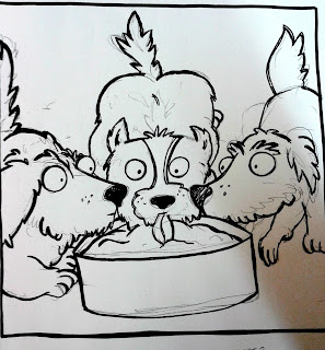
I worked further in my sketchbook to understand the facial expressions of dogs, making them seem more aggressive and less cute. I collected more visual references to develop my drawings from.

SKETCHBOOK IMAGES

I revisted my roughs and altered the composition of the dogs so that they appeared to be moving in the way I intended them to. I had the most issues with the square composition, trying to work out how many dogs to include in this frame and how to position them so that the shot wasn't too crowded.

SKETCHBOOK IMAGES

I saw Bronte working in the studio with tracing paper. I've not really used tracing paper much before, and Bronte's process of layering over her subjects until she found a composition in which they all worked together was something I'd never seen before. She had a very strategic process and I decided to have a go at building my illustrations in that way.

 SKETCHBOOK IMAGES

I found that this tracing paper technique really helped me to understand the format as a scene. From that point, I used this process to develop my final illustrations. It allowed me to transfer previous successful dogs and remove those I wasn't so please with, redrawing them at a different angle or with a slightly different expression.


After drawing out these final roughs, I scanned them into Photoshop. I really enjoyed the Photoshop session this week and I thought that using Photoshop would be a quick and simple way to add colours and textures to my illustrations without ruining the originals. I ideally wanted to revisit the originals with traditional media once I had found a colour solution that worked with the set of illustrations in my digital experiments.


The brief restricted me to using just three colours. I really struggled to find a selection of colours that successfully reflected the tone of my article. I had never used just three colours before, so I had to keep reminding myself that I couldn't involve all the visual information that I would usually do with colour.
I liked how using a restricted colour palette made my illustrations consistent as a series of illustrations. Although I wanted to include a dark, forboding atmosphere, I found that using the colour grey was very bland and using black took away the opportunity to work with colours that could imbue connotations to the illustrations.

I struggled to understand how many colours I was including. Do tones count as more than one colour? I worried that I wasn't following the brief.
Simplifying the file to precisely three colours in the shot above. 
I think it needs white! White would bring out the details of the eyes and teeth, the weapons of these beasts. It would be printed on white stock, so I need to replace one of these colours.
I don't like the purple, it's too happy! A darker, moodier blue is needed.


Tuesday, 27 October 2015

Step Right Up!

20 Line Drawings

The focus of these drawings was working with lines. We were asked to produce 20 drawings using lines in different qualities and strengths. Line is so important and a vital part of drawing, yet lines are so often underestimated. I want to learn how to commit to my lines and how to use them in different ways to suit the tone of my illustrations.

I used different thicknesses of brushes and a variety of media in order to achieve an array of different line qualities in drawing my chosen subject: a circus child dressed as a clown.
The strength of my drawings lies in my interpretation of the subject. These began as observational drawings from reference, but evolved into characters on the page. I really enjoy constructing characters and stories alongside images and I don't want to restrict this.


Charlotte used black tape cut in strips to construct geometric, perfect lines. I found this approach to constructing lines very unusual but it worked really well for her. She managed to make lines without a pen or a brush. I think this was a really good example of using initiative and Charlotte's creative mind.
Alex drew the same wrestler over and over, using different tools and different parts of her body. She started working from reference, but by the end of the task she was drawing the wrestler by heart. Alex has evidently devoted a lot of time to this task. 
I need to think about how much time and effort I am giving to each project. Am I spending enough time on my drawing? Is there enough effort going into these drawings?
I hadn't thought about using different body parts to draw with. This is something I will revisit later because I am intrigued as to how it would affect my drawings.
What does a line look like when it is drawn with my toes?


This task also pushed me to discover a subject that I have found a great love for: conjoined twins. I would really like to learn more about this subject and focus on conjoined twins in my next task of producing 15 line drawings using cross-hatching and mark-making to communicate textures, light, shape and depth of field.

This wasn't part of the study task, but I really enjoyed making models for the Summer task. I wanted to practice the technique more, so I made a circus themed model. Are three-dimensional edges still lines?
I would like to make a conjoined twin model too! I think it would also help me to understand how people move by drawing from this model. The anatomy of conjoined twins can be complex and it must be difficult trying to control two heads and one body between two separate minds.


Editorial Roughs Review

Presented roughs:
Working with roughs is something I hadn't done before this task. I'd planned before, but never in the same strategic process that roughing entails. These are not just ideas, they are plans and maps for my proposed concepts.

Vultures


The concept of this set of illustrations was comparing the behaviour of male 'lad culture' to that of wild vultures. I wanted to take the article less literally and produce a set of illustrations that subtly communicated the tone of the article rather than relying on the obvious motifs of men and women.
Drawing on the figurative language of the article, I picked out the term 'sloppy bird' and constructed scenes of these vultures attacking and eating a small, dead bird.
I would like to use collage to create the feathered texture of the birds.

Dogs
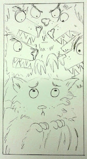


This series of illustrations focuses on the phrase 'pack mentality'. The images illustrate the damage that dominating lad culture can have on vulnerable women who are used as 'banter'. I have attempted to create anthropomorphic dog characters that have fierce, threatening expressions but also demonstrate a sense of community within the pack.
I would like to colour these illustrations digitally and use pink and blue to represent the gender divide between the animals.

Umbrellas


My final collection of illustrations attempts to communicate the misogynistic issues of 'lad culture' by taking a more literal approach. I drew men under umbrellas ('umbrella term') and visually noted the decline in gentlemen culture as opposed to this new lad culture.

What is the tone/atmosphere I'm trying to achieve?
 Trying to portray a serious issue in a sensitive manner, mostly through anthromorphic characters and methaphorical analogies.
Intensity, forboding, dark atmosphere.

What strategies am I proposing to achieve this?
Dark silhouettes and looming shadows representing the terror & anxiety of the scene.


Is there anything you're not happy about in regard to these roughs? What are you finding difficult? What do you think you could do more of?
Portraying expressions - I'm not sure how angry the dogs should be, how scared the cat should appear. I'm not certain how to document the situation. More research required. Visual references needed to fully understand my subjects.
 
Proposed media, method and processes for final pieces
Gouache, water colour, paper cut, photoshop.
I think that Photoshop would be the quickest way to apply colour and to explore several different processes (different brushes) in the short amount of time I have, but I would really like to use traditional media to create a scene with depth and texture.


I was paired with Sophia, who had not seen what my article was about. I was challenged not to speak whilst Sophia looked at my roughs, hearing her try to work out what my article was about without being able to answer her questions.
I found this task really difficult because my instinct was to defend my creative decisions and to discuss her questions. I had to restrain myself so not to respond to her comments.
I've never taken part in such an activity before, but I think it was really useful in that it forced me to listen to the audience and to consider that I would not have the chance to defend myself to readers in the actual context of this work. It was an opportunity to see how other people see my work. I was able to see my work through Sophia's eyes as she deconstructed the images before her.

It was obvious that Sophia was struggling to understand the meaning of my artwork, though she really liked it and said that it conveyed lots of action and drama.
This means that my roughs may not have been very successful at communicating. I need to re-rough in order to make the meaning much more obvious.
She did notice some key themes in my roughs, such as 'community' and 'bullying' that relate to my article, but she was also thrown off course by the theme of 'nature' in my more abstract concepts (representing lads with dogs and vultures) and guessed that my article was about the environment or wildlife.

Once allowed to respond to Sophia, I explained how she was on the right lines in some ways, but discussed what my article was actually about and how I'd taken an unconventional approach to representing it.
Sophia liked the abstract approach and once I'd explained, she understood. She said that when presented with the article, it was clear what the illustrations were about.
She suggested some ways in which I could improve these roughs, such as using colour to add extra information to these drawings (pink and blue to relate to gender) and working from reference to further understand the anatomy of dogs and how they growl.
The pack mentality subject was Sophia's favourite because she felt that it told several stories in relation to the topic and that they acted as a sequence well. They would draw her in if she saw them in a magazine or newspaper.
Some of the roughs need re-drafting because the subject was confusing - e.g. my landscape bird illustration was interpreted as two parents worried for their dead baby chick, whilst my intention was to imply that these larger birds had caused the death of the smaller bird. Sophia suggested that I add at least one more large bird to this scene to move away from the idea of two 'parents' in the frame.

I looked at Sophia's own work, which communicated very obviously what her article was about. Her drawings successfully reflected the tone of the article she was working with and I was impressed with how clearly they read the subject of biodiversity. I gave Sophia some advice in terms of which roughs to take forward and how she could make them visually exciting as well as clear to read. One point I made was that her use of scale added another sense of power to these illustrations and that she should keep manipulating this in order to alter the balance of the image. For example, making a hand bigger than trees would suggest that humans deem themselves superior to the world and other creatures. 'The hand of God'.
I really liked the way that Sophia used composition and she has clearly understood the breif. I'm excited to see what she produces for her final three illustrations.

I also spoke to Eva and we discussed which of my roughs were the most successful.
Eva preferred my 'Umbrella' concept because this made the most obvious connection to what the article is about
I explained how my interests lie in children's book illustration and that this may be why my concepts seem a little naive and cute. She pointed out that this is not a childish article and that I need to make myself more versatile and expose myself to more editorial illustration in order to get into the mindset of this context.
Just as I had advised Sophia on her scaling of subjects, Eva explained how adjusting the scale of my animals could instantly chage the tone of my illustration. Making the vultures larger makes them more scary. Making the sloppy bird smaller makes it appear more vulnerable.
She also suggested that I conduct further visual research into vultures and birds so that the subjects are easier to identify.
Eva had a very tricky article to respond to, a subject of politics. Some of her roughs made the topic quite obvious, whilst others were quite vague. She agreed that once she'd characterised well-known political faces (David Cameron), these illustrations would be much more immediate and obvious.
Eva had done lots of sketchbook work and was making a great attempt at roughing. I am sure that she will make the dry article she was given much more interesting!

There was no one else in this morning's group with the same article as mine. I was really looking forward to learning how they had interpreted this article, but I will have to catch up on their progress next week. I must focus on my own work and success rather than worrying what other people are doing. Perhaps it was a good thing that I didn't get the opportunity to fret over their work in comparison to my own today.

Photoshop Session 5

Today was our final session of Photoshop. 
So far in these Photoshop sessions, we have covered the basics of digital drawing techniques.
I have revised how to scan drawings to a high resolution and how to open them in Photoshop.
I have also learned new skills and shortcuts which have improved my competence in digital drawing.

We had free time today to focus on any Photoshop tools that we wanted.
I felt as though I had exhausted the parrot I had been using in previous weeks and so brought in another drawing to work on.
Siamese Twin drawing scan. This was a drawing I produced in Visual Language in response to the theme 'Circus'. I wanted to add textures to this illustration and experiment with colouring the girls without ruining the original drawing. I decided that taking it into Photoshop would give me a great opportunity to add layers behind the image and see how it could look in different visual formats.


I enjoyed making a digital collage last week when I added textures from photographs to my parrot drawing. This week I wanted to use some of my own sources and began scanning the textures and patterns of my scarf.
 I managed to arrange the scarf so that the creases and folds suited the stance of the girls as a dress and how it would hang on their frame. I think that this was a really simple way of suggesting dimensions and giving more life to the garment.
I also scanned my arms, forming a 'skin' texture that I placed underneath the drawing. I don't think that it is very obvious that it is my skin and because I only used a small sample, it didn't look as lifelike as I would have liked. The style of the illustration isn't realistic, but I did want a tactile aesthetic from my textures. Perhaps by scanning a larger area of skin and applying it proportionally to the illustration, this would produce a richer sense of flesh.

I often focus soley on the forground subject and forget about the scene behind the action. What is happening behind the girls? Where are they?
I used a photograph of a woodland to give a sense of place and contextual information to the scene.
In future practice, I would like to use my own photographs to inform my drawings in this way.
 I felt that the background compared with the digital colours brought too much light to the image. I found it too distracting and didn't think it matched the slightly macabre tone of my illustration. I lowered the saturation of the image to try and tone it down a little.
I also added drop shadows to the characters, adding to the dark and gloomy atmosphere of the scene.
 Monochrome

Converting the illustration into a brush. I then painted the drawing onto different textures.

 
Preferred the black on colour/white to the white on black/colour


I think that this is one of my favourite images I made today. The tone is so sinister and 


I saw some students making really impressive work with graphics tablets. I've never used one before so this is something I'd like to focus on and learn about next time I use digital media.

Monday, 26 October 2015

Editorial Illustration

I've never attempted editorial illustration before!
Some good examples that I want to take note of:

Greedy Bankers - Editorial Illustration by John Holcroft:
[Source: http://weandthecolor.com/editorial-illustrations-john-holcroft/31712]
Humour,
Great characters, obvious message about greedy bankers,
Piggy bank doesn't really need the word 'bank', perhaps a coin slot or a penny would be obvious enough?
A limited colour palette would have made this image tighter. At the moment, the bankers seem a little out of place because they don't fit in with the colour scheme - perhaps what the illustrator intended- but I'd prefer it aesthetically if they were created in tones of pink, browns and greens to match with the piggy. The blue banker in particular just seems wrong, but this completely adds to the message.
I'm contradicting myself.
Really like the textures on the paper, a convention of editorial illustration. Why is this? Why do I expect it? Breaks up the simplistic blocks of colour? Cheap printing aesthetic?

Really clever use of figure/ground. Instantly recognisable and understandable with a very clear message. The confined colour scheme keeps the message serious and helps convey the seriousness of the issue. Like many other editorial illustrations, the use of block colour is very powerful whilst remaining relatively simple.:
[Source: http://www.inspirationde.com/image/10087/]
Powerful, strong, bold.
Serious topic, communicated effectively.
Use of character without unnecessary information - we don't need to see her eyes or clothes, only that it is a woman, that she is shouting(?) and that she is raising her arm. Symbolic - statue of liberty, salute, rebellion, power, campaign.
Nice use of colours, ties the whole image together by sticking to a few chosen colours.
Texture again!


Wednesday, 21 October 2015

Changing Direction

I'm not happy with the direction in which my project is going. I'm feeling uninspired by the Tropical Rainforest topic. I know that inspiration is what you make it and that I can make this project as interesting as I want to, but I am just stuck on this feeling that I made the wrong choice, just as I felt I did with the typology project. I don't want regret to pull my back and restrict my artwork.
I am regretting my decision and if I don't make an act on it now I will be stuck for the remainder of this project.


At the last review, I saw other people enjoying the circus theme and producing really exciting drawings. I usually shy away from topics that other people are doing, wanting to be doing a unique subject that I have no one to compete with, but I know I would take it in a different direction than they are. My circus would be unique to me.

(Above: a few of my collection of old negatives. These were someone's holiday photos that I bought from a Carboot stall,)

I've been reading macabre, circus themed books and collecting images about the circus, even though this was not my chosen topic. I think that there is more content that I can tell stories about regarding the circus than a rainforest. I'm more interested in the history and about learning about the circus than I am about rainforests.
I've been watching American Horror Story - Freak Show and reading Miss Peregrine's Home for Peculiar Children (filled with found photographs of Victorian children in strange outfits, doing contortions and performing.

I want to put the knowledge I already have of the circus to use. I want to learn more about what I'm interested in and make art that reflects this. 
I'm changing my topic. I hope it's not too late but I think that the passion I carry for this theme will help me push through to catch up and visit the previous sketchbooks with my new theme.

Tuesday, 20 October 2015

Photoshop Workshop Week 2

Week two of Photoshop development:
This week's focus was to add colour and textures to our drawings. We were challenged to construct our own custom brushes using these drawings. I was excited to get back behind the screen and improve my skills in digital art.
I didn't know that creating a custom brush was possible, let alone so easy! In today's session we were guided through this process. I made my parrot drawing into a brush and used it like a stamp to repeat the image in different colours.
This image has really progressed from the initial ink painting that it began life as. Photoshop made it possible for me to produce repeated patterns similar to that of a screen print or two-colour lino print. The two-toned patterns would look great printed onto fabric. I've learned a new skill in Photoshop that I would love to use again, particularly for creating end pages for a children's book.
This process allowed me to overlay multiple colours of the image over one another. The above example demonstrates an attempt at a stereoscopic 3D illusion, but I don't think that this aesthetic matches the subject of my drawing. The parrot is a natural animal which suits earthy colours and textures rather than synthetic effects. How can nature be artificially reproduced in a digital media?

I wanted to use real feather textures to reproduce the natural quality of the subject. I'd already explored different brushes last week, so ventured into digital collage this week in search of a more realistic 'feel'.
I took clippings from several photographs of Macaw parrots and layered these under the line drawing. I loved this process and found it all the fun of traditional collage without the mess! I'd like to use my own photographs next time. 
The result of this digital collage reminds me of the work of Eric Carle. I love collage but had never thought that it would be so effective in Photoshop. Digital collage has the additional benefit of allowing changes to be made to the layering and placing of fragments, which is not possible in traditional collage. Clippings can be re-used and multiple variations can be produced.
All of the textures remain bright and sharp, and the original drawing can be placed on top of the collage to maintain the initial linework.