Showing posts with label OUIL 403 Visual Skills Studio Brief 2. Show all posts

Monday, 2 November 2015

Editorial Illustrations Presentation


Roughs - the benefits and difficulties
I found working with roughs really useful because it challenged me to consider ideas as plans rather than just drawings. Producing roughs made me work beyond just sketches and make blueprints in line with solving a complicated brief such as this one.
Being asked to present my ideas as roughs to my peers likened the task to a real editorial illustration brief. This task helped me to think like a professional and produce work to the client's specifications.

Working with roughs isn't something I'm used to and I did find it difficult to produce roughs when I had no clue what they should look like. How rough is a rough? What would my client expect to see at this point? I focused on the concepts behind my plans, but I think that I should have spent a little longer working out the aesthetic of the roughs so that I had a clear idea by the time I presented them to my client. I ended up having to re-rough after the discussion with my client because I still had creative decisions to make in relation to media and colour.
I have to be confident in my work and my decisions.

I tried to take on board the feedback I was given before moving forward with the roughs chosen by my 'client'. Being able to propose a visual concept without making the finished outcome proved incredibly useful in discussing my ambitions and how I should progress to meet these goals.

I found it difficult to get used to working through a roughing process but it made my planning a much more methodical, organised and strategic journey as I moved from concept to proposal for each idea in a logical manner.


Process & Production - the benefits and difficulties
I received feedback from my final illustrations saying that I'd demonstrated good Photoshop skills. Personally, I wouldn't agree with this point because I can see many flaws with the digital application of colour where I rushed or missed details. I am proud of the overall finish that using Photoshop to enhance my illustrations produced, but I know that I could do better and that I need to improve my skills in this area. I don't think Photoshop is my greatest image making asset and I think I should have stuck with my strengths in collage and mark making.
I spoke to Amy who also used Photoshop in her final illustrations, but she used a Wacom tablet rather than just a mouse like I did. I would really like to try using a Wacom tablet next time I approach a brief using digital drawing.
Mary suggested that I experiment with other media too. She suggested water colours, but I saw some really impressive work by other artists in the studio who had tried something different. 
Briar used paper cuts to divide the lines and colours of her paper stock and construct delicate scenes.

Feedback from my peers included positive comments about my planning and preparation: 'Well planned', 'a lot of sketches in the sketchbook'. I'm really proud of the level of work I put into planning this project and think that it paid off in the final illustrations. I was very wary of this project because it was something so alien to what I expected illustration to be, but I think I have created something intellectual and to a professional quality.

Design and Images
After worrying about the restrictions on colours, I received several comments on the colour scheme of my illustrations. I was over the moon to hear feedback saying that the colours work well and I know that this has changed the way I will approach colour in the future. Sometimes simplicity is best and it is always good to have at least some restrictions.

Amy suggested that I could have used more Photoshop brushes, which is definitely something I will explore next time I use Photoshop.

 Composition was something that I think the majority of the studio struggled with. Composition is a major element of design, but as illustrators we don't always consider it as much as a graphic designer would. Composition is often an after thought, but I really tried to get to grips with it through this project. It took me several attempts to achieve the right mise-en-scene, but I can now see the importance of this visual tool and why it should never be overlooked, because it has a huge part in dictating how the image is read.

People seemed to really love my characters and the expressions that they featured. I enjoyed working with character and I think that this is something that brings both consistency and authorship to my illustrations.

The most encouraging comment I received today was that the illustrations would make people 'stop and read'. I am so pleased that my images successfully attracted readers and that these images would look effective in an editorial context.

Concept and Communication
Feedback praised my research and original ideas, but several readers brought up the issue that the concept was not entirely obvious at first.
My abstract approach to the topic of lad culture meant that some readers were confused when they saw the images without the article; this means that my illustrations were not 100% effective in communicating the subject. 
Next time, I would test the comprehension of my roughs to my audience, measuring how far from obvious motifs I can take a subject before it becomes unrelated or irrelevant.
Perhaps I needed to include more visual cues to imply the subject of gender. My peers said that the gender-specific colours played a major role in identifying the topic, so this might be the answer to using an unconventional idea but still making it legible for the reader.
I needed to spend a lot more time working on the communication of my illustrations as this is their main purpose and I am not sure that I have succeeded to do so efficiently.

I am really happy with the atmosphere created by my illustrations. The article was sensitive and serious and I think that I managed to convey a matching tone of voice within my illustrations that evoked an emotional response from my readers.


Tuesday, 27 October 2015

Editorial Roughs Review

Presented roughs:
Working with roughs is something I hadn't done before this task. I'd planned before, but never in the same strategic process that roughing entails. These are not just ideas, they are plans and maps for my proposed concepts.

Vultures


The concept of this set of illustrations was comparing the behaviour of male 'lad culture' to that of wild vultures. I wanted to take the article less literally and produce a set of illustrations that subtly communicated the tone of the article rather than relying on the obvious motifs of men and women.
Drawing on the figurative language of the article, I picked out the term 'sloppy bird' and constructed scenes of these vultures attacking and eating a small, dead bird.
I would like to use collage to create the feathered texture of the birds.

Dogs


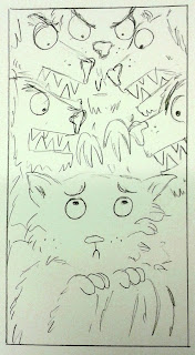
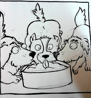
This series of illustrations focuses on the phrase 'pack mentality'. The images illustrate the damage that dominating lad culture can have on vulnerable women who are used as 'banter'. I have attempted to create anthropomorphic dog characters that have fierce, threatening expressions but also demonstrate a sense of community within the pack.
I would like to colour these illustrations digitally and use pink and blue to represent the gender divide between the animals.

Umbrellas


My final collection of illustrations attempts to communicate the misogynistic issues of 'lad culture' by taking a more literal approach. I drew men under umbrellas ('umbrella term') and visually noted the decline in gentlemen culture as opposed to this new lad culture.

What is the tone/atmosphere I'm trying to achieve?
 Trying to portray a serious issue in a sensitive manner, mostly through anthromorphic characters and methaphorical analogies.
Intensity, forboding, dark atmosphere.

What strategies am I proposing to achieve this?
Dark silhouettes and looming shadows representing the terror & anxiety of the scene.


Is there anything you're not happy about in regard to these roughs? What are you finding difficult? What do you think you could do more of?
Portraying expressions - I'm not sure how angry the dogs should be, how scared the cat should appear. I'm not certain how to document the situation. More research required. Visual references needed to fully understand my subjects.
 
Proposed media, method and processes for final pieces
Gouache, water colour, paper cut, photoshop.
I think that Photoshop would be the quickest way to apply colour and to explore several different processes (different brushes) in the short amount of time I have, but I would really like to use traditional media to create a scene with depth and texture.


I was paired with Sophia, who had not seen what my article was about. I was challenged not to speak whilst Sophia looked at my roughs, hearing her try to work out what my article was about without being able to answer her questions.
I found this task really difficult because my instinct was to defend my creative decisions and to discuss her questions. I had to restrain myself so not to respond to her comments.
I've never taken part in such an activity before, but I think it was really useful in that it forced me to listen to the audience and to consider that I would not have the chance to defend myself to readers in the actual context of this work. It was an opportunity to see how other people see my work. I was able to see my work through Sophia's eyes as she deconstructed the images before her.

It was obvious that Sophia was struggling to understand the meaning of my artwork, though she really liked it and said that it conveyed lots of action and drama.
This means that my roughs may not have been very successful at communicating. I need to re-rough in order to make the meaning much more obvious.
She did notice some key themes in my roughs, such as 'community' and 'bullying' that relate to my article, but she was also thrown off course by the theme of 'nature' in my more abstract concepts (representing lads with dogs and vultures) and guessed that my article was about the environment or wildlife.

Once allowed to respond to Sophia, I explained how she was on the right lines in some ways, but discussed what my article was actually about and how I'd taken an unconventional approach to representing it.
Sophia liked the abstract approach and once I'd explained, she understood. She said that when presented with the article, it was clear what the illustrations were about.
She suggested some ways in which I could improve these roughs, such as using colour to add extra information to these drawings (pink and blue to relate to gender) and working from reference to further understand the anatomy of dogs and how they growl.
The pack mentality subject was Sophia's favourite because she felt that it told several stories in relation to the topic and that they acted as a sequence well. They would draw her in if she saw them in a magazine or newspaper.
Some of the roughs need re-drafting because the subject was confusing - e.g. my landscape bird illustration was interpreted as two parents worried for their dead baby chick, whilst my intention was to imply that these larger birds had caused the death of the smaller bird. Sophia suggested that I add at least one more large bird to this scene to move away from the idea of two 'parents' in the frame.

I looked at Sophia's own work, which communicated very obviously what her article was about. Her drawings successfully reflected the tone of the article she was working with and I was impressed with how clearly they read the subject of biodiversity. I gave Sophia some advice in terms of which roughs to take forward and how she could make them visually exciting as well as clear to read. One point I made was that her use of scale added another sense of power to these illustrations and that she should keep manipulating this in order to alter the balance of the image. For example, making a hand bigger than trees would suggest that humans deem themselves superior to the world and other creatures. 'The hand of God'.
I really liked the way that Sophia used composition and she has clearly understood the breif. I'm excited to see what she produces for her final three illustrations.

I also spoke to Eva and we discussed which of my roughs were the most successful.
Eva preferred my 'Umbrella' concept because this made the most obvious connection to what the article is about
I explained how my interests lie in children's book illustration and that this may be why my concepts seem a little naive and cute. She pointed out that this is not a childish article and that I need to make myself more versatile and expose myself to more editorial illustration in order to get into the mindset of this context.
Just as I had advised Sophia on her scaling of subjects, Eva explained how adjusting the scale of my animals could instantly chage the tone of my illustration. Making the vultures larger makes them more scary. Making the sloppy bird smaller makes it appear more vulnerable.
She also suggested that I conduct further visual research into vultures and birds so that the subjects are easier to identify.
Eva had a very tricky article to respond to, a subject of politics. Some of her roughs made the topic quite obvious, whilst others were quite vague. She agreed that once she'd characterised well-known political faces (David Cameron), these illustrations would be much more immediate and obvious.
Eva had done lots of sketchbook work and was making a great attempt at roughing. I am sure that she will make the dry article she was given much more interesting!

There was no one else in this morning's group with the same article as mine. I was really looking forward to learning how they had interpreted this article, but I will have to catch up on their progress next week. I must focus on my own work and success rather than worrying what other people are doing. Perhaps it was a good thing that I didn't get the opportunity to fret over their work in comparison to my own today.

Monday, 26 October 2015

Editorial Illustration

I've never attempted editorial illustration before!
Some good examples that I want to take note of:

Greedy Bankers - Editorial Illustration by John Holcroft:
[Source: http://weandthecolor.com/editorial-illustrations-john-holcroft/31712]
Humour,
Great characters, obvious message about greedy bankers,
Piggy bank doesn't really need the word 'bank', perhaps a coin slot or a penny would be obvious enough?
A limited colour palette would have made this image tighter. At the moment, the bankers seem a little out of place because they don't fit in with the colour scheme - perhaps what the illustrator intended- but I'd prefer it aesthetically if they were created in tones of pink, browns and greens to match with the piggy. The blue banker in particular just seems wrong, but this completely adds to the message.
I'm contradicting myself.
Really like the textures on the paper, a convention of editorial illustration. Why is this? Why do I expect it? Breaks up the simplistic blocks of colour? Cheap printing aesthetic?

Really clever use of figure/ground. Instantly recognisable and understandable with a very clear message. The confined colour scheme keeps the message serious and helps convey the seriousness of the issue. Like many other editorial illustrations, the use of block colour is very powerful whilst remaining relatively simple.:
[Source: http://www.inspirationde.com/image/10087/]
Powerful, strong, bold.
Serious topic, communicated effectively.
Use of character without unnecessary information - we don't need to see her eyes or clothes, only that it is a woman, that she is shouting(?) and that she is raising her arm. Symbolic - statue of liberty, salute, rebellion, power, campaign.
Nice use of colours, ties the whole image together by sticking to a few chosen colours.
Texture again!


Monday, 19 October 2015

'A Day In The Life' Editorial Illustration

Editorial illustration is a strand of commercial illustration that I have heard of before, but something that I have never really given much attention.
Before this year, I had no clue about anything related to politics and I deliberately avoided any form of 'News'. The world scares me and newspapers, in particular, made me feel disappointed and disgusted by the human race.
I've tried to get into politics and to keep up with current affairs in order to stay up to date and informed, but newspapers are still not something that I would want to read. The fact that this task was centered around 'editorial' illustration immediately made me nervous.
I have very little existing knowledge of this form of illustration and of this context.

My interest lies in children's book illustration. There is a great difference between these context and audiences. Both respond to text but feature different genres and purposes. I tried to embrace the challenge and learn new skills, hoping that this experience would make me more versatile as an illustrator.

I was given an article about Lad Culture. I found this topic very serious and sensitive. I have quite strong opinions on gender and equality, so the fact that this article discussed misogyny brightened my spirits in that I knew I could give some genuine opinions to this task. 

I met with four other people who were given the same article. We had an initial discussion about the topic and our thoughts around it. I found this part of the task quite difficult because we had different views on the article. I didn't want to tell anyone that their point was wrong, but our group did produce some very strong and contrasting perspectives.

This task spurred some questions in my mind:
What if the illustrator doesn't agree with the article they are given by a client? What if they do not condone the argument that they are asked to support? Is it more important to accept work or to be genuine to yourself? Should your art always mimic your own voice?

Responding to the article
I began by reading the article several times and then summarizing it, making sure that I fully understood the extent of the discourse. I then went through and selected areas that I found important (e.g. highlighting key words - misogyny, banter, lad culture).
I noticed that I had also highlighted a lot of analogies and metaphorical phrases 'pack mentality', 'sloppy birds'. This figurative language is what really interested me and sparked visual ideas.
Reading the words and responding, I drew packs of wild dogs and vulnerable, fragile birds.

There are several restrictions for this project, including colour, printing, dimensions and format.
I found that working straight into boxes drawn out to the proposed dimensions really helped me to consider composition and to literally stay within the lines of the brief.