Wednesday, 30 November 2016

ILLUSTRATION FRIDAY: TAPE

 My first Illustration Friday submission: Tape


Concept
I didn't spend long on this brief so I didn't put much thought into the concept. I knew I wanted to avoid drawing a roll of tape - I wanted to do something a bit more out of the box.
I came up with the subject of video tapes and watching VHS movies, but I don't think the idea is well executed. The video tape in the girl's hand is too sketchy, not immediately communicating that it is a video. The television is the most recognisable object and I'm relying on this to communicate the rest of the image.

Tone of Voice
Trying to fit in with the humorous, comical illustrations I've seen working so well online like Gemma Correll and Sophie Corrigan.

Roughing/final version 
prefer the orignal sketches! This finished one lacks the quick
Digital

Colour
completely random choice. Needs more planning and testing.

The more I look at it the more I dislike it, but it's submitted now so I can forget about it.


Tuesday, 29 November 2016

Storyboards

I found storyboarding a useful tool for devising, planning and scripting moving image.
It is used in the animation industry so is something that I want to get familiar with.
I tried to use a variety of Points of View and camera angles, which made the (often quite dull) sequences more dynamic and interesting.
I'll use storyboarding to structure my moving pictures sting before I take it to After Effects because this will save me a lot of time and effort on the screen.

Fred's storyboarding session today built on these techniques. He demonstrated with Kyle's storyboards that you can create an illusion of depth on a flat screen by layering assets (e.g. background/foreground).
We were challenged to think beyond the frame and consider how things move INTO/OFF the frame.
We also discussed pace and tension.

Monday, 28 November 2016

Chronic Worrier Does Some Worrying

Feeling anxious tonight. Does my work answer the brief? It's neither a book or a set of prints!
It's not PRINTED - it will be digitally printed. I know we were given the option to do this, but it seems like I've cut corners and cheated  by doing this. 
Did I take the easy road? Was it a trick to see if I was dedicated enough to do a traditional print? Have I failed?

I've seen some really brilliant work hanging around in the studio and mine is so different. It's not up to that standard and I don't think that mine is something you'd see in Colours May Vary (for example)? I guess my target audience is different and my purpose/context is different too. It might be found in a gift shop for the Baltimore House, but not in a print shop.
I've gone in a different direction which I am normally raring to do... I seek innovative/unexpected/unusual/atypical work, but I am questioning whether I have wasted all of my time making something that isn't right for this brief.

I need some sleep. Things always look better with fresh eyes! Goodnight.

PAGES AND PROGRESS

My desk has been covered in trimmings, glue and cutting tools for the past two weeks and I am so tired. I just hope that what I've made will be good enough. I've been straining to get this ready to print, but I'm not sure if it's the best it could be.

I've so much admiration for Edgar that I want this book/print/house to live up to his legend. I really want it to be atmospheric, authentic and from the same world as Poe's mysteries.


At the time when Edgar was living on Amity Road, he was quite poor and living  in a very cramped house with Elizabeth (his grandmother), Maria (his Aunt) and Virginia (his 10 year old cousin, whom he married when she was aged 13). I have concerns that these interiors are too posh for such a household and may not be accurate, but I don't think that impacts too much on the overall 'feel' of the spooky house, especially since the reader decides what goes into the house and where they fit.

The reader's interpretation is vital because their response builds the inside of the house and builds the story.


Accidental eerie ghost trees! Really love this page. This will be lots of fun to animate since it has depth and layers to it. I can have crows flying through the trees, characters walking deep into the woods etc.

I've been working hard on this brief.
I do feel like I have neglected other modules because of the impending print slot but I do intend to make up that time. I haven't blogged as much as I would have liked to. I haven't been reflecting enough to look at what I've done each day and really SEE IT ALL together. So it's quite strange to see it all now, at the very near end of printing pictures (the submission is a while away, but I want time to dig my teeth into moving pictures). It's all coming together.

Friday, 25 November 2016

Book Construction


It works! It opens and folds and it's a house! I'm so relieved because I was about to give up on it. I should have just stuck to a pamphlet fold book because this has caused so much trouble with printing/trimming/fitting to paper, but it's actually functioning now and I can finally get on with making the rest of the pages.

Wednesday, 23 November 2016

Paper Dolls


There's so much to do so much to do so much to do.
PLOUGHED ON TODAY.
What I achieved today:
+ Doll roughs (every character mapped out, from hair to undergarments)
*insert 1830s references here*


Thank the lord for long bus journeys, I can sometimes do a lot of work on the way in at 6.55am.
I would have liked to have spent longer developing these characters. They've been in my sketchbooks, mind and ideas for a while but I would like to get under their skin a little more and do further research into the Poe family. Perhaps this is something I can revisit when making the moving models for moving pictures. I want to get back into my sketchbook and play with facial expressions/para-linguistic features to go alongside my storyboards BUT FOR NOW these are sweet little people of the Poe variety, so they'll do!
+ Doll Collages (all four characters constructed with monoprint textures)
I would like to have had more time to make monoprint transfers of lace/material textures to use on the garments.

GOOD VIBES ABOUT AFTER EFFECTS/ANIMATION:
I LOVE AFTER EFFECTS and I know I want to use it AGAIN! Had a quick chat with Ben about it and he told me about his friend that works at Mackinnon & Saunders (wowee!). The more I learn about/watch/experience animation, the more I want to get into that field.
I can still study illustration. I can still make illustrations. I can still be an illustrator. But I can also develop animation skills, work with animators and make my illustrations move.


Tuesday, 22 November 2016

Palaver

TECHNICAL DIFFICULTIES

This morning, Fred said 'at some point, technology will let you down.'
Thanks for that curse Fred! It's happened... 
I tried to print my house double-sided and even though the two pages were perfectly lined up in the Photoshop document, the printer knocked it majorly out of place because of the large border on the short edge for duplex handling.

MIKE FLOWER SAVED MY LIFE
well, my house at least. He took a look at my document and suggested that InDesign or Illustrator would be better suited for the paper handling. I went away and fiddled with it, Mike came back to check that it was working and we printed it and IT WORKED. Solved!

I'm running out of time there is SO MUCH TO DO
and the storyboarding briefing was brilliant, I want to get going with that but I need to finish my printed pictures work for wednesday to be digitally printed downstairs!

Monday, 21 November 2016

Virginia Blinks

Virginia Clemm from Jay Stelling on Vimeo.

Using Toggle Keyframe - this holds the transformation between keyframes so that it jumps to the repeat. Works like stop-motion.

Friday, 18 November 2016

A POEM FOR POE

House Number 3,
North Amity Road
The place where Edgar
 And his family stowed
Climb up the narrow stairs
To your cold, dark room
See the desk at which Poe
Would write Ulalume
A black cat on the doorstep,
A pendulum inside
Down to the cellar
Where a tell-tale heart cried
A raven’s caw, a knock at the door
The mysterious house still stands

 In Baltimore.

PAPER BIRD TEST

Paper Bird Test from Jay Stelling on Vimeo.

Thursday, 17 November 2016

MOVING PICTURES Study Task 4

THIS IS THE BRIEF I'VE BEEN WAITING FOR
I'm so interested in Animation at the moment. My work is often created with the intention of MOVING at some point (articulated dolls/puppets, scenes), so it is really exciting to finally get the chance to MAKE IT MOVE. I want my illustrations to have LIFE and now here is a brief in which I get to create that life and motion.
Moving characters
Do I have to make it all in After Effects? I'm impressed with the things that can be done using After Effects and enjoyed making crazy pans and applying properties to the objects, but can I make the characters/puppets/scenes SEPARATELY and use After Effects simply to bring it all together in layers?
Can I use stop motion and PHYSICAL puppets?
Extend your Printed Pictures aesthetic into moving pictures!

A short sting/advert for a documentary about your author
Could I do it as an advertisement for the Poe House in Baltimore? I've been learning about and making work about Poe's location, his house in Baltimore, which is now a museum. I think it would be appropriate for my sting to reference the house as the animated short is likely to be conceptualised around the work I have done about THE HOUSE and SPOOKY SCENES.
I intend to recreate Poe's mysterious MOOD AND IMPACT in my moving pictures.

Carson Ellis

The Wildwood Chronicles Book Trailer - Carson Ellis. This was one of the examples shown in the briefing and I found it utterly enchanting.
Colin Meloy's fantastical folklore storytelling is illustrated by Carson Ellis's intricate paper worlds. A marriage of nature and whimsy creating a 2 dimensional land of wonder.

Ellis's rich scenes are translated to moving image through the use of After Effects, using layers to build up the depth of a dense forest with foreground through to background. Each of the assets are separate layers, able to move independently from the background.
Panning is used to move the audience through the woods - we are moved through the trees as the frame scans further left. We move deeper into the woods through zooming closer. The under layers become foreground as we zoom towards them.


There is so much going on in this animation, which could easily make it overwhelming, but since the movements are all subtle and natural, it means that the overall motion is immersive and inviting.
The viewer is transported into Wildwood and left with a taste for the stories, just as a teaser should. Not giving everything away, but flirting with a promise of what is to come.
Directed by Aaron Sorenson.


Although this credits sequence doesn't have the depth and physicality to it that I love about The Boxtrolls films, it does use digital animation very cleverly to illustrate the ideas of the film.
Rotation and position communicates falling down - action packed and adventure.
Type overlays the animation, using the dark spaces and forms in the images as to add to the scene rather than take over.


Definitely not all After Effects but such a spooky tone and mood!
Similar in atmosphere/tone to my intentions
Made to LOOK OLD - grain, camera wobble, flickering light, black and white filter. Jittery camera, distortion.

Elsewhere, The Survivors from Ali Aschman on Vimeo.

Paper puppets - disturbing. Separate parts for limbs and joints - I could make my characters in parts and then put them back together on-screen.

Dontshare from gianluca maruotti on Vimeo.

Uses layers to create depth. Lots of houses on different layers moving at different speeds.
Bird movement - I am considering using a raven/crow in mine so I need to study how this artist has made the bird come to life. It moves very quickly and the wings move in a 'V' formation - up and down.
Still scenes with only a few things moving, creates a sombre and melancholy tone. E.g. curtains moving in the wind.
Same beginning and end - circular, narrative, emotional.

Giangrande - Paper Plane (Official Video) from gianluca maruotti on Vimeo.

The artist makes paper puppets - uses blu tac to stick paper down, stay in place.
USED AFTER EFFECTS IN THE WOODS SCENE - the same scene of trees, but panning across seamlessly, as though the woods are never-ending
wheels spinning on anchor points
Sea coming up, same texture repeated and layered

NEST ISSUE 10 SUBMISSION - FOCUS


Just a tiny brief to get the ball rolling. I received a call for submissions email from NEST and realised that this would be good practise to get me warmed up into the flow of Responsive.

THE BRIEF IS TO SUBMIT ARTWORK IN RESPONSE TO THE WORD 'FOCUS'
The broad spectrum of work in NEST means that my models/puppets would be welcome.

THE REWARDS OF THIS BRIEF:
Some exposure, example of my work being published in print

THE CHALLENGES OF THIS BRIEF WOULD BE:
graphic design, typography (not experienced/skilled in)
Haven't read the book

THE APPEAL TO ME:
QUICK, easy (not the way I would usually approach a brief, I much prefer longer and more commitment to a brief but I think that I need to start responding since we have a crit coming up and the Roald Dahl brief will be a big project that I haven't got much to show for yet)

Successes:
Does it answer the brief?
Yes. It responds to the word 'FOCUS'

Things to Improve:
I didn't rough or plan this response. Since it was only a very quick brief and I didn't have much time at all to prepare, I just took a doll I had already made and took several photos. There was no clever concept or research involved in the process of answering this brief, so the idea is very obvious and boring - a camera for 'FOCUS'.

Very quick response, should have made the camera myself, but I just used a little toy one I had in my drawer. 

I don't think my tone of voice was appropriate for this publication. My work is usually aimed at an intended audience of children and that's who I enjoy making work for, so the outcomes I produced might not be relevant for the readership: students and artists.


I'm not particularly proud of this. It's a nice photo but it has no real message behind it and it was made just for the sake of entering a competition, which isn't really what this module is about.
However, it has given me experience in quickly responding and sending off my work.


RESPONSIVE SUPPORT GROUP

First peer review for Responsive:
We got to choose our own groups (maybe not the best choice, since we're already friends and won't want to dishearten/offend/criticise HONESTLY?)
Working with Megan Swan, Polly and Alicja.

Initial discussion as to HOW MUCH WORK IS ENOUGH WORK.
Hard to establish which briefs are substantial and which are smaller briefs.

Swan has chosen to do ALL THREE PENGUIN BRIEFS. Sound rationale for why she wants to do these; interested in book design, has enjoyed book cover projects before, enjoys reading. She has therefore decided to spend a lot of time with these briefs. The Penguin briefs could be individual, shorter, smaller briefs, but Swan is putting in what she wants to get out of them so I think this is the right path for her. She wants them to be substantial projects so she is spending a substantial amount of time on them.
Variation - Swan's wondering whether she needs to do a few smaller, different briefs so that she has a wider variety for the MODULE submission. Maybe Illustration Friday - some little briefs that can be done when she has a spare few hours - but her focus is on PENGUIN.

Swan's timetabling is really structured and planned! I need to do this! Allocated four weeks for each brief, including time for research, concept development, thumbnails, roughing, reviewing, refining, printing and submitting her work.

Polly's practice is more design-centred, so she has chosen a D&AD brief, HASBRO Games design.
She thought that we had to pick at least 5 briefs, so had taken on a lot more work than she needed to, because she thought she had to in order to pass the module.
We helped Polly to narrow down her choices. The D&AD brief was going to be a lot of work, especially since Polly isn't collaborating for this big task and she wants to take it all the way to production (the brief doesn't say that it needs to be made, just designed), so she has decided that she needs to pick smaller briefs instead of more BIG ones.
A question of PASSION: she picked the Greetings Card design brief because this is something she's passionate about and FAMILIAR with. Although she wants to do more character design and narrative illustration, we came to the conclusion that the Roald Dahl brief might be too much work to take on alongside the HASBRO brief.

Alicja was struggling to choose which of the briefs she wanted to do. She was yet to find any briefs that she were suited to her practice. After listening to my ideas for the Roald Dahl brief, Alicja thought this might be something she could work on.
She wasn't familiar with the author but I know that it's right up her street. REQUIRES RESEARCH.

My main dedication is the ROALD DAHL brief, which I will be spending a lot of time on -starting now and working up to the week before the deadline. A project I know I will enjoy and I know that I work well with LONG PROJECTS.
I want to do some little briefs too. I'd already looked at the Art Doll Quarterly magazine submissions, but after seeing others in the room with little briefs already completed, I've decided that I need to find even more little briefs to keep me busy and enter into a variety of different briefs.

TIMETABLING
GET IT DONE, STELLY.

Wednesday, 16 November 2016

PEER REVIEW

WHO IS YOUR AUDIENCE?

preferred my house with the folds

WENT TO GO SPEAK TO JAMES MCBEATH FROM DIGITAL PRINT
(finally! I've been putting it off for way too long)
Technically, he can print duplex A2 but doesn't like doing it and it's very costly. Suggested I stick to A3. That's my answer!
Booked in to print on the 30th November - very soon.


Monday, 14 November 2016

MonoCollage


Since all of the print inductions are over, it's been time for me to start making work that could be used in my publication.
Using the skills and techniques I've learned in the print workshops, I've been trying to reconstruct the original drawings I did of Poe-inspired characters and houses in print form. I'm used to drawing with line, but monotype wasn't my favourite of the printmaking processes, I found it too rough and wanted to push myself to think beyond line.

Revisiting the magic of visual language and working with SHAPE/COLLAGE.
Difficult to get myself to think with shapes, but once I got into it I just kept cutting (freehand, with scissors!) and things appeared. The act of moving the shapes around the page until they find their 'place' is great, it means I don't have to commit to the image until it all comes together. Instead of drawing an arm in the wrong place, I can simply recut it or move it until it looks the way I want.
It's similar to the movement of my jointed, articulated dolls and puppets and I think the closest I could get to making puppets in this print-based project.
I'm enjoying this way of working and think it's a great translation of my 3D practice.


THE GRAIN OF THE MONOPRINT adds so much to the illustrations! Last year in Visual Language, I was just using plain paper stock (contour card, wove paper, laid paper, coloured paper) and although the images were built up in layers, they still felt a little flat, I think because the papers were just block colours. The printed textures I'm using help to communicate the dark, dingy and spooky atmosphere of Edgar Allan Poe.

Wednesday, 9 November 2016

ART DOLL QUARTERLY


Looking at more magazines/publications that have open calls for submissions, I found Art Doll Quarterly. This is a very niche magazine with a SPECIFIC subject: art dolls. I make art dolls, so why shouldn't I submit my work to be featured? The worst that can happen is they say no...

https://stampington.com/image/cache/data/issueImages/1ART-1602-Art-Doll-Quarterly-Spring-2016-175x175.jpg

Unlike Beautiful Bizarre magazine, Art Doll Quarterly establishes dates, deadlines and outlines challenges that they want submissions to answer. This means I'll have a direct plan to stick to, which i reckon will help me with timetabling, but it will also provide me with a theme to follow in my creation of the art dolls (e.g. one of the current themes is Powerful Women, in which I would have scope to research, plan and design a doll specifically in response to the brief).

My only concern is that the magazine does have the tendency to be a bit twee at times. There's a lot of craft fair/farmer's market sort of things. Just a little prim/not quite as I see the edgy, alternative scene of ART dolls. Not all the content is like that, there are some wonderful examples of what I would define as art dolls, hence the images I have picked out. To me, an art doll is different to a traditional doll because it is new, alternative and handmade. It breaks the mould a little. One of a kind.

Scratch that, I have two concerns. My second concern is WHO IS THE AUDIENCE? Is it just people who like art dolls? Perhaps these are potential customers, but is that enough? ARE THE READERS ALSO MY COMPETITION? I'm heading straight for consumers instead of the big wigs in the industry here...
Do professionals read these magazines? Am I heading down the wrong track?

BEAUTIFUL BIZARRE MAGAZINE


https://beautifulbizarre.net/wp-content/uploads/2016/05/Back-Issues.gif

Submitting my work to live briefs doesn't necessarily have to be things labelled as competitions.
It's simply an externally set brief - a challenge, something that may benefit my practice.

I've been thinking about where my work sits in the industry and how a lot of my work is about physical creations rather than traditional 2D illustrations. For some competitions, this may mean that my work stands out/is at least slightly intriguing, but I do feel like a lot of the competitions for D&AD/YCN are aimed at design rather than creation and I don't feel a connection with the tasks in that they're not what I hope to be doing after I leave university, so I've been looking for slightly more specific briefs that ask for puppet/doll/model-making/character design.

I also think that the industry I want to poke my little toes into is more about art dolls/puppetry and theatre/stop motion cinema, so I'm wondering if there is a better way into that than battling for a design trophy? It's more about getting my art and work OUT THERE, and I think I might have better chance with smaller competitions/submissions that are more specific to my interests.

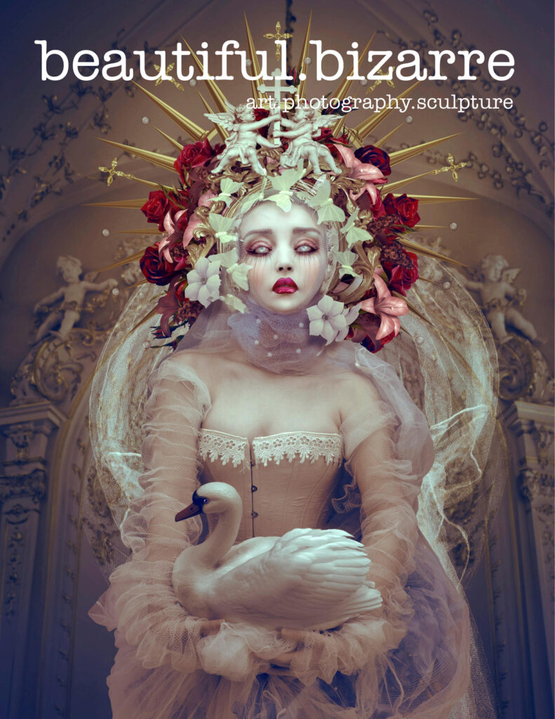
Beautiful Bizarre magazine is a quarterly art, photography and sculpture magazine that showcases the artwork of unique artists across the globe: 'beautiful.bizarre is the place where the unique, the evocative, and the beautifully bizarre are celebrated and readers can discover a decadent alternative to mainstream art, culture and couture.'
It's a rather niche market, but I think that this alternative style content and tone better suits my form of model making than the consumerist values of making a logo etc.

https://beautifulbizarre.net/wp-content/uploads/2014/01/beautiful.bizarre.jpg

No set 'themes' or briefs but ANY work. Want it to be appropriate and relevant, so would need to study their previous issues. Start tagging instagram posts with '#beautifulbizarre' to see if they do like my work and reblog it in their submission sunday feature.

There's no prize or payment for submitting but it would give me a lot of exposure digitally and in print if my work was accepted. It would also be delightful to see my work published in a magazine like this.

https://beautifulbizarre.net/wp-content/uploads/2014/01/BBA-EDITION-1-ADVERT-150-791x1024.jpg

Tuesday, 8 November 2016

Poe's House

A VERY PRODUCTIVE MONDAY!
Although my bus was late due to traffic (took 2.5 hours to get in to uni as opposed to 1.40), I still got into uni with five minutes to spare. I HATE BEING LATE and I was freaking out a lot but I got there and it was all groovy. BUT DON'T GET ME STARTED ON THE JOURNEY HOME (I had to stand up half the journey!) Anyway. Commute aside, I had a good day.

Did a bit of drawing and a bit of thinking... Not changing direction, but turning the gear up a notch.
Instead of just a random spooky house, GO BACK TO RESEARCH and make it Poe's house.
The foundations are already there, but this will make the publication a little more relevant and interesting (hopefully) in that it will have some factual/historical elements.
Not changing much, just tweaking the concept slighly to make it better.

Audience change slightly
context of reception maybe gift shop in the Poe Museum?
Purpose also shifts, slightly informative as it's based on the real house/real life of Poe.

Quick Catch-up with Ben:
Liked the house print - making things quickly and getting an idea of the final outcome already 
STOCK, newsprint doesn't fold well - look for thicker card stock
First person shooter approach has been integrated well, manipulating the audience like Poe did.
story in each room? - the tell tale heart, the black cat etc

Plan now is to print out loads of the monoprint textures I made and have a go at collaging with them. Make bricks/windows etc. Layer and arrange.
Maybe cut more lino stamps?
Design the house plan
Design the character sheet
Design the prop sheet
Research 19th Century fashion, architecture, interior design, wallpaper, furniture, lifestyle, 

Costumes

Spoke to my friend Amelia who is studying Costume at Huddersfield and working in the wardrobe department at York Theatre, suggested lower waistlines and coiffeur hairstyles
accessories
SILHOUETTES
Needed to pinpoint down to a specific decade of the 19th century instead of looking at the century as a whole because a lot happens in 100 years! Poe lived in Baltimore in that house from 
so I'm setting this in the1830's 

PENGUIN CHILDREN'S BOOK BRIEF RATIONALE

https://www.penguinrandomhouse.co.uk/about-us/design-award/children-s-cover-award/


THE BRIEF IS TO DESIGN A BOOK COVER FOR 'THE SECRET DIARY OF ADRIAN MOLE: AGED 13 3/4"
Supports to my interests in: stories, reading, narrative, character

THE REWARDS OF THIS BRIEF:
Prize, networking, industry, exposure, brand, company, PENGUIN

THE CHALLENGES OF THIS BRIEF WOULD BE:
graphic design, typography (not experienced/skilled in)
Haven't read the book

THE APPEAL TO ME:
enjoy reading - penguin fan, my intended target audience

Monday, 7 November 2016

SCREEN PRINTING

The last of the inductions!
Again, I HAVE screen printed before but I have yet to thoroughly enjoy it/want to do it/know what I am doing. I've done the process before (several times), so in theory I should know HOW TO SCREEN PRINT. In practice, I don't. Lots of worries as I entered the room. Lots of worries whilst I prepared my screen, and then all of those worries piled into bad pressure from shaking, weak hands, a muddled head making me forget everything I actually know and an anxious mood making me a pain to work with. Just the usual then.

INTENTION:
Make a rough print of my house. Only printing A4 size so not room for all the flaps, plus can only print one side of the publication today, but it will be useful to see how it prints and whether the final thing could look the way I want if I used screen print.
SCREEN PRINT IS PRECISE AND NEAT, OFTEN USED IN MASS PRODUCTION. WILL IT HAVE THE SPOOKY, MYSTERIOUS LOOK I WANT? WILL IT LOOK TOO CLEAN? TOO TIDY?
My positives look a mess, but I think they'll look okay when printed together...

HAPPY ACCIDENTS:
We were told to make one ink pot each, so I made black but then I realised that I should really be printing light-dark colours, so I needed another pot for my first layer. Raided the scraps, found a pre-made blue but there wasn't enough! Made do with it until it completely dried out but didn't have enough to finish the nice paper prints.
SOLUTION:
Found another pot (a lighter, aqua colour) and blobbed it right into my reservoir. NOT ENOUGH TIME TO CLEAN MY SCREEN! Ended up making these weird marbled-effect prints with random swirls of both colours. Maybe with any other print, this would have looked wrong and just bad but I think it actually adds to my 'ghostly' aesthetic.


By the end of the session I was feeling so much better. PROUD of what I've made! Happy with how I overcame the issues I had. NOT too scared to go back down there again. Improvement!

Sunday, 6 November 2016

LINO INDUCTION


Lino is great, but lino STAMPS are even better. So much fun! I made some little raven stamps and printed some patterns with them. This could work well for making patterned wallpaper to go inside the Poe House?


Has that grainy print quality but also very bold and graphic.


Friday, 4 November 2016

House Book

Since I had a bit of a change of direction for this project, I thought it might help to revisit the research stage and find some prints better suited to this format and see how I can take inspiration.

https://s-media-cache-ak0.pinimg.com/564x/46/4c/a3/464ca378ff4f71f1c70dbf82f47227e5.jpg

Not the same tone as my publication since this is much more upbeat (high key colours, twee/kitsch scene), but the actual content of the houses is what I wanted to look at. Mark-making to describe the different materials (wooden pannels, steps, pavement, glass windows, tiles, brick). Simplistic shapes - long oblong houses, symmetry, varying forms.
No suggestion of life from the windows. Black, doesn't overcomplicate the image and keeps things simple but does make the houses lack life/homeliness.

https://s-media-cache-ak0.pinimg.com/564x/75/3f/d8/753fd8bec17947dd45717f4cac1c0746.jpg

A look-inside-the-house cross section illustration. Doesn't make much architectural sense but is charming in that it gives you a glimpse into the home. Consider wallpaper, furnishings, flooring etc.
CAN JUST ONE SCENE LIKE THIS tell a WHOLE STORY? There's a lot going on in that house just in this illustration! The mouse is asleep in the bed, but it's obviously day time. The Rooster is sleeping too, in a room without any windows and the little red hen is cooking something. Add text/narrative around/inside the building?
More info under flaps - more interaction!

https://s-media-cache-ak0.pinimg.com/564x/71/1f/4d/711f4d1509ebc6101097d063409b816b.jpg

This one excited me because it's a similar SPOOKY tone to what I'm going for. It's for kids but focuses on haunted house/ghosts. Maybe a little more toned down than what I'm intending (Ghosts don't smile!)

https://s-media-cache-ak0.pinimg.com/564x/6a/47/04/6a4704741f5f840bfc53c24ab9299fbf.jpg

It's a screen print but they've printed black on red paper! I hadn't thought of that before, I just thought of the stock being white (and this is the third colour). The WHITE of the ghosts is achieved through a final layer of white printing, and adds much more depth/interest to the scene. Ghosts are supposed to be transparent, so by mixing a lot of printing medium with less ink, the bulk will be slightly less opaque, especially with it being a light colour on top of dark colours like red and black.
I think this is so clever and I would really like to have a go at printing onto coloured stock with white like this.

Thursday, 3 November 2016

Lift-the-Flap House


I've spent quite a while today measuring, drawing and planning the house structure and it actually works! On a duplex-print A3 page, I should get the inside and outside of the house, plus opening walls, a roof flap and a basement flap.
I don't know if this counts as a print or a publication. I think it's a publication because it's something you'd buy as a product rather than a print to hang on a wall. It has more function than a print?
Needs spookifying, it's not scary yet! HOW SCARY TO GO?

My little brother (TARGET AUDIENCE. AGE 8. Only knows of Edgar Allan Poe because of the Simpsons. Loves Treehouse of Horrors/Goosebumps books) says it should be VERY GORY. Bodies in the basement/fingers in the flowerbed. Wants to see explicit pictures/blood.
I don't know, part of me wants to make this much more about Poe's romanticism and camp nature, with charming little ghosts/undead characters, but I also want to be more unapologetically uncensored, gruesome and controversial. A kid's book with the slimygross details.
Something to think about.

Roald Dahl

Brief 
To illustrate iconic characters and scenes from your favourite Roald Dahl children’s stories. The illustrations should appear as if they are part of a published series.

I am a huge Roald Dahl fan and was even more enamoured with his work as a child.
I was INSTANTLY DRAWN TO THIS BRIEF because it would allow me to revisit those childhood passions and make work for an author whom I admire and always dreamed to work with (albeit not technically possible, so making work for his Estate would be the next best thing).
We believe that every child in the world should enjoy Roald Dahl’s stories just as much as we do. If you agree, then we would love to work with you. 

The brief focuses on storytelling and narrative, two themes that drive my work in all areas of practice. This is absolutely the DREAM BRIEF. Everything I want to do as an illustrator and everything I expected it to be when I signed up for it.

http://cdn.shopify.com/s/files/1/0254/9563/collections/quentin-blake-roald-dahl_large.jpg?v=1395236431

The only concern I have is that Roald Dahl's work has already been made visual, specifically by the iconic illustrations of Quentin Blake. That's a big name to live up to and I might find it a challenge to tackle character design without echoing those well-known drawings that have gone before.

Target Audience 
Our core audience for Roald Dahl’s stories are boys and girls of the future, aged between 5 and 11. They don’t necessarily identify themselves as fans of Roald Dahl – yet! They may prefer YouTube, their games consoles, or messaging their friends on SnapChat. You should aim to make them love Roald Dahl’s stories just as much as you did once upon a time. 
Children's books are the reason I came to study illustration (although since then I have moved to explore other realms of illustration, it is still the communication with young imaginations that excites me), and working with children's books is still my ambition.
Children are an audience I am familiar with and enjoy making content for. My younger brother is 8 years old and definitely falls in the target audience for this brief. This means I have infinite access to feedback from my intended audience, enabling me to get his opinions and thoughts on what I'm making.

http://littlezosienka.files.wordpress.com/2010/10/quentin-blake.jpg

The Creative Challenge 
We invite you to illustrate a series of iconic scenes, featuring at least three iconic characters from Roald Dahl’s inventive, revolting, wicked, or friendly stories in a style of your choosing. None of your illustrations should be boring, safe, or predictable. All styles welcome.
I've already had some ideas for what I would like to make. The concept of constructing a scene excited me and got me thinking about performance, puppetry, set design and costume. There are no restrictions on media or format, so I know that it would be acceptable to take this direction in re-imagining Dahl's work, so long as I am mindful of his tone of voice.


https://s-media-cache-ak0.pinimg.com/originals/29/ae/58/29ae58ab339cbd824f72c800ebfbb832.jpg

Mandatories 
You can choose to illustrate between one and three scenes. Within this series, you should illustrate at least one child character, one villain character and one fantastical creature — whether this be a witch, a giant, an insect or an oompa-loompa!
You can select scenes from a mixture of novels, although the illustrations should appear as if part of a coherent series. 
The illustrations should also compliment our logo - you’ll find some copies of this in the project pack.
I've quite a lot of Dahl's work before and watched all of the film adaptations, but reading through the list in the project pack, I've realised that there are a few titles I'm not familiar with! It would be a challenge to study and work with titles that I've not come across before, but I also think it would be much more a venture for me and may lead me to make more unexpected and inquisitive work.

Wednesday, 2 November 2016

MEGA CRIT / A DIFFERENT IDEA

Before I start, I had an idea on the bus this morning and it's changed everything.
EVERYTHING. I was thinking about the visiting lecturer yesterday (Louise Lockhart, see PPP blog), and her printed products, especially her paper toys, and I thought - these are prints! These are printed pictures, but they're DIFFERENT. They're fun, they're innovative and they're interactive.

http://payload433.cargocollective.com/1/14/467132/10965920/prt_300x300_1461779748.jpg

So I'm thinking: bring back Poe's element of mystery. Look again at his first-person perspective that made his horror so personal and terrifying (thanks Ben for sending me in that direction). Make a publication that is more fun, creepy and adventurous than just some pages stapled together. 
I can't make puppets/dolls (in a 3D form, the way I normally do), so I'm going to have to be a bit inventive with the printed product.


THE IDEA IS to make a lift-the-flap sort of book, in the shape of a house. Readers will be able to look inside the haunted house, under the floorboards and inside the walls. I think this would count as one print, and then I'd have four printed card sheets that go alongside it, with characters/backdrops/clothes/objects to be cut out and played with.
I COULD MAKE THIS REALLY DARK.
I could also incorporate the storytelling and narrative by hiding text within the house or following a character through the house from room to room.
I DON'T WANT TO JUST COPY LOUSIE LOCKHART. I know that other people have made lift-the-flap books before and it's not just her idea, but I am concerned that my idea has come straight from seeing her work. I don't want it to be a copy of her design.


Work in Progress
(photo of what I had laid out on the table)
Lots of work to show today! Feeling good that I have TWO exciting ideas and that I can use this opportunity to ask my peers WHICH ONE (yay, getting other people to make decisions for me!)


I finished a little mock-up of my narrative and quickly photocopied it into a book format so I can have that on the table for people to pick up and flip through.


Feedback:

(for once I'm scanning it and not going to rewrite the whole of the feedback, genius Jay)


Some constructive feedback, very happy with the responses I got today. People really liked what I've done and were impressed by the progress I've made.
I asked the question: to go with the storybook or to follow this new idea - the house?
People liked the house, just thought that the book would be easier.

Magpie: 
(the new name for me looking and seeing what other people are doing, collecting things and hopping away back to my nest).
(Megan NW, Sophia and Printing onto fabric! Is that allowed? They didn't specify what stock we use, so why not? 
Since I'm making a publication, this is probably not relevant for me and it doesn't make sense for Poe, but I would love to make a printed textile raven plush if I could (maybe just as an extra product, not for the brief)

MONOPRINT INDUCTION


Ghostly images and shapes! I especially love the noisy textures, it reminds me of film grain and makes my prints look old/eerie. Definitely works for Poe. I think Screen print/half tones will look too clean/modern, whilst monoprint is more natural.

I've done monoprint and monotype before and I've started having a go at home, but I am still trying to prove to the Jaybrain that it is fun and that I am capable of being a printmaker, so to stop putting it off/start getting excited about prints.

Had a bit of a go with monotype (drawing onto a plate, though I only finished one, seen on the 5th page of the Issuu presentation). Didn't enjoy this as much as monoprint. Don't think my lines are strong enough (too quick, sketchy and weak), I'm better with shape in this respect so preferred making stencils.
The monotype just looks boring and doesn't have the expanse of printed surface like the monoprints do, it just looks like a bad drawing with a fuzzy line? Maybe it would look better combined with the monoprint, e.g. monotpying over the top of an already printed texture to add details.

I wasn't thinking of the prints as images so I didn't pay much attention to the composition. My prints don't make much sense on their own, they're not finished pages and I didn't put much thought into how I was laying the tombstone stencils onto the plate for printing, I wasn't arranging them in any way as though it was a scene, rather placing them all down with enough space to chop them out when I want to re-use them, planning on using them as textures for collaging with later.

The idea of monoprint is that is is all an experiment, but I am very wary of following the rules and 
also feel like I'm being watched/can't truly let myself get into the flow of making and playing. I felt restricted because of the environment.
I DEFINITELY WORK BETTER AT HOME IN MY OWN SPACE.
I felt a bit panicky at one point after cutting my finger on a knife and then feeling like I'd done something wrong/was being looked at/just wanted to get out of the building/general anxiety doom. As soon as I thought the print technicians/peers had had enough of me/thought I was stupid/were angry because I was doing things wrong, the worry lever hoisted me down into the pit of despair. So I took a stroll, got some water and came back. Got on with it. Not a fun time but I did it and got through it. I made some things, did the session and came out in one (shaking, scratching, almost-crying-but-not-crying) piece.

Mucky fingerprints over everything. Need to be more careful.
Keep them clean and safe!
Tried to keep everything I made though, even the scraps of stencil with the print residue.