Tuesday, 11 October 2016

Peer Tutorial

I didn't redraw for this tutorial because I knew I wouldn't have much time for the making (TWO DAYS TO MAKE!), so I kept the chosen six drawings but also brought along snippets of the photo tests I'd done so far.
Group: Kayleigh, Sophia, Owen, Steven, Isaac


MY GROUP HAD SO MUCH WORK! We all had a lot to say and everyone contributed to the discussion. This is probably one of the best peer tutorials I've had; we were all in the right mindset to show and tell.

THINGS TO TAKE AWAY:
All had different authors, so very different work.
Sophia's process - innovative

Feedback:
VERY POE even though it's using children's language
Liked the bird one - keep it as it is!
Done a lot of work already so just SHOW IT OFF. Make it look good. Don't remake things!
They don't all need to be the SAME two colours. Could mix and match?


NEXT STEPS:
TIMETABLE. PLAN THE WEEK AHEAD.
Take better photos
Refine
Backgrounds?
Print and Present!

Sunday, 9 October 2016

MAKING


PROCESS
cardboard houses - wasn't sure if they needed painting or not since I was taking the photos in black and white to apply the colour restrictions after?
Good to work from a rough - like a script to go by

IMPROVEMENTS
Make it to size
make a better moon
consider the framing and composition - how big, how far,
make gravestones
set up the scene better - make a hill

NEXT STEPS
COLOUR
CRAFTING
PRINTING

Friday, 7 October 2016

18 ROUGHS MEGA CRIT

MEGA CRIT


Going in: feeling positive! I've finished the 18 roughs for the critique and I feel happy with them. They have the tone that I wanted to emulate: a spooky vibe and a mysterious setting. More refined than the initial 60 thumbnails because I have had time to develop both the selected concepts and to figure out the compositions. Started to consider colour and media.

A BIG THANKS TO CHRIS SICKELS for proving that ROUGHING 3D illustration is POSSIBLE and USEFUL. Seeing his roughs next to his finished 'makes' has shown me that HE USES ROUGHS TO PLAN, COMPOSE AND DIRECT the scene.


Feedback:
Concept:
Spooky, dreamy, charming, peaceful, have lots of emotion.
tentacles tell a story - trapping

Visual:
TENTACLES!
Like the blue - blue is dreamy and yellow reflects nighttime
Big spooky eyes
Composition - draws you in, almost golden ratio, dreamy, good use of space
range of angles and viewpoints - line of sight
simplicity and characterisation

They really liked my drawings! I'm a little surprised. I think they're okay, I enjoyed drawing the tentacles but I didn't think people would really admire them like this. They're just my roughs! They're a blueprint of what is to come...

My Question:
I want to make them as sets/models - am I wasting time?
Short brief, save it for a longer one
prefer the illustrations
something nice about the 2D drawings
develop drawings instead
compromise - layering flat illustrations in sections? Relief?


GOING FORWARDS:
Tallied up the most popular (highly voted in the feedback) roughs.

I'M IGNORING THE SUGGESTION TO STAY WITH DRAWING. I know I won't be able to go 3D for the next Studio Brief and I don't want to miss this chance. I am willing to compromise slightly, using cardboard or some flat illustration and relief, but I am always wary that a drawing is always a drawing. I don't think drawing is my strongest power.
Though I am a bit torn since my peers seemed to like my drawings! WHY? WHAT? I just don't see any magic in them. They're lines on paper. I drew them as a plan. They're not the REAL THING.


PLAN FOR THE REST OF THE DAY:
GRAB CARDBOARD
AND MAKE, MAKE, MAKE!

CARDBOARD MAKER


I wanted to get making right away,  so scavenged the only material I could get my hands on abundance of: cardboard.
Three whole boxes were left abandoned next to the bins in college, so I took them and a tube of UHU into my studio space and just started to translate my 2D illustrations into reliefs.

Not the sculpted forms that I wanted to make (a feathered, textile bird, a wooden house, clay moon) but this was a quicker way of producing props/models.

It also solved my problem of being torn between 3D and my 2D drawings. Since getting all that feedback on my roughs with people telling me to carry on drawing, I wanted to feed a bit more of a drawing practice into the model making (e.g. line, shape, character), which I attempted through the rough cardboard chopping and sticking paper eyes to the Raven.

Since I'll only be working in 2 colours you also won't be able to see the brown of the cardboard so there's no point wasting time with painting the props.


I AM REALLY HAPPY WITH THIS BIRDCAGE! Made using a metal bottlecap and wire - SO EASY. It's messy and rough but I think that works. My mum described it as 'daintily jagged'. I do love an oxymoron!


Sunday, 2 October 2016

STUDY TASK 2: ANDRE DA LOBA

Andre da Loba is not an artist I've heard of before. I was attracted to his quick, child-like 3D illustration in the form of cardboard cut-outs painted in acrylics.
http://beautifuldecay.com/wp-content/uploads/2011/12/andre002.jpg

They're so silly and crude that they're funny. It's this naive, frank approach to 3D illustration that makes his work memorable and striking. When I discuss playfulness, THIS IS IT. This is having FUN with art. Andre da Loba obviously wasn't aiming for perfect brush strokes and precise lines with this piece, he was just letting loose and it works.
The hand of the maker is evident in his illustration, since it is his hands that chopped the cardboard, splodged the paint and glued it all into a hodge-podge mess of happiness. If the lines were perfect and the paint was smoothly applied, it wouldn't have the same degree of wonky, fast-paced busy-ness.

http://www.andredaloba.com/wp-content/uploads/2012/09/Land-of-Decoration.jpg

I found it hard to believe that da Loba's work has been published in highbrow editorial contexts. I really like what he does, I just can't imagine other people enjoying it in that context! I suppose it adds a lot of fun and humour to dull articles, much more than what a drawing could bring.

http://www.andredaloba.com/wp-content/uploads/2012/09/I-Five.jpg

He draws and screen prints too. The image above is a laser-cut shape that has been screen printed. I much prefer his hand-chopped art because it's more of HIS input than a computers. It's all his craft and it's original. Anyone could have made this sculpture and I wouldn't be able to tell. It's nice, just not what I now recognise as Andre da Loba's handiwork.

http://www.andredaloba.com/wp-content/uploads/2012/09/C_023.jpg

STUDY TASK 2: CHRIS SICKELS - Editorial

I've been following Chris Sickels (Red Nose Studio) for a couple of years now, but I didn't realise that he has worked in EDITORIAL illustration. I didn't think his work COULD BE editorial.

He is an illustrator but illustrates using sculptures, puppets and tiny hand-made props. When Ben told  me that Sickels's work has been published in 'The New Yorker' I felt so much better about this brief because I realised that physical illustration can be printed and showcased in this format too. Not your typical editorial illustration, but it can be found in this context. Magazines and newspapers have comissioned Chris Sickels to do it. They've paid money and CHOSEN this kind of 3D illustration over more traditional, pencil-on-paper methods.
Nothing is stopping me.

http://www.ideastap.com/ImageHandler.ashx?FileName=/Upload/CmsMedia/IdeasMag/ImageUpload/201501/RedNose1-8ad12e4d-635560756064708351.jpg&Width=540&Height=306&ImageMod=Crop&OutputFormat=HighQualityJpeg&CacheEnabled=True

The image above screamed out the answer to one query I had about printing: Can photos be printed in two colours? OF COURSE. Sickels has achieved a two-colour print by taking the photo in black and white before applying a blue colour overlay, turning all the image into values of the same colour.
I could easily use this same technique to turn my photos into two-colour prints.

'I build little 3D worlds and take photos of said scenes to have them reproduced on a page to grab a viewers attention for about three seconds and hopefully, lead them to read the story, article or investigate a package.'
Sickels crafts everything in the image: painting backdrops, making props, sculpting the figures and hand-drawing over the image - all in order to communicate something to the intended audience.
These images document and help to explain topics as analogies; the viewers see a little scenario that they can relate to or respond to.
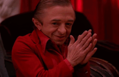
FROM ROUGH TO MODEL
http://www.ideastap.com/Upload/CmsMedia/IdeasMag/ImageUpload/201501/RedNoseInFocus-1a3d3d9e-635560757601016047.jpg

I've always wondered how other MAKERS make! I sometimes struggle to sketch and plan a sculptural piece because I never know what it will look like until it's made. I feel that I need to let the materials choose how they will look and not plan anything too much, or it will seem too staged and artificial.
Sickels's roughs are so similar to his final photographs - very well planned! Even considered the lighting in his roughs. THEY DON'T LOOK ARTIFICIAL. Sickels, as the photographer and designer, is the director. He has to control all variables and make creative decisions in order for the photograph to look the way he intended, so this is a good process for planning the shot. 

Further Reading: http://www.ideastap.com/IdeasMag/the-knowledge/chris-sickels-red-nose-studio-3D-illustration
http://www.howdesign.com/design-creativity/design-inspiration/chris-sickels/

Friday, 30 September 2016

IDEA PICTURES

Idea Pictures - David Lynch
PLUNGING INTO IDEAS WITH THE KING OF ABSURDITY, MR DAVID LYNCH.
His video in today's briefing has got me ready to make and play and be creative.
https://media.tenor.co/images/2800f216044ca7c31975eabc417e0925/raw

Into Task:
Drawing visual metaphors for given words on the screen.
I understood why we were doing it but I felt so awkward and I struggled to get into the task with it being so quick! I couldn't keep up. By the time I had an idea, we'd be onto the next word. I ripped out the page I did do because I wasn't happy with it. I know I should have kept it in there but every time I saw the drawings I got angry with myself.
I think this is partially a result of my situation though. I was feeling particularly anxious and the room was very busy.

GIVING VISUAL METAPHORS ANOTHER GO
I didn't enjoy the Editorial brief in Level 4 and I didn't make friends with the task today. That doesn't mean I can't do it! TRYING AGAIN. Not giving up.
Bronte and I tried to make each other laugh by coming up with silly drawings and combining the words on the screen (e.g. mystery+cow, cue Bronte's hilarious cow wearing a deerstalker hat). Giggles fuel engagement sometimes. A chirpy mind is better at puns and visual metaphors than my regular stressed head.
That said, I was a little manic in studio today and I need to find a balance between feeling distant and being ULTRA INTENSE JAY.

Chat with Ben:
3D is fine for this task (going to be difficult for the print briefs, but this one should be okay), you should go for it! Chris Sickels - editorial sculpture. Andre da Loba - painted cardboard illustrations.