Sunday, 30 October 2016

WHITBY

A project about Edgar Allan Poe? A picture book about everything spooky?
Well, that certainly calls for a research trip to Whitby!


I'm having so much fun with this project. I am loving the Autumnal colours and the atmosphere of October, of dressing in drapey, witchy clothes and of pretending Poe-is-me. I've always appreciated spookiness (insert pictures of my 9th birthday party/my 'pretty little dead girl' dress/my living dead dolls'), but since discovering Poe I just think I've found some resolution to all these weird obsessions I have, because Poe had them too and he made them into chilling, classic tales. I want to creep people out a little too, to make little kids who love that stuff to chuckle evily into this book (FINALLY A KID'S BOOK THAT'S AS WEIRD AS I AM.)


Friday, 28 October 2016

MONO PRINTED RAVENS


Scanned in the monoprinted textures and wanted to have a go at collaging! To save printing paper and ink, I had a fiddle on photoshop first. Working well! Does this still work within the restrictions of printed pictures? It's using ALL printed textures, just scanned, chopped, arranged and then printed digitally.

This one worked best because it's all one tone of black. Monoprint leaves have interesting patterns that work well as feathers. SIMPLER SHAPES? Really want to make him into a gif just to watch him move and hop like a real crow.

Wednesday, 26 October 2016

MONO PRINTING

Since this brief is all about PRINTING, I wanted to get started!
I had a bottle of printing ink in my room, so had a quick makeshift-mono printing session.
Found some feathers and leaves and MADE, MADE, MADE. Serendipity. Letting what happens happen. Collecting textures!

I've never enjoyed printing so much. I made SO MUCH in such a short amount of time. DEFINITELY DOING THIS AGAIN. Going to go out and find more things to print with.

GROUP TUTORIAL

Ben, Alicja, Sophia and Shelly

All doing publications! BEWARE OF CONCERTINAS - lots of technical challenges.
Jamie's going to go through some InDesign processes on Friday. THIS WILL BE USEFUL.

Good idea to target Poe for Children but don't hold yourself back! Be scary. Don't be afraid of terrifying them.
THINK AGAIN ABOUT THE SPECIFIC AGE GROUP - I specifically remember being 9 years old, having a Living Dead Doll birthday party and it being the best thing ever. 8-11 years?
Why do kids enjoy being scared? Research into this...

MONOPRINT TEXTURES. Go and make loads!

Liked the characters, keep drawing them AGAIN AND AGAIN. Have things ready to go into the print room with.

Monday, 24 October 2016

RESPONSIVE STUDY TASK 1

WHAT IS A BRIEF?
A brief is a problem that needs answering. An issue that needs a creative solution.
Briefs are set by professionals, often people who do not work within the creative industry but require creative expertise. Briefs are set by companies and clients, but often written by individuals in the marketing sector, whose job it is to distribute the brief.
WHY DO WE NEED THEM?
We need briefs to establish what the problem is. Clients require briefs to set the task and outline the job they need doing. Creatives require briefs so that they know what is expected of them.
Briefs are sometimes used as a contract, a hard copy of the agreement between the client and creative for the specific task.

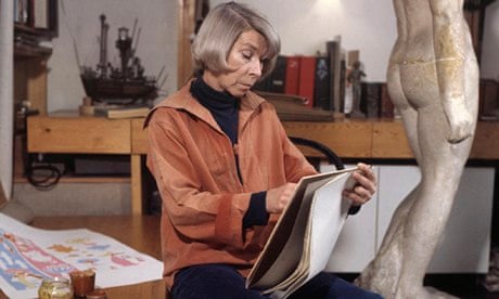
https://i.guim.co.uk/img/static/sys-images/Books/Pix/pictures/2014/1/13/1389627464524/Tove-Jansson-Creator-of-t-009.jpg?w=620&q=55&auto=format&usm=12&fit=max&s=4c2dd82b21a55deacfbcf5f191bc57ef
(Tove reading a brief)

  • To what extent the briefs will allow you to meet your criteria for success within the module.
Entering competitions would meet my ambition to submit my work to real-life clients and answer a live brief, so completing any of the briefs would meet this criteria. 
Striving for success can be damaging and especially dangerous with my ongoing anxiety disorder, but I do like to have a goal to work towards. I prefer the idea of a criteria for doing well, rather than succeeding, because the concept of success suggests that not meeting it is failing.
My definition of success/doing well for Responsive is about conducting myself professionally and making a name for myself in the creative industry: the degree to which I meet this criteria depends on how well I do in competing (e.g. winning a competition would mean I have succeeded in getting noticed and recognised for my work), but ultimately by engaging in the briefs and tackling the challenges set, I will be aiming towards this idea of 'success' and I should be doing well.

I intend to make exciting work in response to live briefs. I want my solutions to be creative and innovative, to stand out from other entries and to be remembered. I think I need to pick briefs that inspire me in order to spark these outcomes. In this regard, the briefs for WRAP and FEDRIGONI are more exciting to me than MSC because I am more passionate about their brands/subjects. I would achieve more in terms of making exciting work by choosing a brief that I find exciting, so WRAP or FEDRIGONI would allow me to meet this criteria for success.

http://media.comicbook.com/2015/09/hensen-152660.jpg
(Henson networking)

  • To what extent the briefs will benefit you with regards to the value of entering competition briefs.
It's important to consider whether the time and effort I will be investing in participating will be worthwhile. Will my practice be extended through this process? Will my portfolio be enriched by this brief? What would I get if I won? 
Entering any competition would give me experience and some degree of networking, since I would be responding a brief set by individuals and the entries are judged by experts. 
All of these briefs are published and awarded by YCN, a renowned establishment whose name would be great to have on my CV.
The prize for winning a YCN brief is:
'winning entrants are published and awarded at a splendid Ceremony each year. All winning work is showcased in the pages of the YCN Student Annual. 15,000 copies of the Annual are distributed across education, and across the creative industries internationally.'
Winning a YCN brief would considerably increase the degree of exposure and networking I might achieve.
Associating my name with the clients and brands: WRAP and FEDRIGONI are both companies that I admire, so it would be brilliant to work for them as clients. Winning a competition with FEDRIGONI or WRAP may lead to further work with them or with other companies who see it.

http://newsimg.bbc.co.uk/media/images/39627000/jpg/_39627149_bagpuss_300.jpg
(Bagpuss winning)


  • Identify any technical or skills challenges that may need addressing.
Don't get involved with things you don't know about/have the skills to conduct. We are often encouraged to break out of our comfort zones on this course and create work that isn't familiar territory to us, but it is always a risk to embark on a brief that requires work beyond your own skillset. I do want to challenge myself because it pushes me to make something different and be surprised by my outcomes, but I will be aware of not biting off more than I can chew.
These briefs are open to professionals and students across different specialisms, each with their own strengths, so I think that playing to my own strengths is vital in submitting my best work.
MSC's brief asks for a resolved video/moving image - COLLABORATING may be the best solution for this brief, since I will require external knowledge beyond my current skills. We have been advised to collaborate in this module, so there is definite potential to work with animation students for this brief, who would be able to provide technical expertise. 

http://www.chrisbeetles.com/sites/default/files/stock-images/IN-THE-VINEYARD-1-k3968.jpg
(Wain's Cats Collaborating)

Part 2 - Based on your response to Part 1, select one of the three briefs that you think will provide an opportunity to fulfil the criteria discussed in the studio session. 

I have chosen to explore the Fedrigoni Brief further: http://www.ycn.org/awards/ycn-student-awards/2015-16-ycn-student-awards/briefs/fedrigoni
This is the brief that excites me most, due to its subject (papers, being a product I purchase and sell in my retail job, so I already have existing knowledge on the subject) and because the 'Imaginative Paper Shop' itself sounds like somewhere I would like to visit/work. I believe in the product and want to learn more about it. I feel the most inspired by this brief, so I think it has the most potential to produce exciting outcomes.


    • What problem(s) are identified by the brief?
Meeting their customers' demands, Fedrigoni have decided to open a new retail outlet in which to sell their papers in single sheets, rather than bulk supplies like that of their bigger warehouse. They are launching a new shop in the London Graphic Centre. 

    • What is the brief asking you to do about it/them?
The Fedrigoni brief asks for competition entries to promote the shop. They are looking for submissions that promote the new retail unit (advertising/marketing).
The brief also asks that the entries involve using paper 'Think about how you can use graphic design and paper to introduce customers to our new retail space.', tying in their product and identity through this media choice.

    • What is the brief trying to achieve?
Fedrigoni ultimately want to promote their new shop and are attempting to do so by asking the submissions to 'put paper to great use to engage with people'. They are trying to achieve an advertisement that engages/inspires customers using paper.

    • Who will benefit?
Fedrigoni would benefit from this brief, hopefully gaining more customers, more clients and more profit. In the grand scheme of things, it will the be owner of the company who gets more money in their pocket, but if the promotion is a success and their is an influx in trade, this will also bring money to the paper/arts industry, to the London Graphic Centre and to the London economy. Fedrigoni are benefiting just by having their brief on the YCN website; accessing lots of young artists and getting their brand recognised by potential customers.

    • What is the message?
The brief suggests that the message is to encourage people to go and visit their store/buy their products - we have a new store, go and have a look/buy our paper. Looking at the Fedrigoni website for further information on what the brand/product stands for, Fedrigoni Paper is affordable luxury. Fedrigoni sell fancy, professional products but their main selling point is that they are worth the money, that their products are great quality.
I also discovered that Fedrigoni support the environment and endeavour to balance the amount of carbon they use in producing paper by giving back to the land (planting trees). This is not stated on the brief as something they want to be communicated, but I do think that it's something that would encourage lots of modern consumers (especially art students/artists) with pscyhographic traits in environmentalism/conservation.


    • Who is the audience?
Printing companies, artists, designers, students, stationers, stationery fans. People who live nearby to the London Graphic Centre/existing customers of the London Graphic Centre. Consumers with disposable income to spend on fancy papers. People who care about quality and desire that extra finesse. Professionals, aspirationals.

    • How will the message be delivered?
The brief doesn't specify the deliverables - whether they want posters, moving image or size dimensions is not specified, only a few suggestions: 'it might include special
prints, booklets, direct mailers'. They do ask, though that the outcome uses paper and uses it creatively. They don't want just a leaflet! My passion for 3-Dimensional work would pull me to develop paper sculptures, possibly paper dolls - this could also be an engaging and exciting element to my outcome as the promotional material could also be interacted with. The posters/mailers that contains details about the new shop could double up as a toy/game, but I would need to make this appealing to my professional, adult audience.
    • Can you foresee any problems in responding to the brief?
Using papers other than theirs - Fedrigoni supply samples of their papers for use in the submissions, but if I ran out I would have to use alternative stock - they have stated that it is acceptable to use other papers in the submission but I would be wary of this being false advertising!
Materials/expenses - if I did have to purchase extra materials, it may end up costing me more than the brief is worth.
I don't know much about photography - potential to collaborate with Photography students.
I don't know much about design/typeface - potential to collaborate with Graphic Design students.
By submitting my work, I run the risk of my work being copied/stolen. Once it is on the internet, uncopyrighted, it could be taken and used by anyone. I need to keep hold of/provide evidence that it belongs to me.


https://mir-s3-cdn-cf.behance.net/project_modules/disp/99a8738743467.560c29f99fd88.jpg

I really love these winning posters! I was searching the internet to see if I could find any of the winners and there are some very clever paper-cut works, but this series in particular made me smile. It looks REAL, it's not trying to look like a drawing or a photograph but PAPER. The artist has achieved a luxurious feel through the connotations of the foods they've chosen, but also through the use of graphic design: black backgrounds suggest sophistication and the composition of the 'foods' is neatly arranged, gourmet paper!
It is successful because it is engaging, it makes you look twice, a double-take. It shows off the products because it uses the Fedrigoni papers and it is creative because it is well-crafted and an unusual approach to selling/promoting paper.

MAKING POSITIVES

LINE DRAWINGS

Thursday, 20 October 2016

Tutorial with Teresa (+ David Roberts Artist Study)

Tutorial with Teresa
Discussed my progress - keeping up with everything. Blog LITTLE and OFTEN (sorry for writing too much/waffling). I'm struggling with a bad cough, BOOK A DOCTOR'S APPOINTMENT!
Work on COP blog. Continue ENGAGING with the tasks.

SPOOKINESS, GOTHIC, LOW KEY PALETTE. The mid-century illustrators I've been looking at use a high-key palette - is it low or high I want to use?

Anxiety got to me and I was very fidgety/teary by the end of the tutorial and I feel really bad for being this way and ruining the tutorial (I didn't say much/didn't feel I was 'there/felt distant') but I do think I am getting better. THIS IS THE FIRST TIME I'VE CRIED AT UNI SINCE STARTING BACK SO I THINK I'M DOING OKAY. NO PANIC ATTACK EITHER! I wobbled a little but I was anticipating that with having a one-to-one tutorial.
Being professional doesn't mean you have to punish yourself for being you/being human. Just try again next time.

http://res.cloudinary.com/artlogic/w_260,c_limit/ws-booktrustfileserver/usr/images/books/main_image/30377/uncle-montague-s-tales-of-terror-jacket.jpg

Teresa suggested I looked at David Roberts. Similar tone to Edward Gorey, but a little more modern and predominantly CHILDREN'S BOOKS.
Some bright and cute children's books but it's his illustrations for TALES OF TERROR that really hooked me because of their dark and macabre tone (similar to Poe/Gorey), but aimed at children. This is how I want to tackle the Printed Pictures brief, in taking dark themes but twisting them into spooky tales for kids.

Roberts has a background in fashion design - evident in his use of pattern, surface and costume. Dramatic, theatrical illustrations achieved through this Burton-esque process of making pictures as though they are stages/scenes.
https://s-media-cache-ak0.pinimg.com/236x/cd/7f/4e/cd7f4ea602fbaa446fc461d2eaaac7a4.jpg

Reminds me of Alicja's work (http://a-golec1518-sp.blogspot.co.uk/2016/01/visual-narratives-final-outcome.html) very gaunt, undead, fashionable characters.
The illustrations in Tales of Terror use JUST BLACK AND WHITE, a monotone pit of ink. I wonder if using JUST ONE MORE COLOUR would ruin the ghostly atmosphere of Roberts's work?

https://s-media-cache-ak0.pinimg.com/originals/12/a6/bb/12a6bb1814f627c36992d11509afabc8.jpg

'Well written, well-paced and accompanied by perfect creepy illustrations, this is a wonderful book for children who like to be spooked!'
http://www.booktrust.org.uk/books/view/30377

EXACTLY WHAT I AM AIMING FOR. 

Wednesday, 19 October 2016

COMPETITION BRIEFS

TASK: Identify 3 briefs just from D&AD + YCN  - why have you chosen these?  Read and comment on philosophies. PRINT FOR THURSDAY.

SELECTION
I looked at both YCN and D&AD's briefs, but none of this year's D&AD briefs really appealed to me; perhaps it's because a lot of them are design-centred, but I just didn't feel attracted to them. I may revisit the D&AD briefs later on and find things I didn't see this time, but for now I've found some from YCN that are more my thing. 
YCN briefs aren't released until Monday 24th, but these are a selection of briefs from last year that I have highlighted as ones I would have considered.

YCN
'Established in 2001, YCN is a curated, creative network. We help creatively minded people and organisations to make relevant new connections, to learn and to do.'
This echoes what the Responsive Module is about and also matches my ambitions in what I want to get out of this module. I want to learn and do, so I need to make relevant connections with a range of creatively minded people.

WRAP
TOPICS: Waste (re-purposing materials and using found objects is a big part of my practice, so this could be a way in which I could promote recycling with WRAP - maybe collaged characters made from card/material scraps).
VALUES: Recycling, the environment - issues that are important to me.
AUDIENCE: Aimed at students, familiar territory.

MARINE STEWARDSHIP COUNCIL
TOPICS: Oceans, fish (very visual topics. Research-driven. Always fun to make fish!)
VALUES: Sustainability, save the oceans (important, yet often overlooked)
The output: moving image, an area I'm increasingly enamoured with - stop motion, model-making.

FEDRIGONI
TOPICS: PAPER, stationery, (working in a stationery shop, products that I know about and am a consumer of)
VALUES: Quality, the hand-made, tactile
The output: Use paper in your solution! I enjoy working with paper and physically MAKING 3D models/illustrations, so the old-school, hands-on tone of this would be well suited to my process.

Tuesday, 18 October 2016

RESPONDING TO RESPONSIVE

This module is all about engagement.
I really want to get as much as I can out of this brief. Be it collaborating, competing or applying, I just want to try and see where it gets me. I need to know that after this module ends, after this COURSE ends, I will be able to grab opportunities like these and do well without the support of the University.
I also think it's important that I start building my name now. Who is Jay Stelling? What has she done? What has she produced? Start to put my work and myself OUT THERE. I HAVE DONE THIS. I HAVE WON THIS. I HAVE WORKED WITH THESE PEOPLE. 
It's not about bragging, but it's about striving to be the best illustrator I can be. I'm a huge perfectionist so I am always thinking that I could do BETTER. I think I'll work quite well on this module because it asks for ambition.

TASK:
Sign up for competitions.

Signed up for D&AD: Check! YCN had a much more complicated website and the section that I was on said that I needed to be 'invited' to join.

Monday, 17 October 2016

PRINTED PICTURES ARTIST STUDY: JP MILLER

 
https://blogger.googleusercontent.com/img/b/R29vZ2xl/AVvXsEibeXyEP9omxKoMOAUAdrqshvhYX0e4-a4Us3A87-d9CPBOosQCAqrSE7F99YbHA2EHwFxcR_tbekwAqCokOE8h1m-3p7QHOHZFKdfA8Vu27jtHQgR0XZbBEVdj6WBTCVkIWLfRA1cFyTI/s1600/hoagycarmichaelssongsforchildren13.png

After working for Disney in the 50's, JP Miller moved onto writing and illustrating children's books. Miller was signed to Little Golden Books, whose publications were sold at 25 cents each.
These little books were produced to budget printing costs and sold in supermarkets.
The books were made to be small enough for little hands, were colourful (as they could be for the cost) and featured simple, fun illustrations designed to keep young minds occupied. They were readily available, mass produced and easily accessible for the everyday family in America. 

https://blogger.googleusercontent.com/img/b/R29vZ2xl/AVvXsEhCLW4DumOLuDIx5gt7NhQyqMYb3xz9OHWEz3EA7L9xvZRWP46ZizfgK2mNaPSiy9vIpi34fae8amcf82w7_reylampMeIQczf4lyOoqdZInW2Pz0FRWU75ty9-PzTotFqRkaCWxZeC1Zu5/s1600/JPMiller15.jpg

Libraries at the time didn't approve of the Little Golden Books because they were too simple - illustrations should be fine art and not 'comics', yet Miller still became a household name, a children's classic. His illustrations are very simple, shape based images. Colours overlay on the screen prints to create depth and a third colour.

https://s-media-cache-ak0.pinimg.com/564x/ed/17/d6/ed17d6327dc8b03db1974ba0845ca360.jpg

Two colour screen prints:
Miller used colour in a very clever way, creating a warm atmosphere to the scene - a cosy, comfortable scene for young, sensitive readers.
He mixes bright colours with grey/brown to tone them down. Here's a really useful, in-depth analysis of his colour use: http://johnkstuff.blogspot.co.uk/2008/11/jp-miller-painter-of-warmth.html

SPOOKY DESIGNS FOR SCREEN PRINT


A couple of quick drawings turned into positives in today's first Software induction for screen print. I've revised how to clean up images, apply colour masks, knock-out and multiply layers. They look pretty spooky! Need to work on my linework, so weak and sketchy. BE BOLD AND STRONG, YOUNG LINES.

Sunday, 16 October 2016

PRINTED PICTURES

Initial Concerns

I'M NOT GREAT AT ANYTHING TECHNICAL. I always find something to mess up in the print room and I just know that I'll do something wrong, get flustered and anxious and then be too ashamed to go back in (ever again).

Also not sure if my work lends to this process?! I don't work with print. This feels a bit alien to me; I've done mono, screen and lino before but I haven't really enjoyed it (I haven't gone back to the process voluntarily)...

TRYING TO GO INTO THIS WITH AN OPEN MIND.
Ben described the process as 'serendipity' (a fabulous word), so I'm trying to channel my inner (somewhere very deep, deep down) serendipity and let whatever happens happen.

http://i.vimeocdn.com/video/487223322_1280x720.jpg

IDEAS

THINKING A PUBLICATION rather than individual prints because I love working with narrative. Individual prints are more for decoration, I prefer to use illustration more for storytelling. Just think a book would give me more scope for that.

Spooky kid's book
along the lines of: Mona the Vampire / Funny Bones / Edgar and Ellen / Emily Strange / Nightmare Before Christmas
Ghosts, monsters, Halloween, graveyards, spooky cute goodness!

http://cdn.hexjam.com/editorial_service/bases/images/000/009/958/xlarge/Screen_Shot_2015-08-07_at_17.46.32.jpg?1438966065

Saturday, 15 October 2016

PRINTED PICTURES: ARTIST STUDY Ella Bailey

Ella Bailey

DIGITAL MADE TO LOOK LIKE PRINT. 
The images look like print because of the textures she applies digitally, making the ink seem as though it has been applied through a screen. The shapes she uses are ideal for printing because they are blocks of solid colour.
Perhaps not actualised in screen print since it isn't cost or time efficient compared to digital for mass production. She uses more than two colours, so would need several positive layers.
Why has she tried to make it look like it has been screen printed? Bailey is heavily influenced by 'retro' illustration (evidenced by her kitsch characters and the elements of 50's/60's interior design in her illustrations), which I think is why she's tried to echo this in her modern take on those pictures.

https://tygertale.files.wordpress.com/2014/10/wpid-photo-201410272342457.jpg?w=650&h=341

Her work exists as publications. She has worked for several publishing companies, including Nobrow, Flying Eye books. Nobrow has a collection of illustrators who produce picture books under their publishing and they are a very successful publishing house. They've brought out some beautiful books, but I can't help but question if they have a house style. There is an undercurrent of trendy, graphic illustrations and although all of them are unique, there does seem to be a signature 'Nobrow look'. Is Bailey conforming to that? Did they give her specifications? 

https://tygertale.files.wordpress.com/2014/10/wpid-photo-201410272342454.jpg?w=650&h=416

Ella Bailey's illustrations appeal to me because they have the three things I always aim for in my own work: character, charm and narrative. Her characters are lively and full of personalities. The ghosts (see first image) each have their own dance move, details that make them believable and identifiable.
Bailey creates charm through her childish imagination, her attention to detail in the scene (socks everywhere! Silly and fun) and her friendly, informal tone of voice.
The illustrations I've included on this blog post come from her book 'No Such Thing'; the theme of this storybook is Halloween, a popular seasonal event that I've never seen written about in a kid's book before, but that children love. This is a similar topic to that of my own intention for this brief.

Friday, 14 October 2016

PRINTED PICTURES: Artist Study Edward Gorey

EDWARD GOREY
https://s-media-cache-ak0.pinimg.com/564x/ea/0d/13/ea0d1312b81f1ba97f6f22ecb0e44cec.jpg

Printed Pictures. Looking at artists who use printing processes to make illustrations with a similar tone of voice or subject.
Edward Gorey's work belongs to the same twisted land as Poe's. Although Gorey worked decades after Poe, his illustrations were retrospective and reminiscent of Edwardian/Victorian/American Romanticism. His Gothic imagery discusses similar themes of death, the afterlife and spirits; his dark, macabre tone echoes Poe's melancholy tales.
I find Gorey's illustrations spooky and surreal, the same kind of atmospheric mood that I'm intending to portray within my Poe images.

Publications
combining his dark illustrations with humour and wit. Enigmatic, horrific tone of voice. Controversial audience: for children or not?! Sensitivity, censorship.

Gorey's process consisted of etching
Scratchy, rough and sharp images
monotone

EDITORIAL MEGA CRIT

I have completed my final set of three editorial illustrations! I'm not sure how much they channel POE, but they do tap into his themes and his gothic romanticism genre.


Low-Key Colours have created a dark, eerie atmosphere.
Lost the face of the moon - there was too much going on! Didn't seem as busy in the roughs but I think that's because there's a lot more information picked up in the photo (leaves, stones, cardboard) than in the drawing (the spaces where the scene exists was planned as blank space). So I ended up using a full moon without a face. I've lost a lot of the message in this image (it was originally Poe's woman in the moon visual metaphor), but I prefer it without. Sometimes simple is best.


Worried that this one didn't really suit the rest of the set. In order for the girl to be seen in print, I had to make the blues lighter than the other two prints. This has made the tone a little lighter. Is it too cute? Not spooky enough?


This is the one image that I didn't really change much after the last peer review. My peers thought it was ready and I thought the image was everything I was aiming for so I left this one be.
Much less photoshopped than the other two images -  to a certain extent, I wish I'd left those alone too because they have been over-edited and fiddled with... THIS ONE IS RAW.


Came in this morning to print and Josh said my images 'belong on the set of a Tim Burton movie' which made my day!
PHYSICAL PRINTS
they would have looked a lot better if I'd had them printed professionally. A nice matte paper? Funky stock? Bronte booked in to print hers downstairs and they looked MIGHTYFINE. This brief didn't require us to invest in swish prints but it's always worth putting a little extra effort into presenation and production.

2 COLOURS
Ben commented that several prints in the room weren't actually 2 colour! This was a result of over-photoshopping and I'm not sure if mine count as two colours or more!

CRIT FEEDBACK

Effectiveness of the Concepts/Messages
Communicate tone and feeling rather than a specific message
I think I might have got a bit sidetracked by the FEELING. Similarly to Visual Narratives last year, I moved away from the message and focused on creating atmosphere. I'm happy with the atmosphere, it's very Emily Strange/Mona the Vampire - charming spook - but I am starting to wonder if I've been forgetting about the task at hand AGAIN. The only issue with PASSION is getting TOO MUCH INTO the work. I think I got lost in those spooky trees and forgot to say anything about the subject.
moody and eerie, dark and mysterious, intriguing - drawn in to the world
they feel like snippets of a scene


Visual Language and Tone of Voice
Brilliant character and storytelling
atmospheric and interesting
like a storybook - makes me want to read it
tones of blue create a dark, moody atmosphere
love the mix of 2D and 3D
3D illustration is your thing!
Magical atmosphere, great use of puppetry
3D works well for the compositions

Visual Quality:
Photos have depth, high level of craft
Amazing detail and amount of work put in
so much effort and skill in the craft of these, but LOVED your 2D illustrations! Wish you had developed them further. You're obviously so good at 3D but would have liked to see something a bit different to your normal stuff
IS THIS NORMAL? Am I sticking to ONE THING? This is the only comment that sort of got me a bit this week. It's not negative, but I can't help but take it as a bit of an 'I told you so'... I didn't listen to the advice I was given. Did I do the wrong thing? 
Magical! Loads of detail. Level of craft is amazing
how did you make these in 7 days??
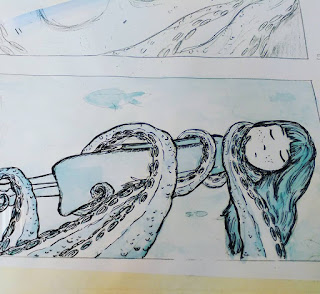
Really pleased that my hard work shows. I have put in a lot of effort (I made those tentacles over and over again until they were how I wanted)
Enchanting. You've used your 3D skills in a  great way to compliment some 2D images - lovely depth!

Constructive feedback

OTHER WORK I LIKED:
Loads of work in the room! I'm proud of us, we've produced so much in such a short space of time.
Dana's feminine and surreal Leonora Carrington prints.
Galuh's humorous and silly collages - loads of outcomes, quickly produced. She obviously enjoyed the process of MAKING.

Tuesday, 11 October 2016

Peer Tutorial

I didn't redraw for this tutorial because I knew I wouldn't have much time for the making (TWO DAYS TO MAKE!), so I kept the chosen six drawings but also brought along snippets of the photo tests I'd done so far.
Group: Kayleigh, Sophia, Owen, Steven, Isaac


MY GROUP HAD SO MUCH WORK! We all had a lot to say and everyone contributed to the discussion. This is probably one of the best peer tutorials I've had; we were all in the right mindset to show and tell.

THINGS TO TAKE AWAY:
All had different authors, so very different work.
Sophia's process - innovative

Feedback:
VERY POE even though it's using children's language
Liked the bird one - keep it as it is!
Done a lot of work already so just SHOW IT OFF. Make it look good. Don't remake things!
They don't all need to be the SAME two colours. Could mix and match?


NEXT STEPS:
TIMETABLE. PLAN THE WEEK AHEAD.
Take better photos
Refine
Backgrounds?
Print and Present!

Sunday, 9 October 2016

MAKING


PROCESS
cardboard houses - wasn't sure if they needed painting or not since I was taking the photos in black and white to apply the colour restrictions after?
Good to work from a rough - like a script to go by

IMPROVEMENTS
Make it to size
make a better moon
consider the framing and composition - how big, how far,
make gravestones
set up the scene better - make a hill

NEXT STEPS
COLOUR
CRAFTING
PRINTING

Friday, 7 October 2016

18 ROUGHS MEGA CRIT

MEGA CRIT


Going in: feeling positive! I've finished the 18 roughs for the critique and I feel happy with them. They have the tone that I wanted to emulate: a spooky vibe and a mysterious setting. More refined than the initial 60 thumbnails because I have had time to develop both the selected concepts and to figure out the compositions. Started to consider colour and media.

A BIG THANKS TO CHRIS SICKELS for proving that ROUGHING 3D illustration is POSSIBLE and USEFUL. Seeing his roughs next to his finished 'makes' has shown me that HE USES ROUGHS TO PLAN, COMPOSE AND DIRECT the scene.


Feedback:
Concept:
Spooky, dreamy, charming, peaceful, have lots of emotion.
tentacles tell a story - trapping

Visual:
TENTACLES!
Like the blue - blue is dreamy and yellow reflects nighttime
Big spooky eyes
Composition - draws you in, almost golden ratio, dreamy, good use of space
range of angles and viewpoints - line of sight
simplicity and characterisation

They really liked my drawings! I'm a little surprised. I think they're okay, I enjoyed drawing the tentacles but I didn't think people would really admire them like this. They're just my roughs! They're a blueprint of what is to come...

My Question:
I want to make them as sets/models - am I wasting time?
Short brief, save it for a longer one
prefer the illustrations
something nice about the 2D drawings
develop drawings instead
compromise - layering flat illustrations in sections? Relief?


GOING FORWARDS:
Tallied up the most popular (highly voted in the feedback) roughs.

I'M IGNORING THE SUGGESTION TO STAY WITH DRAWING. I know I won't be able to go 3D for the next Studio Brief and I don't want to miss this chance. I am willing to compromise slightly, using cardboard or some flat illustration and relief, but I am always wary that a drawing is always a drawing. I don't think drawing is my strongest power.
Though I am a bit torn since my peers seemed to like my drawings! WHY? WHAT? I just don't see any magic in them. They're lines on paper. I drew them as a plan. They're not the REAL THING.


PLAN FOR THE REST OF THE DAY:
GRAB CARDBOARD
AND MAKE, MAKE, MAKE!

CARDBOARD MAKER


I wanted to get making right away,  so scavenged the only material I could get my hands on abundance of: cardboard.
Three whole boxes were left abandoned next to the bins in college, so I took them and a tube of UHU into my studio space and just started to translate my 2D illustrations into reliefs.

Not the sculpted forms that I wanted to make (a feathered, textile bird, a wooden house, clay moon) but this was a quicker way of producing props/models.

It also solved my problem of being torn between 3D and my 2D drawings. Since getting all that feedback on my roughs with people telling me to carry on drawing, I wanted to feed a bit more of a drawing practice into the model making (e.g. line, shape, character), which I attempted through the rough cardboard chopping and sticking paper eyes to the Raven.

Since I'll only be working in 2 colours you also won't be able to see the brown of the cardboard so there's no point wasting time with painting the props.


I AM REALLY HAPPY WITH THIS BIRDCAGE! Made using a metal bottlecap and wire - SO EASY. It's messy and rough but I think that works. My mum described it as 'daintily jagged'. I do love an oxymoron!


Sunday, 2 October 2016

STUDY TASK 2: ANDRE DA LOBA

Andre da Loba is not an artist I've heard of before. I was attracted to his quick, child-like 3D illustration in the form of cardboard cut-outs painted in acrylics.
http://beautifuldecay.com/wp-content/uploads/2011/12/andre002.jpg

They're so silly and crude that they're funny. It's this naive, frank approach to 3D illustration that makes his work memorable and striking. When I discuss playfulness, THIS IS IT. This is having FUN with art. Andre da Loba obviously wasn't aiming for perfect brush strokes and precise lines with this piece, he was just letting loose and it works.
The hand of the maker is evident in his illustration, since it is his hands that chopped the cardboard, splodged the paint and glued it all into a hodge-podge mess of happiness. If the lines were perfect and the paint was smoothly applied, it wouldn't have the same degree of wonky, fast-paced busy-ness.

http://www.andredaloba.com/wp-content/uploads/2012/09/Land-of-Decoration.jpg

I found it hard to believe that da Loba's work has been published in highbrow editorial contexts. I really like what he does, I just can't imagine other people enjoying it in that context! I suppose it adds a lot of fun and humour to dull articles, much more than what a drawing could bring.

http://www.andredaloba.com/wp-content/uploads/2012/09/I-Five.jpg

He draws and screen prints too. The image above is a laser-cut shape that has been screen printed. I much prefer his hand-chopped art because it's more of HIS input than a computers. It's all his craft and it's original. Anyone could have made this sculpture and I wouldn't be able to tell. It's nice, just not what I now recognise as Andre da Loba's handiwork.

http://www.andredaloba.com/wp-content/uploads/2012/09/C_023.jpg

STUDY TASK 2: CHRIS SICKELS - Editorial

I've been following Chris Sickels (Red Nose Studio) for a couple of years now, but I didn't realise that he has worked in EDITORIAL illustration. I didn't think his work COULD BE editorial.

He is an illustrator but illustrates using sculptures, puppets and tiny hand-made props. When Ben told  me that Sickels's work has been published in 'The New Yorker' I felt so much better about this brief because I realised that physical illustration can be printed and showcased in this format too. Not your typical editorial illustration, but it can be found in this context. Magazines and newspapers have comissioned Chris Sickels to do it. They've paid money and CHOSEN this kind of 3D illustration over more traditional, pencil-on-paper methods.
Nothing is stopping me.

http://www.ideastap.com/ImageHandler.ashx?FileName=/Upload/CmsMedia/IdeasMag/ImageUpload/201501/RedNose1-8ad12e4d-635560756064708351.jpg&Width=540&Height=306&ImageMod=Crop&OutputFormat=HighQualityJpeg&CacheEnabled=True

The image above screamed out the answer to one query I had about printing: Can photos be printed in two colours? OF COURSE. Sickels has achieved a two-colour print by taking the photo in black and white before applying a blue colour overlay, turning all the image into values of the same colour.
I could easily use this same technique to turn my photos into two-colour prints.

'I build little 3D worlds and take photos of said scenes to have them reproduced on a page to grab a viewers attention for about three seconds and hopefully, lead them to read the story, article or investigate a package.'
Sickels crafts everything in the image: painting backdrops, making props, sculpting the figures and hand-drawing over the image - all in order to communicate something to the intended audience.
These images document and help to explain topics as analogies; the viewers see a little scenario that they can relate to or respond to.

FROM ROUGH TO MODEL
http://www.ideastap.com/Upload/CmsMedia/IdeasMag/ImageUpload/201501/RedNoseInFocus-1a3d3d9e-635560757601016047.jpg

I've always wondered how other MAKERS make! I sometimes struggle to sketch and plan a sculptural piece because I never know what it will look like until it's made. I feel that I need to let the materials choose how they will look and not plan anything too much, or it will seem too staged and artificial.
Sickels's roughs are so similar to his final photographs - very well planned! Even considered the lighting in his roughs. THEY DON'T LOOK ARTIFICIAL. Sickels, as the photographer and designer, is the director. He has to control all variables and make creative decisions in order for the photograph to look the way he intended, so this is a good process for planning the shot. 

Further Reading: http://www.ideastap.com/IdeasMag/the-knowledge/chris-sickels-red-nose-studio-3D-illustration
http://www.howdesign.com/design-creativity/design-inspiration/chris-sickels/