Wednesday, 13 April 2016

Other Tributes to Henson

Other people have used illustration to celebrate Jim's life and career:

http://33.media.tumblr.com/tumblr_lvjkn7cD6r1qzh8oz.png

A digital illustration that really tickles me! Kermit puppeteering Jim! Love it! The digital aesthetic, as I've probably groaned on about a million times, ain't for me, but I really like this concept. Humorous tone, not like my approach in that respect because this artist is looking at the COMICAL tone of Henson and I think they're successfully communicating that in this.


http://www.puppet.org/museum/pix/img_jimhenson-big.jpg

SOMEONE MADE JIM INTO A MUPPET! Very simple idea, the first thing I thought of for this brief, but this is executed really well... it's obviously JIM and it also LOOKS LIKE A MUPPET

http://images.mentalfloss.com/sites/default/files/styles/insert_main_wide_image/public/creation_0.jpg

HAHHAHAHAHAAHA YEEEEES. Humorous approach to Jim's legacy. Using Jim's familiar characters is a great way to broaden the reach of the illustration - most people would 'get' this, because they recognise the Muppets, even if they don't recognise Jim's face.

THE RESURRECTION

PLAN
FIX BIG PUPPET
People seemed to like the big puppet but it fell apart a little when I tried to add a jaw. 
BUT since people are responding well to this one, I have decided to resurrect her!
SOLVED: Not permanently fixed, but a temporary revive for this lil' gal. 

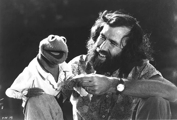
Aim: take a groovy photo of me and the Gelfling mirroring each other. Like the below photo of Jim and Kermit - a relationship/bond between puppeteer and puppet.

https://s-media-cache-ak0.pinimg.com/236x/11/eb/7a/11eb7ac2f94e20e99e10e614d48cfb21.jpg


http://vignette2.wikia.nocookie.net/muppet/images/9/93/Jimkermittmm.jpg/revision/latest?cb=20060202064627

Took some photos of me with her - puppet and puppeteer - really wanted some photos out in the garden to match the rest of the series.., maybe us looking at each other on a bench, but it was raining so I made do with a quick snap of us inside.

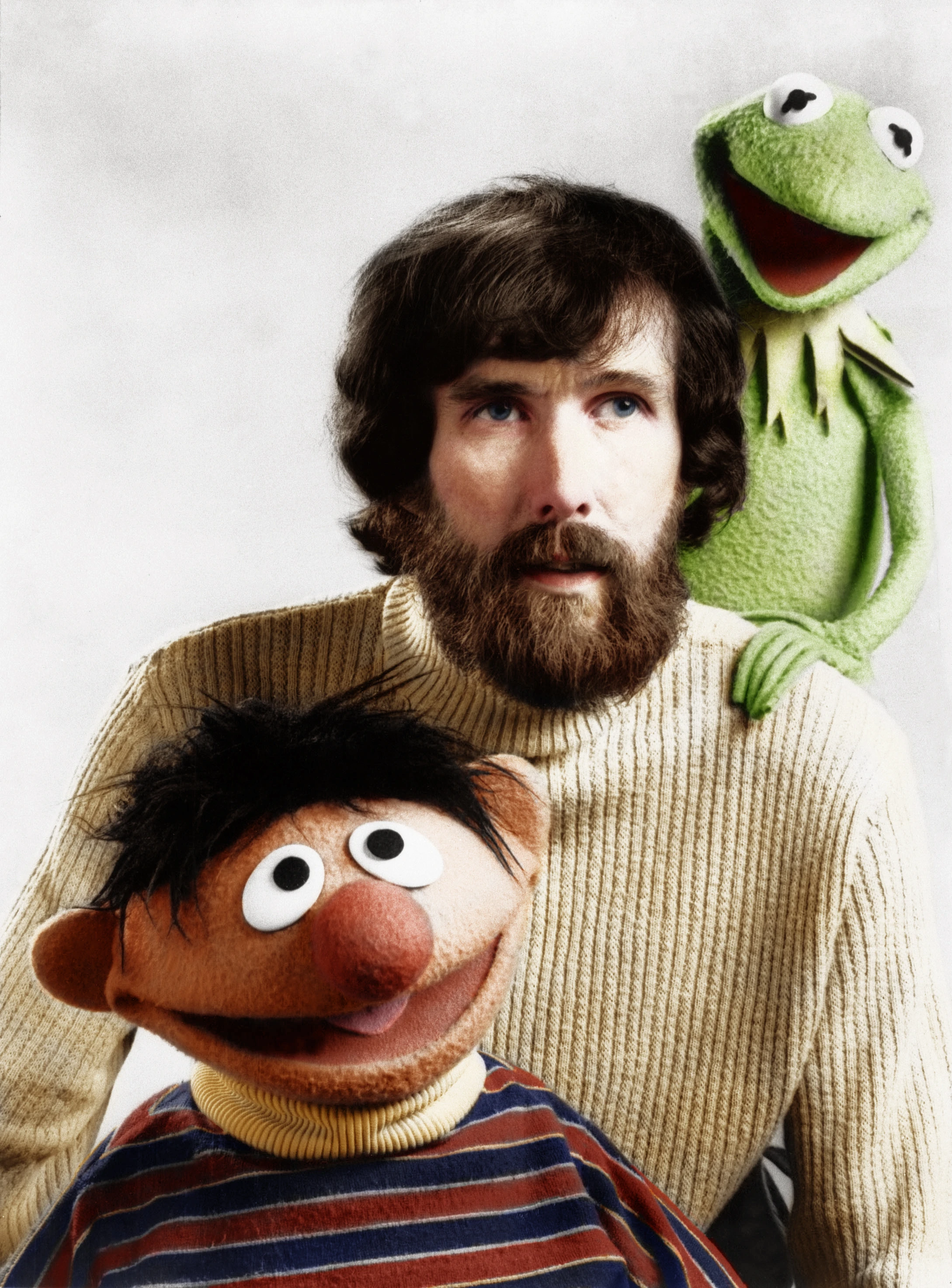
http://vignette1.wikia.nocookie.net/epicrapbattlesofhistory/images/f/fc/Jim_Henson_Based_On.jpg/revision/latest?cb=20150824015640

HOW COOL WOULD IT BE FOR ME TO LAY MY OWN BEARD AND DRESS UP AS JIM AND TAKE A SHOT LIKE THAT! Alas, really running out of time before my print slot so I had to make a speedy decision with this and at first I hated it! I look so awkward and the doll has green hair - just looks weird!!!!

https://s-media-cache-ak0.pinimg.com/736x/91/fc/21/91fc218a0b03ec0e0564a9d38c75c097.jpg

BRAINWAVE : what about a black and white filter? It might make the poster stick out like a sore thumb next to the rest of the set, BUT it would tone down the green hair, it would make it look like she was a mirror of me - 'frankly, I'm much more comfortable when I'm wearing a puppet' would make so much more sense if she's a puppet version of myself - AND it would link to Jim's earlier work in black and white. His first broadcasts. His classic projects.
It's also BREAKING THE MAGIC SPELL. Behind the scenes, the black and white of Jim's career rather than the technicolour finished products.
Adds authenticity to the poster.


Hmm. Yes. Like it much more in black and white but still not sure whether people will GET that it's Jim! That this is all about HIM.


http://www.henson.com/jimsredbook/wp-content/uploads/2011/11/JH_01_81_rb.jpg


http://cdn.ebaumsworld.com/mediaFiles/picture/2315435/83588136.jpg

THINGS JIM SAID

  • When I hear the art of puppetry discussed, I often feel frustrated in that it's one of those pure things that somehow becomes much less interesting when it is overdiscussed or analyzed.
  • One of the nice things about puppets is that it's your own hand in there. You can make it do anything you want it to.
    • Jim Henson, p. 51
  • There must be a lot of shy actor in puppeteering. His work is the puppeteer's statement. It's his outlet. If I had to face the audience myself, as Jim Henson, I'm sure I'd be just a bit shy. But when it's your puppets that face the audience, it's different. That I can do very easily.
  • People shouldn't come expecting to see the Muppets because they are not here. This is something else.
  • With puppets, I don't think you should try to duplicate what humans do. It can cause problems.
  • Puppetry's a lot harder than people realize, and it's particularly difficult doing a movie. You have this scene with all these puppets, and when something goes wrong, you've got to set the whole thing up to do it again. With people, you ask an actor to walk across the room a second or third time, and he does it. That's it.
  • Puppets have the same sort of graceful aging that cartoon characters have.

Tuesday, 12 April 2016

POSTERS


Fiddling about with adding line drawings over the top of the photographs. Almost works... maybe if I draw them on a wacom tablet so that they are perfect white lines it might look better.

I don't think it adds much to the image though. It makes it more Dark Crystal-esque (more Brian Froud style) but it doesn't say anything more about Jim and I think it just confuses the image as there is too much going on! Distracting from the puppets.

Having a go at putting type on too but I'm really not a graphic designer so I don't know whether this works at all! It scares me that there are so many variables as to which font to use, how big to make the size and where to place it. The font I used for 'DANGERS' on the top right image suits the tone of the dark fantasy of the dark crystal but doesn't go with my puppet vision.
I can't escape a 70's groovy tone in my creations ahah. This is me trying to channel '84 dark fantasy and I still get a hunkydory Ragtime vibe ooop.


Postcards


Should I add quotes? Where should they go? What fonts should I use?
I hate trying to decide on Photoshop… there are infinite possibilities!


Monday, 11 April 2016

RED NOSE STUDIO

Looking for other artists who make funky 3-DIMENSIONAL ILLUSTRATIONS. Things that have the potential to move and that are made as PHYSICAL models but that also exist as FLAT, printed media. What transforms them into illustrations?

RED NOSE STUDIO - CHRIS SICKELS

Describes his work as 'sculptural and 3D illustration'.
He makes scenes that tell stories - a single frame that has a BIGGER PICTURE. So much work goes into these images - into making each element, placing them and photographing them. There are infinite possibilities for how the picture could look, depending on where each piece is placed, the lighting of the photograph... I wonder whether Sickels roughs out a plan of not just what the characters will look like, but of the composition of the page as an illustration, too.


https://s-media-cache-ak0.pinimg.com/564x/dc/f9/c1/dcf9c13beac9971aa8c935695662351f.jpg

This model of Edgar Alan Poe interested me because he has solved the problem that I have been tackling. He's made a 3-Dimensional model in response to a classic legend.
It's not a traditional PORTRAIT - it's a recreation, a re-imagining, a miniature scale figure.
It's identifiable as Poe, but it has this otherworldliness to it, as though he has been through a weird Coraline-esque vortex that has changed him.  YOU'VE CHANGED, MAN!  It's obviously Sickels's work in style and form, but it's also obviously inspired by Poe himself.

Feeling like I should have made a lil' Jim! It just seemed too obvious...
I wish I had seen Red Nose Studio's work before I'd got so far into the project!
It's giving me confidence that what I do CAN be illustration.

https://s-media-cache-ak0.pinimg.com/564x/13/d9/f8/13d9f878a305bff0e1a319183da0764b.jpg

In this example, it's the type that brings the still frame into a graphic image. If I choose to make my posters and postcards into promotional material for the short film I made, this could be a simple way of contextualising it. Adding a masthead and details about the production in an overlay of type.

http://www.magnetreps.com/wp/wp-content/uploads/2013/04/RedNoseStudio_PolarBear.jpg

Traditional illustration - drawing/ink combined with the model-making process. So clever! I could play about on Photoshop to combine layers of scanned drawings and photos of my models.
I wouldn't have expected the two to work so well together, but the way that this artist has carefully cut around the model to collage it on top of the drawing is neat and seamless. Although the two media have a very different aesthetic style, it doesn't make the illustration look odd or out of place, it actually creates even more interest within the frame.
I'd liken this to the photographs of Jim Henson with his hand in a puppet - for some parents, this 'spoils the magic', but for others it just makes the art form even more enchanting - getting a glimpse into how these little things are made and where they begin as sketches.

https://s-media-cache-ak0.pinimg.com/736x/c9/de/01/c9de0143af4efa6e7ff42192d6ec4c83.jpg

The intricacy of his sets is breathtaking and gives the viewer so much to look at. There's textures, shadows, colours, forms, foreground, mid-ground, background. There's depth where objects overlap. There's the whole construction of a miniature world. Physical effort, making the houses stand up alone. Posing the model. Sculpting, placing, building, crafting, PLAYING.

For me, that's a lot more than a drawing can ever offer. Even if you spend 10,000 hours on a drawing, it's still only used one hand and a chunk of brainspace. Making a scene involves the whole body and both sides of the brainnoodles.

STAMPS