Friday, 31 March 2017

ART DOLL QUARTERLY COMPLIMENTARY COPY

I wasn't expecting to receive my complimentary copy of Art Doll Quarterly until after May 1st (that's when they hit newsstands, plus it's an American publication so it would take a while to get here), BUT IT ARRIVED TODAY! I'm so pleased because it means I can put it on here before the 503 submission and I'm just so proud of it. MY DOLLS PUBLISHED IN AN ACTUAL MAGAZINE.

I'm so proud and impressed and pleased and I'm positively beaming, dancing around the house with my copy. I'm going to have to visit any of the UK stockists I can find, just so I can stand next to it and cry at it being my dolls in a real magazine. I don't know for sure how many stockists they have here (I MISS BORDERS BOOKSHOP), but Art from the Heart in Harrogate definitely stock it.


It's so sweet of them to send it to me, I was worried that maybe I wouldn't get published just because they wouldn't want to send it all the way to the UK when they get plenty submissions from the US alone...  but they did still publish my work and they sent it to me free of charge. There were also submissions from Greece and Germany published.

I'm looking at the photos I submitted though, and I'm seeing so many flaws. Things I would have changed and how the photos could have been much sharper. I think this is definitely something I need to work on and it could really benefit my practice if I learned how to take super-sharp high quality photos, for both print and screen. Hopefully I can learn for next time and keep submitting to ADQ, I hope to keep this relationship going with ADQ and that this is only the first of my entries!


I don't know how they pick the doll artists to profile as the main feature each time... I don't know if people apply to be featured or whether the magazine contacts the artist they would like to feature? It would be useful to know more about their process. Each magazine retails at £14.99 so they must make quite a bit of money from it, but it's a huge magazine (144 pages). I may email them and ask some questions, not only as a contributor but as someone who would love to work in creating a publication like this (PPP research!).
How many readers do they have? (reach and audience - what is their actual audience demographic)


I'm glad I sent the editor a big long response to her questions. Some of the other features are much smaller with just a few sentences explaining their entry, but since I sent a few paragraphs, they've all been published next to the photos of my dolls. They even put in brackets (cotton candy) after I said candyfloss so that the American audience would understand. 

This is my first properly published work and I'm over the moon. I feel like a professional and this had made my decision to submit to more unusual briefs pay off. It was worth it and I know my work fits in this context. Happy Jay is happy!


Thursday, 30 March 2017

Fairyopolis

I was trying to work out what made this Fairyopolis book so special and to capture that same kind of wonder in my Emily of New Moon book.
I had a few of these sort of books when I was about 10 (Pirateology, Dragonology, Wizardology) and they were pretty special. The kind of books you keep nice on your bookshelf and every time you look at them you find something you didn't see the first time around. They're novelty books but dressed up in hard back with 'gems' on the cover, so they also fit into the gift book market.
I want my book to be less novelty, but definitely a gift product.
I know I kept all of the tiny letters and clippings safely in the pockets of these books, they're not the sort of books you just throw away. Templar's ology books were a collectable series so as soon as I knew there was another one in WHSmiths, it would go onto my Christmas list.
The books are filled with ephemera and pockets. Children read them and think they're reading genuine facts and secrets that others don't know.
This is the reading experience I want to create in EONM, so consumers would buy the special edition gift book, open it and find answers, questions, letters and secrets that all belonged to LMM.

Cilcely Mary Barker's world is pressed into the pages of Fairyopolis. It's a very personal approach and
Fairyopolis is presented in a facsimile scrapbook format.
gift book
ephemera
scrapbook of wonders
a book to treasure

DESIGN BOARD FEEDBACK


I thought I was almost done with my design boards but this mega crit has changed that... There's a lot I need to sort out and that means going right back to the first board and starting again.

It was useful to see how other people had approached design boards and to see what works well. It's a different sort of looking to see it on the screen and then see it printed at actual size, i.e. seeing it at A2 size has made me realise how huge my font is and that I can reduce it right down!
I've put too much blurb on too, the purpose of the design board is to SELL the product, not explain my process.

I can see the value in design boards - they are professional and essential for pitching ideas and submitting work, I think it is vital that I learn how to do them properly but I really wish I'd had a little more practise before having to submit them to these competitions. Seeing how they SHOULD be done is making me worry that the ones I sent to YCN and the ones we sent for D&AD weren't up to scratch and might have brought our submissions down.

Tuesday, 28 March 2017

BRING BACK THE BLOG

I've not been blogging as often or honestly as I'd like to, so a lot of my thoughts have been bubbling, growling, stewing. I need my blog to let these things out, to give myself time to make rational decisions and then file them away neatly. Out of the cluttered mind, bottled thoughts.

It feels so good to sit down and talk about things on here and I have missed it so much. I've been so focused on the outcomes that I've not given myself the time to reflect properly. I know how important blogging has been for me (i.e. last year I blogged a lot and it really informed my work), I know that I need it to sort myself out, but I get up, go to uni, make the work, come home and finish personal doll orders then sleep. There's not enough time in the day, even though a blog post can take just 10 minutes. Any chance I get, I find something that seems more 'important'. I haven't been able to justify that time with my anxiety. I'm fighting a losing battle here and this is the first time I've managed to punch in a proper blog post in a while but I'm not going to budge until I'm back on top of this.

Mega Crit


Coming into the crit...
The printer in our studio printed the colours way darker than they were on screen and in the prints I did at home, so I have three photos in the intended colours and three photos in a much darker, too high contrast print. Anxious that this might make my work look bad or that my peers might think I don't know that the contrast is way too high - hoping I don't get feedback telling me this because I know already and that's not how they're going to look. Should have prepared a little better and printed them all on the same printer.

Responses
Positives...
My peers seemed to really like the scrapbook concept (research-based) and the scrapbook aesthetic (collage).
They also really liked the drawings I've been doing, which I wasn't feeling that happy with. They like BOTH THE SCRAPBOOK AND THE DRAWINGS - so what do I do? Which should I choose? Maybe I could mix them together a bit more but will it just look random and indecisive?

To work on...
Don't cut images off the edge.
Use sticky pads to bring depth and levels to the scrapbook page - some things will be lifted higher and others not as far forwards.
More shadow.

What I saw
In our studio...
People mocking up already! Am I behind? Lots of digital work - quick way of making work, especially when we have so many other demanding modules at the moment.
Lots of screen printing - people really enjoyed that in 504 and I didn't, makes me worry that I'm not being as experimental as other people or being as ambitious with processes.

In the Level 6 Studio
Tyler Robson's HUGE amount of sketchbook work! So many pages and pages of drawing - really impressive amount of character sketches. I saw Tyler in the studio (I've never spoken to him before but we follow each other on Instagram) and told him how impressed I was by his work. Made a connection, made a friend!

Monday, 27 March 2017

Collage Testing

It works! They look like pages of a scrapbook, but need more paper stock, materials, drawings and ephemera. Measure the ACTUAL printed size. Consider placement and layout - don't squish things too much! Don't crop things off the page.

Wednesday, 22 March 2017

MOVING PARTS COMPETITION

SECOND PLACE! 

I just got an email from Moving Parts Festival to say that I got second place in their stop-motion animation competition, yay! I felt that my video was really rushed and that it would have been better had I kept to the story and not messed around with cinematography effects so much, but it is pleasing to see that it has been awarded second place by a PUPPET festival. Getting into the area of making I want to be involved in and hopefully will make some contacts this way.
I'm really intrigued to see what the 'overwhelming number of entrants' produced, especially to see who came first.
I was worried that entering smaller, independent competitions like this might not be the best idea, that I should be focusing on the larger ILLUSTRATION competitions, but this has paid off and has given me the opportunity to work to my interests.

Tuesday, 21 March 2017

DESIGN BOARDS NATIONAL AUTISTIC SOCIETY

I volunteered to put together the design boards for D&AD submission because I knew that Molly still had to finish her video and otherJay has a lot to do in his other modules. I summarised our project, intentions and campaign idea but I wrote way too much and the slides were just really bland and boring. Too wordy and not digestible.
I asked Molly and other J to take a look and add/change anything today and we got it sorted: coloured backgrounds and bullet-pointed lists. I'm glad it's ready to go! None of us are graphic designers and we didn't spend huge amounts of time on these design boards but they do the job of pitching our project and they are ready for submission.
We could have started working on the design boards earlier in the process or made a video explanation to better suit our project, but within the time frame I think we made a professional and effective attempt at design boards.

Peer Review 505

Peer Review with Steven, James, Penny and Kate. The groups have been switched around so that we're not working with the same teams as last time, which I think is a great idea. It means we'll get fresh thoughts and ideas but it does mean re-explaining proposals and starting right from the beginning. These folks might not know what was discussed a the last point of contact, they might not know what has already been suggested or whether I have done what was asked after last time. 
However, I think it's vital to get different opinions, different perspectives and also just SEE how other people are approaching their projects. I learn through reflecting on not just my own experiences, but also through seeing my peers/other practitioners wrestling with their projects; they might be having the same issues I'm having, or working with a similar medium and there is so much we can learn from each other.
I think I'm finally letting go of that gripping fear that people are going to 'steal' my ideas (narcissistic, I know) and just trusting people and sharing thoughts for all of our benefit. Help a brother out.


With the INTERIM CRIT approaching, this peer review was pivotal in assessing where we are up to and what needs to be done. Next week will be the final crit before Easter break so we need to make sure that we are prepared for it, ready to get the feedback and help we need before we go out into the wild for four weeks.
I came into the crit knowing exactly what I'm doing with my project. Feeling very positive about it, still loving the concept, just a little bit lacking in content because of all the other modules that are pressing right now. I wanted to ask my peers whether I was going in the right direction, what they thought I should be focusing on and just generally asking them if they like it. 

Steven
Steven's project is about Asian folklore and myths - way cool - and he seems to be really enjoying it. He's done a lot of research and reading into his stories which is great and fuelling his knowledge/confidence in the topic. The 6 illustrations about these legends will be applied to book covers. He's done loads of character development and roughing in his journal (Steven is great at this and can fill sketchbooks very quickly). He wasn't sure what he needed to do for next week so we helped him pick the roughs he should take forward and I suggested that he bring them out of his sketchbook (like he has started to) and draw them larger so he can spread them out on the table for peers to clearly see what he's moving forward with.

James
James has made a full comic strip about Death. Really emotional and he's put lots of work into this, writing the whole thing himself. A risky game since we aren't getting marked on narrative, but this is what James enjoys and he hasn't spent too much time on that. He knows that the emphasis should now be on the images and he is working on that. I asked where he would apply the comic and he said he wanted it to be a webcomic, Penny suggested making some gifs or short videos, I suggested a simple animatic and we then went on to discuss applications for comic fairs, such as banners and a stall that James could mock-up digitally.

Penny
Penny's project is an old story about the Devil going on holiday to Wales. She's making this into a children's picture book and it's really sweet. Penny is from Wales and she's packed her Welsh drawings with charm and humour. Her devil actually reminded me of Paul Klee's Devil hand puppet, which I told her to go and have a look at. A personal project and one that is definitely relevant to her. She's got the characters nailed but it struggling a little with the backgrounds, to which some ideas were thrown around regarding block colours, simple landscapes and reference photos of Wales.
In terms of application, Penny is thinking about the context of her children's book, of how it could be sold to both English and Welsh children. She wants to make the text bilingual and will be considering point of sale for both markets.

Kate
Kate is doing editorial illustration and tackling the subject of artificial intelligence. This sparked a big discussion on our table as we conspired and worried about the threat of robots stealing our jobs/wives. She's got lots of ideas and has made some great illustrations that could be used, she now needs to narrow down her roughs to just six and think about how else they could be applied.

For next week I need to:
Start making some of the scrap book elements (e.g. post cards, letters, stamps and found papers)


Collage Research

Because my research has been centred around Lucy Maud and her time on the island, and she kept those beautiful scrap books as mementos of her life, I thought that a scrap book approach to image-making for my illustrations for the book would be relevant and interesting. Not a traditional approach, not conventional and I don't think it has been done before for any of her books, which makes it all the more special as a homage to Lucy Maud. Being so strikingly different in its images may also make my book stand out against mass-market books on the highstreet.
I've been collecting some visual research around scrap books, commonplace books and gluebooks. Above are a few of the ones I liked and some ideas for things I might include.
Emily write to her deceased father throughout the book, so including letters, post cards and stamps would be appropriate. I've been looking into stamps from PEI around the time that Emily of New Moon was set. The letters were also written on scraps of paper, making the 'scrap-book' medium a fitting choice.
Using Pinterest might not have been such a good idea, since there are so many modern scrap book/art journal artists at the moment and I'm not such a fan of modern things trying to seem 'vintage' or these generic paper stocks re-appropriated over and over again in scrapbooking material. Though I will be trying to make my scrapbook pages look old and authentic, I hope to make all of the elements myself, including the paper stock, the post cards, the photos and the handwriting.

Monday, 20 March 2017

Emily of New Moon Doll

This is my first attempt at making the Emily of New Moon doll. She will be used in my scrap book images as a model for photographs, taking these snapshots as though she is really on PEI. I want it to look like these pages are pages from Emily's own journal, so they will include her writing, her drawings, her mementos and photographs around the island.
I wanted Emily to be authentic, so I looked at clothes and fashion for girls around 1910 in Canada. Her shoes aren't quite right, I was trying to make button boots but they're too chunky and blocky.
I usually make the eyes on my dolls as simple black dots but because this is supposed to be the 'real' Emily, I decided to approach this doll with a bit more of a realistic expression.

I will need to either make the doll so that she can be repainted, redressed etc for the different scenes, or make several dolls to interchange for photos.

Sunday, 19 March 2017

Autism Unmasked

Abi's Story
(Jay Stelling)


Luke's Story
(Molly Halson)


Alex's Story:
(Jay Foster)


Successes:
Each story is suited by its animation style. It is clear that they have been created by three different artists but there is an obvious reason behind this and you can see that just by watching all three. Each story has a different perspective and by a different artist interpreting each story, there are three different visions to suit those perspectives.

I'm really proud to have made this animation and worked so well in a collaboration with Jay F and Molly. Our videos compliment each other and I would love to work with these two again!
We've made a substantial amount of work and I think that they are all of a high quality.

They all work together as a series. The title and end credits are consistent across all three animations, as is the colour palette.

They're all heartfelt, honest and insightful documentaries.
I think we were successful in achieving what we set out to achieve: we have humanised autism in these documentaries and we have made videos that could be used with a positive impact on the world.

The typeface is playful and attractive, much better than the ones the brand guidelines told us to use!

Could be Improved:
I think my animation is very basic and simple compared to Jay F's and Molly's. Mine isn't as dynamic as their's, but this is suited to Abi's story. Her recording is quite slow, quiet and considered, so the animation matches this.
Mine only features head shots of figures whereas Jay F's and Molly's are more interesting with varying compositions and camera angles. I could have done more storyboarding to make my animation more exciting.

Jay F's is the only video to have video still playing behind the logo at the end, which is an inconsistency in the series and the orange against the logo is a little jarring here.

In the brand guidelines, The National Autistic Society said not to use any other fonts than those they suggested so I am worried that 'Molly's Hand' might go against this guideline.

Saturday, 18 March 2017

Group Conversation 4

We had some issues with submitting because the D&AD website crashed, but we did eventually get it up, with Molly doing the upload and me writing the descriptions.
We submitted for the white pencil award too because our autism unmasked video could make a positive impact on the way autistic people are treated and viewed.

Thursday, 16 March 2017

GROUP CRIT - 505


What I'm doing well:
Research! Lots of research into the content of the book, the life of the author and the industry/context I'm working towards. I knew from 504 and level 4 that research is what really gets me interested and finding something I am passionate about makes my outcomes really rich and informed, so I am happy to be doing it again and glad that it's paying off.
I have been finding balancing all the modules difficult lately but it is reassuring that I'm not alone in this, everyone is trying to juggle! I need to keep on top of this though and make sure I am putting in enough time because this is the BIG 30 credit module.
I tried to make sure that I had work to show today so I could get feedback and work on that for next week. My peers seemed impressed with the amount of work I had done, even though I didn't feel like it was a substantial quantity.

What I need to do:
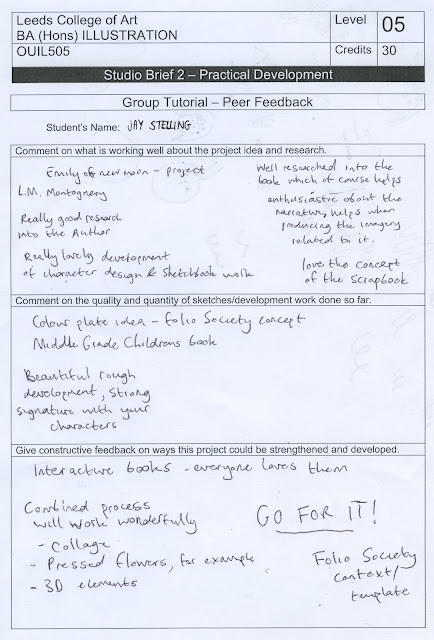
GO FOR IT! It's time to get making, scanning, putting things together.
My peers said that they liked the idea of it being a scrap book format rather than just simple colour plates - this is more of an interactive book and it will be a completely different approach to illustrating the book. It will also allow me to work in a variety of media and formats rather than committing to just one: drawing, model-making and collage all in one image. Best of all of my little worlds. My finger is in all of the pies and I'm going to eat them all.

RESPONSIVE SUBMISSION TIMETABLING

ADQ: County Fair                                                     -  15th December     COMPLETED AND SENT  Successful

Hobbycraft Share Your Heart                                   -   End of February    COMPLETED AND SENT

ADQ: I am Woman                                                   -  15th March            COMPLETED AND SENT

Moving Parts Animation                                           -  15th March            COMPLETED AND SENT  Second Place

Moving Parts Poster Photo                                       -  15th March             COMPLETED AND SENT

Roald Dahl                                                              -  23rd March            COMPLETED AND SENT

ADQ: I am Woman                                                   -  15th March            COMPLETED AND SENT


Completed Extra Briefs (smaller briefs - not as important/relevant to my practice) :  2 x Illustration Friday,  1 x NEST Magazine Submission1 x Hobbycraft Monthly Submission, 


NATIONAL AUTISTIC SOCIETY (COLLABORATIVE)         - 22nd March

MOLLY'S HAND


The fonts in the brand guidelines were really uninspiring so we decided to make our project a little more personal, less robotic, by making our own font.
This is Molly's handwriting and I love it! It's informal and soft without being childish, the kind of typography you see in an Oliver Jeffers book. The kind of typography I've always wanted to use, but have never found anything quite like this... thanks Molly!

Tuesday, 14 March 2017

BOOKBINDING

I've done bookbinding before so this was more of a refresher for me.
I love how passionate and enthusiastic Suzie is about bookbinding, it's really inspiring.
There are loads of different binds and techniques I'd like to try. Suzie brought some examples in for us to have a look at which was great, so we could have a touch and see how they work.

I found cutting the paper with a knife difficult because I'm weak, my wrists were hurting and my arms  were shaking the whole time. I need to get stronger!!!

Because this was a twilight session it was after uni and we were there really late. I CAN'T WORK AT THIS TIME. I get so tired and I didn't get home or eat my tea until after 9pm... I was knackered and stressed and strained and just in a bad state, all because of a late session.
Anyway, I survived.
Just.

I'd love to make a proper hardback book for 505 but I'm not sure how I'd do that - would I have to reprint the whole book or just cover an existing copy?
I'll speak to Suzie about it,

Monday, 13 March 2017

Animation


Getting on with my side of the project. This is a very different approach to what I've seen other groups doing, because we're all responsible for our own videos rather than working on one video collaboratively. 
I am worried that maybe we are doing it the wrong way, that this doesn't 'count' as collaborative practice, but it is working well since we can all just get on! We're still meeting up regularly and reviewing our videos as a SERIES, they are designed to work together but the animations are made mostly independently.


Character Animation

I had a go at using the character animation tool controlled by webcam and it's so strange. I'm sure it can look good when done properly and it's a really clever feature but I'm quite freaked out by it! It's copying everything I do and it looks possessed.


SUBMITTING TO ROALD DAHL

I chose the Roald Dahl literary estate brief because I have a passion for storytelling. Since reading Roald Dahl's books as a child, I have become enchanted by his world and the magical stories he told. Dahl captured my imagination and I was excited by the idea of re-imagining the scenes from these modern classics. Dahl had a very unique approach to writing for children in that he was bold, truthful and often quite scary. I enjoy making illustrations for children, trying to visualize the excitement of a scene, so the challenge of translating Dahl’s unconventional tone of voice thrilled me. Quentin Blake is renowned for his illustrations in Roald Dahl’s books, but I believe that readers may rely on his illustrations instead of imagining the characters independently. It’s time for a change and I tackled this brief with the intention of encouraging a more imaginative reading experience. The Roald Dahl Literary Estate shares the original intentions of the author and I appreciate their dedication to Roald Dahl’s legacy. When I think of Roald Dahl, I don’t just think of the stories or the characters, but I remember the worlds he created. Roald Dahl caught the attention of readers by bringing them into his magical worlds, showing them the wonders of the imagination. I am an illustrator but I enjoy working in three dimensions, physically constructing props and puppets to bring illustrations to life. Each of the scenes I made exists beyond the screen or a printed medium, they are standing models that can be touched and moved. I wanted to be brave and bold in my approach to the illustrations, echoing Dahl’s memorable narratives. The handmade figures and scenes I produced for these images are combined with hand drawn foliage and leaves to blur the lines between what is real and what is fantasy. Dahl’s stories speak of fantastical creatures, bizarre events and real-life scenarios, so I made my illustrations to exist between dimensions. I chose to illustrate three different scenes from Roald Dahl’s stories. For the villain character, I made my own Grand High Witch from The Witches. The Grand High Witch is the scariest character I have ever encountered and I wanted to capture her ferocious power. The child character I showcased is James from James and the Giant Peach. James is a brave and adventurous character who encourages children to explore and appreciate the nature around them. The fantastical creatures I featured are the tiny Minpins folk from Roald Dahl’s The Minpins. Unlike most of Dahl’s books, this story was not illustrated by Quentin Blake. The original edition was illustrated by Patrick Benson and it is a lesser known story, so I attempted to bring these forgotten creatures into the spotlight. The Minpins is a lovely story and it deserves more recognition.

TUTORIAL WITH TERESA


The main discussion was about my health since I collapsed again at uni. I'm embarrassed and sick of being an anxious mess, it would save a lot of time and effort and feelings if I could just NOT WORRY about things!

Thursday, 9 March 2017

Responsive Group Tutorial


Brief: The National Autistic Society brief asked for 1-8 videos with a combined length of 2 minutes. The videos should be about Autism (specifically adults with autism and the struggles of trying to find work as an autistic person). They want this to follow on from, but not imitate, their Too Much Information video for their Autism Uncut campaign.

Intention: We wanted to answer the brief by creating an animated documentary series. Our aim is to humanise autism and tell the stories of the everyday people it affects.
We decided to produce one film each, but make them to work together as a series/collective campaign. They will each be produced by a different artist and have their own visual language, but will be cohesive and standardised in their colour scheme and fonts (following the brand guidelines).

What we've done so far: We have conducted interviews and recorded audio. We've each chosen an interview to work with and cut them down to around 30 seconds (combined length 90 seconds, so we have some breathing room to expand if necessary).
We have a group Pinterest board that we have been pinning to, creating a mood board of illustrators and animation that we are feel is relevant in content/visually appealing).
We have all started to develop characters and drawings that will be used in our animations.
Jay F has done a lot of work, much more than Molly and I have done. However, he's been neglecting his other modules so needs to make sure to balance his workload. I do feel like I need to catch up and that by not having as much work as Jay F, that I am letting the team down. We don't have long left at all (13 days) so it really is time to get moving (literally, animating!) 
I have started to colour my character sketches but I am aware that my animation might be too simple. Will it be engaging enough?

Questions: Is is appropriate? I usually work for a much younger audience, typically children, so I am concerned that my illustrations might not be appropriate for an adult audience. Will they find it patronising? The other groups told us that it's fine, it's endearing and charming, not too child focussed but still child friendly. Reminds them of Nick Sharratt.
Do they work together? Yes! They work together as a series really well. Some groups said that it looked like they'd all been created by the same person, but Steve said that it looks like three different artists but deliberately catered to the individual stories we are telling.

Feedback: Use Edge Animate to voice the frames. It's a really easy way to lip sync 2D illustration, especially for beginners. Lots of tutorials out there (animation is getting easy for non-animators to do).
Hashtag - Iamnotmyautism is too long! AutismUncut is better and already used by the National Autistic Society, so we should use that one.

The other groups: Kat, Neneh and Guy are working well together. Each have their own roles, working to strengths.
Ash, Bash and Mary had some communication issues and it's very tense in their group at the moment. They'd chosen the Roald Dahl brief, which is more of a personal illustration project and they're struggling to make it a combined effort. I suggested that rather than Bash and Mary doing the inital sketches and Ash 'cleaning them up'/redrawing them, that they each work on different areas or layers of the illustration e.g. someone does backgrounds, someone else does character design and another does costume/objects.

PROVINCIAL BIRD


The provincial bird of Prince Edward Island is THE BLUE JAY! Me! Just like how I found a connection to Poe's Raven in 504 and discovered a Jay feather, MONTGOMERY IS CONNECTED TO THE BLUE JAY AND THAT MEANS THIS TOO WAS MEANT TO BE.

Monday, 6 March 2017

Life, Animated


Jay F, one of the animation lecturers and Patrick all recommended watching this, so I had very high expectations.
Rightly so! What an incredibly insightful film, and from the perspective of an adult. So interesting to see how the boy in this film grew up learning how to interact with the world through Disney films. I've never been a huge Disney fan (I don't even remember watching many) so I don't think I related to this documentary as much as Molly and Jay F did, but I did find it inspiring and eye-opening to the reality of growing up with autism.

The little I knew about autism already was through my Psychology A Level studies and I have realised how generic and scientific that understanding was. I didn't really understand the human element and, like most people, generalised the 'symptoms'. I expected that everyone with autism had difficulty making eye contact or empathising with others but it's much more complex and varied than that. Every experience is unique.
I knew about 'Theory of Mind' and thought that was all there really was to autism, a lack of this undesrtanding/perspective, but like most theories, theory of mind doesn't explain the whole story.

The main message I got from this is that autism is not something that is suffered. It's not a disability and there are so many people who are affected by it. Everyone has their own ways of interpreting the world and dealing with sensory input, there are things (like Disney films) that can guide individuals through challenges like making friends.
This documentary was a bit cheesy and twee at times, focussed on this 'miracle' 'breakthrough' and how 'heartbreaking' it is. It was very americanised and dramatic but it definitely had good and honest intentions.

STUDY TASK 2: Inspiring Illustrators (Belanorqua)

Belanorqua


I'm sure I've mentioned Belanorqua's work several times before because I am utterly enchanted by their textile dolls. Belanorqua is a team of two dollmakers from Poland: Norka and Biel. Their social media pages are very popular, which is where they post their images to be seen online.

There's not much information about them available - they are a very mysterious force, calling themselves 'human minks'. This is all part of their artistic presence, an enigmatic signature which involves never crediting their full names or giving much information away. They post pictures, often without captions, so the viewers are left to interpret the photos alone.
Belanorqua's approach to mysterious authorship in their promotion suits the tone of their work, since their art dolls and scenes harbour mystical tones and magical themes.

Their process of dollmaking features embroidery, propmaking and photography.
They do sell their dolls as products but their finished photos involve a lot more than just the dolls - using nature, cats, flowers, etc. to capture eerie and enigmatic shots of the dolls in our world.

Purpose: Their dolls are sold as products, so they are intended as art dolls/objects/collectables. The photos they post online have two purposes, the primary is to promote their doll products, and the secondary purpose is to tell stories with these figures. The photos only tell stories as a by-product of promoting the dolls, to demonstrate the artistry in their construction, but these photos are what interests me most, how the dolls can be posed and interact with environments as physical illustrations/static puppets. The photos and dolls feature themes of nature and magic but it is not immediately obvious whether Belanorqua is making an explicit comment/message.

Audience: Their audience is consumers, users of Etsy. Doll or art collectors. Likely to be female adults aged 25-35. 

Context: Belanorqua's dolls are sold as products online through Etsy. They exist as photos on social media and are sometimes featured in art magazines. I would be interested to see how Belanorqua could extend this practice and apply their illustrations to wider contexts, such as book illustration, greetings cards, tarot cards or as stop-motion puppets for animation.

Inspiration: Belanorqua is inspired by other dollmakers Pantalova and The Pale Rook who also sell dolls online via Etsy. They use found materials from nature, including feathers, bones, rocks, leaves and moss.

STUDY TASK 2: Inspiring Illustrators (Willowynn)

Willowyn (Margeaux Davis)


Willowynn's textile dolls are fairytale characters in three dimensions.
She creates soft doll sculptures, complete with clothing and boots using second-hand fabrics in order to imbue more history, character and story to her dolls. I think that this is evident in that the dolls do not look pristine and new, they look slightly antiqued and worn, as if a treasured toy of years gone by. This definitely adds to the value of Willowynn's craft because she demonstrates handmade imperfections, the raw nature of a craftswoman.
The dolls are delicate, elegant and majestic.

I feel aligned to this artist because I also make handcrafted characters, only in a different medium. I would like to learn more about sewing and garment construction in order to fabricate intricate costumes like she does. I will need to do research into the era in which L.M.Montgomery lived in order to make sure that my Emily of New Moon is appropriately dressed to be historically accurate.

Inspiration: Prior to being a dollmaker, Willowynn was a park ranger. This interest and knowledge of nature informed her creative practice, drawing from nature as she began Willowynn by crafting animal sculptures.

Willowynn's characters are inspired by fairy tales and folk-lore, but exist as dolls/sculptures as products on Etsy. They are made for the purpose of selling as ornamental/decorative products.
I'd love to see these in the context of children's books, where the ideas were inspired and born. Her dolls are inspired by words and literature, so could Willowynn combine these two elements? Use text/typography to integrate with the photos?
Does she ever exhibit her dolls in galleries? They are so competently made and look very professional, they should be displayed as works of art too.

Audience: These dolls are aimed at Etsy consumers, craft lovers, girls. Maybe bought as gifts.
She hosts workshops and teaches classes on sewing/doll making so her audience is also amateur or beginner doll makers who want to learn from her.

I think that Willowynn's photographs could be improved through the introduction of props and scenery. Most of her photos are shot against a blank off-white background (again linking back to her rustic, weathered, craft aesthetic by using an off-white/cream and a wooden tabletop rather than crisp white) which does make them look professional as products for Etsy, but I think they could look even more magical and enchanting if they were photographed as though they were in another realm, or as if they are interacting with the environment instead of stood in a studio. Willowynn has a passion for nature and beach-combing so these would prove excellent backdrops for photos using her dolls.

Promotion: Willowynn promotes her work through her website, blog, social media. She is often featured in art magazines and on Instagram collectives like @ dollmakers.
She also has a newsletter subscription.

Smoky Bacon

Smoky Bacon from Jay Stelling on Vimeo.

Am I happy with it?

Is it appropriate? It's still the kitsch and silly 70's puppet animation character I wanted to make but I've managed to make the animation appropriate for older audiences by subverting it at the end and creating this abstract, creepy vibe.

I'm happy I got the chance to work on a puppet animation brief and make something fun. I'm glad I decided to do this brief, even when I thought there wasn't enough time. I managed to squeeze it in and pushed myself to get it finished. The overall animation is bright, silly and a little macabre; it is everything I wanted it to be so I am pleased.

I think that it would be appropriate to be shown at a puppet festival and that the audience would enjoy it as a celebration kitsch puppet television.

The music was a good choice and everyone I have shown has approved of this jingly folk tune because it enhances that 70's feeling I tried to create.

What could I improve?

I'm aware that this probably isn't the most professional competition. They didn't ask for design boards, evidence of development or give many format specifications, so it didn't provide me with much practise of professional pitching.

I could have made the distorted ending even weirder, with more vignetting/dripping overlays/reversed music.

If I had longer to work on this brief, I would have made more characters, made a longer animation and made more of a narrative. I could have spent longer storyboarding and developing my ideas.

In the future, it would be great to get some experience working with: actors, puppeteers, musicians animators, photographers and video editors.

Sunday, 5 March 2017

Ornate Books


I found these books at a carboot sale in Rufforth for £1 each! Lovely, ornate little hardback books, just the sort of classic, special feel I want for my 505 production. Can I actually print a whole book? 339 pages + 6 colour plates? Will I be able to produce a beautiful hardback book in this time frame?
It would be incredible to have a PHYSICAL book with my illustrations in, even if it is a one-off edition. Something truly special for my portfolio.

Eggs & Nests of British Birds was published in 1910 and The Illustrated Language of Flowers is from 1869.


Saturday, 4 March 2017

STUDY TASK 2: Inspiring Illustrators (Julia Sarda)

Julia Sarda
I saw Julia Sarda's debut picture book, The Lizsts in Waterstones during our initial research for this project. She has re-imagined many classic children's stories with her soft, Autumnal palette and gentle brushtrokes. Since I will be re-imagining a classic children's story, I thought that Sarda would be a useful artist to investigate. She hasn't attempted to modernise these stories, to change the stories we are so familiar with, but she has stayed true to the original texts and illustrated drawings that readers will feel enchanted by.

I'm especially interested in how Sarda combines her illustrations with text from the stories she's illustrating. Format and composition is very difficult when you are confined to a space or frame, but Sarda works really well with borders, squeezing entire scenes into one oblong, page-sized box. These are conventional colour-plate formats that aren't used as much since digital printing and lower colour printing costs enabled illustrators to print in colour throughout entire books, but Sarda seems to be bringing this trend back and embracing the traditional aesthetic of books holding just a few precious colour images.

Audience: Sarda's charming and ethereal illustrations are intended for children. Again, they may be also consumed by older audiences, especially book/print enthusiasts, or adults who remember/loved these classic books when they were younger.

Context: Children's books, including Mary Poppins and The Secret Garden. 
Also exist as prints (the format works perfectly for this and would be great for libraries, bedrooms, offices, schools, etc). Sarda sells her images as high res digital files so that they can be printed by the customer, which I think loses some of the value and authorship of the print. It's not been printed by Sarda, or even shipped by her - it's come out of your own printer.

Purpose: To illustrate the discourse of the stories. Her illustrations are lively and full of action for entertaining her intended audience. She is primarily a storyteller and she tries to visualise the discourse through her characters.

Promotion: A lot of the promotion of Sarda's books is done by the publishers she works with or the booksellers she she stocks her books within. Bookstores have made displays to celebrate the release of books she has worked on and her publishers will regularly promote these books in an attempt to sell more. She has a website and social media pages where she posts snippets of her creative process and latest projects.


These are cakes with Sarda's characters on made for the release of The Mystery of the Clockwork Sparrow. A very inventive and playful promotion.

Inspiration: fairy tales and folk art have inspired Sarda's dream-like stories and images. She is also informed by vintage illustration and packaging (especially for typography and colour schemes). She travels a lot (India and Tibet), which inspires her work culturally.

Friday, 3 March 2017

STUDY TASK 2: Inspiring Illustrators (Carson Ellis)

Carson Ellis

Carson Ellis is a contemporary illustrator working in a similar context to that which I am working towards. Carson Ellis and Colin Meloy (The Decemberists) created the Wildwood Chronicles books together, a series of middle-grade fantasy stories.
They have a close relationship as author and illustrator, and the books are really a collaborative partnership. The close tenor between words and text shines through in the synthesis of visual and written style.
How can I achieve a relationship with an author who is no longer alive? I need to learn as much as I can about Lucy Maud Montgomery in order to make my illustrations harmonise with her words. I need to understand Montgomery's mind so that the book does not feel disjointed or random.

Although Carson Ellis illustrates books that are intended for an audience of children aged 7-11, lots of adult readers appreciate the books for their nostalgia, magic and beautiful illustrations. The books are also available as special editions (box sets/hard backs), so they may be pursued as valuable gifts/collectables.

How does she promote herself?
'I’ve made a couple of promotional postcards,' 'Really, The Decemberists have turned out to be a better promotional tool than anything else imaginable.'
'Most art editors and book people found me through the stuff I’d done for The Decemberists, I don’t think I was ready to work as a book illustrator five years ago, and I’ve learned a lot doing all that stuff—album art, T-shirt designs, Web site illustration, stage backdrops and photo shoot sets—it’s been way more work than I did in my five years of college.'
http://blog.artistsmarketonline.com/uncategorized/carson-ellis-interview
Ellis is a popular artist figure on social media, with 38.9k likes on her Instagram account. By keeping these updated and interesting, Carson Ellis promotes herself as an artist and showcases her illustrations.
'It’s pretty fascinating to be able to post something on Instagram and find out immediately whether or not people like it.'

What inspires her?
Similarly to Montgomery and Demidova, Carson Ellis says that her work is informed by her surroundings and scenery. She draws inspiration from the forests and nature around her home in Portland, Oregon. The Wildwood books were set in this same town, much like how Montgomery's books were set on PEI.
'I strive to make art that feels mystical—I think that informs my illustration style a lot'
http://www.designsponge.com/2014/02/a-day-in-the-life-of-carson-ellis.html

Thursday, 2 March 2017

STUDY TASK 2: Inspiring Illustrators (Olga Demidova)

Olga Demidova


Lucy Maud Montgomery's fascination with Prince Edward Island is woven into almost all of her stories. The island was her home and the home of some of her most famous characters, so I would like to make reference to the nature and landscapes of PEI in my illustrations for Emily of New Moon too. These scenes and settings were important to Lucy Maud, so this is something I want to pay attention to myself.
I stumbled across these paintings by Olga Demidova and found them really immersive in their depiction of wilderness and scenery. The artist has illustrated the depth of these detailed worlds through layering (mountains behind trees behind bushes behind flowers), altering scale (rules of perspective - assets farthest away being the smallest and closest to the viewer being the largest). 

I would like to recreate PEI by layering illustrations of nature and houses like Demidova has, capturing the tone of the landscape and Emily's adventures within these landscapes.
I also admire Demidova's use of mark-making to suggest currents, winds and atmosphere. 
I was surprised to learn that these paintings were actually made on Photoshop as I thought that they were gouache paintings so I am quite impressed by the realistic textures she has achieved. I wouldn't have actively searched for 'digital art' as I didn't think it was 'my thing', but this may be something I could experiment with to add more texture and movement in my work.

Demidova's audience is very similar to my intended audience for this project. Her illustrations are aimed at children and exist within the context of children's books and children's magazines. She's also applied her characters and stories to animation.

How does she promote herself?
Olga Demidova is a Russian artist, but captions her artwork in both Russian and English language on social media, making her posts more globally accessible.

What is she inspired by?
She takes inspiration from the Russian landscapes she grew up in.
Her intention is to 'share a moment of happiness with her audience'.

Wednesday, 1 March 2017

STUDY TASK 2: Inspiring Illustrators (Puppet Story Books)

Living Story Books / Puppet Story Books


These are beautiful but also really weird. 'Puppet story books' or 'living story books' are books where all of the images are actually puppets set up in scenes with the text over the top... This could be one way of approaching children's illustration through 3D media.
They're quite dated and I'm not sure if modern children would find them appealing or just be freaked out by them.