Returning to the reflections I'd made on my work so far in order to improve my summer projects. Fixing faults, changing images and making sure that the project is complete.
The image I had made for 'Something you would rather not have done' really wasn't working, no matter how I composed it. I thought about different solutions to this question and moved away from my original idea completely.
Re-reading the brief, I looked at the suggestions for this point and realised that my answer original answer didn't really make sense anyway. No one had told me to cut my hair. That was my idea and I had complete free will over that.
The brief suggests ideas like 'having to get a job to support your studies'. I've learned that reading the brief SEVERAL TIMES is essential in producing a coherent and relevant resolution.
I started to consider variables in my life that I have no control over at all.
Extraneous variables that happen around me without my consent, and things that I need to do, regardless of how I feel about it.
Growing up and adulthood is something we cannot escape from. I thought that I could represent this by giving my Jay doll a badge or a label saying 'RESPONSIBLE ADULT'. I wanted to pose her looking grumpy and frustrated whilst other dolls were having fun.
Another idea was to hang her up on the washing line, no escape. Hanging out to dry.
Another idea was to hang her up on the washing line, no escape. Hanging out to dry.
Standing in line, with no choice but to conform.
(well done if you noticed the spelling mistake in the sign above! Proof reading is VERY IMPORTANT...)
Typo corrected.
Does the image make sense? Is it clear why she is on a washing line?
Is it even clear that this is what she is doing?
Last time I blogged about the Summer project, I'd highlighted that the 'something that tasted good' was another image which might need re-working. I didn't think that the doll looked active and thought that I could re-paint her face to appear mid-lick.
I really didn't like the second attempt.
I don't like her eyes closed, they look too big. Her mouth is messy and there are lots of dents on her face from the several layers of previous faces she's had painted. The lighting is wrong, it's too dark. The image is too close-up, it should have been a mid shot to show the background. The ice cream is angled away from her face. Her hands are breaking.
I hate it so much that I want to take this photo down, but again, I'm trying very hard to accept my mistakes and move forward from them by acknowledging them.
I tried to fix the tiny little picky things I'd pointed out earlier, but made even more of a mess.
I much prefer the original.
Don't fix what ain't broke.
Something beautiful.
I can't decide which image is the most beautiful. Does the Jay doll need to be present?
I really love the crafting of my moth, especially in this image, but I'm not sure whether it fits with the rest of my series of images.
Presentation of Final Images
I wanted some kind of structure in which to present my images for the crit tomorrow.
I'm a perfectionist and could take ages obsessing over how to do this but I know that this should not be the priority and that it isn't going to be marked. I would just like something to keep the images together, in a set sequence and to stay neat.
I wondered about hanging the images with pegs from a washing line like my 'Something you would rather not have done' image, but this would be much too fiddly and large to transport into college.
After some deliberation, I decided on a photo album format.
I also had the idea to mount the images onto slightly larger squares and present them in a little box.
I printed the images on semi-gloss hp photo paper using my inkjet hp printer. Lovely, professional results.
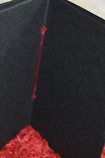
As any pre-bought photo album would have too many pages for my images, I made my own.
Black paper (170gsm), folded and easily bound with ribbon.
The colour choice of ribbon was another decision I stumbled at. I hate decisions.
I went with red in the end, to match the warm tone of most of my images on the pages.


No comments:
Post a Comment