Showing posts with label OUIL 406 Visual Communication Studio Brief 1 Character. Show all posts

Tuesday, 23 February 2016

GIF to the End


Making GIFs is loads of fun. I've learned a new way of working, and a really modern and useful application of illustration. Taking these skills forward, I'd like to continue applying my illustrations and characters to GIFs. They're really quite easy to create, but they're so exciting and revolutionary that they really grab attention.

I'm super proud of what I've made. Mostly, I love my Fibres and I think that they're successful original characters. They're believable as living organisms and it's incredibly exciting to see them actually moving and coming to life.

This brief has shown me that it is possible for illustration to exist beyond static images and that there is a demand for these from the industry. Illustrations can move and say a lot more than one single frame.

What people thought of my GIFs:
'he is so disgusting but I can't help but love him'
'they work really well as a series'

How I feel about it:
I'd agree that my characters have consistency and you can tell that they are a family, they come from the same world. I hope that this doesn't mean they are same-y or boring, that I have stuck to a 'style', but that by choosing to use the same family of characters, you can see the translation between the formats.
The comment about them being disgusting but appealing made me very happy - my characters achieved their intentions of being gross, but also somewhat endearing. They communicated the words they evolved from clearly, e.g. SNORE made people yawn. It was obvious that SNOT was picking his nose and eating it, much the disgust of many viewers, and that Mite was itchy (although I think Mite was the least obvious and gross of the bunch so he was the least successful).

I definitely solved the brief of creating three GIFs from my character designs, using each process (3D, Digital and Handdrawn). I think some people forgot about character, or moved away from their initial character designs. Briefs can lead you down different roads and off on tangents; in Visual Narratives, my book evolved away from a story and became a more abstract journey, meaning that I didn't quite solve the brief. This time, I've tried to stick to the challenge at hand and use my characters to COMMUNICATE.

What else I saw:
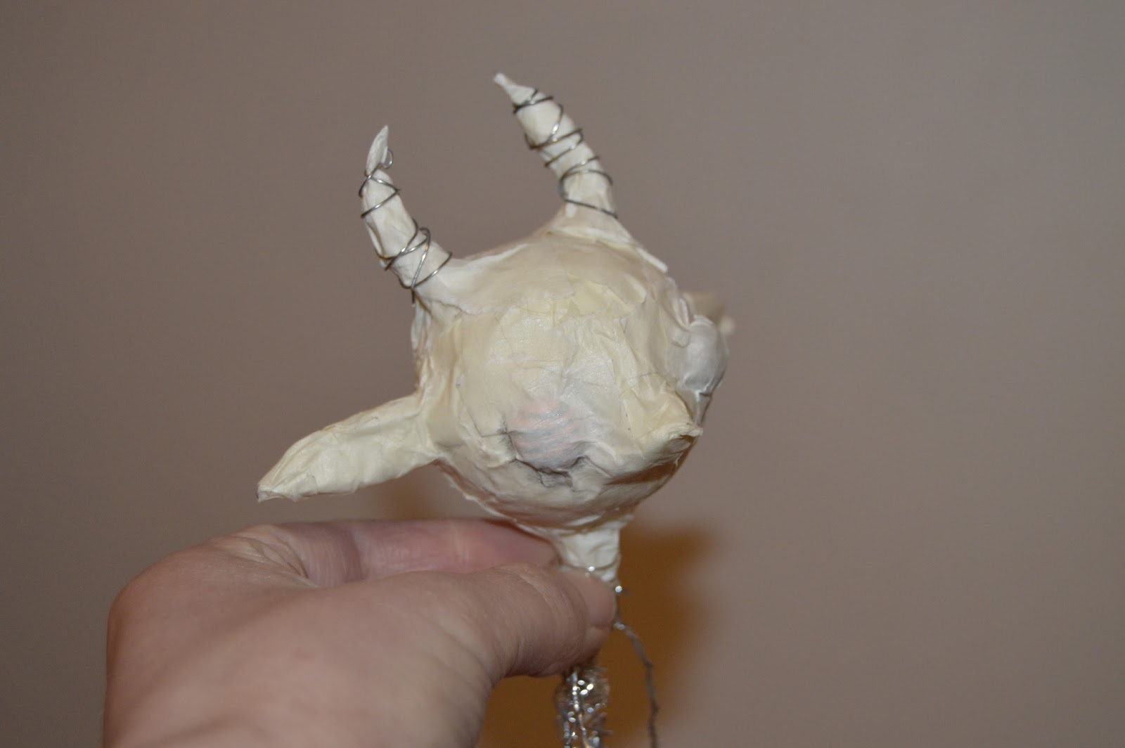
Emma's puppet was awesome and it was great to see other people enjoying the magic of 3D illustration (even though it scares me that they will take over the world and leave me behind).
Some awesome collage and textures in hand-drawn GIFs - where most people are comfortable working and produced some groovy things. Keep it goin'.
Beth Marsh's series worked really well together and had consistency to it. A fluid movement transcribed across the media. Breathtakingly beautiful. GIFs can be simple and slow.
Kat's eye and teeth - weird but cool as hell.

I don't want to let my lil' guys go and it seems a shame to have spent so long creating these beasts only to leave it at this. I'd love to revisit the Fibres, even if it is in my personal work.
I prefer longer independent projects where I have time to explore areas and really get into the research... it was great to have a week of self-directed studio time but I would've liked to have EVEN LONGER!


Sunday, 21 February 2016

FINAL 3D GIF


Been fiddling with this for so long and I was worried that it was just a waste of time.
It looks pretty much the same and my parents couldn't see the difference…
but to me, it's MILES better. I feel much happier about handing this in as opposed to the previous version, even though there is only a few slight differences.
I added a scratched, grunge texture to make the image sit better with the series, matching the textures of the other two GIFs.
The eye blinks look more natural and less superimposed.
The lighting doesn't look so stark and accidental anymore, I've made it look intentionally darker and with a higher contrast and saturation, a warmer, musty atmosphere.
The white patches of plasticine have been covered up so that he doesn't look so blotchy.

DIGITAL GIF


He's still kinda jittery and doesn't move as smoothly as I would have liked.
I really like the FLASH but it's not as flickery and dodgy as I wanted.
Lines are sketchy, attempting to mimic the hand-drawn energy but just looks to lack confidence?
The flies were a last minute touch and their movements don't make any sense but they do add another element of motion to the static background.
Disappointed with my background but that wasn't the focus, it was the character I was focusing on.
Uh. He could be so much better but this is only one of the three GIFs I have to make so I'm going to have to leave him at that! Digital isn't really what I'm interested in so I haven't spent as much time on this as the other two processes, but I have learned how to use a Wacom and how to make a digital gif so I guess it was beneficial to me.

Saturday, 20 February 2016

Alternative 3D

I tried to fix Snot.
I repainted him and fixed his limbs and sorted him out after he fell apart post-GIF (must have been all that nose-picking). I wanted to re-shoot the 3D GIF because 3D is what I'm really passionate about and I'm worried that what I have made doesn't show enough skill. 
I want to show that I can make cool things.

As the photographer, I AM IN CHARGE OF EVERYTHING WITHIN THE FRAME.
I am in charge of the lighting, the backdrop, the angle. So I'm controlling all these variables.
The new backdrop is much better and more controlled. Using cameras, looking dusty and old. I used a sheet of black card for the floor and white card for the wall behind him. I collected dust and sprinkled it over the 'floor' but does it just look messy?


The new paint coat isn't right, just not the right green.
You can see the white-tac under his feet.
His hair lost all its bounce and looks like a really rubbish clown wig.
I'm finding it really hard to tell whether I'm being silly and picking out flaws that aren't apparent to most viewers, or whether I am doing the right thing and trying to improve.


So I gave up part-way through because this is even worse than the previous version.
I'd spent so long on that one and I don't have time with such a short brief to re-do a whole 3D GIF right now just because I'm being a perfectionist. I've already wasted time attempting to, but I'm stopping now.
I'm using what I've got. I know it's good. I know it's not as good as it could be, but everything could ALWAYS be better. It's about knowing when to stop. It's more important to hand in everything that was asked for than the spend the whole three weeks making ONE PERFECT GIF.

Friday, 19 February 2016

3D GIF


I thought he was finished but now I'm not too sure.
Maybe I've been looking at it too long, but I'm seeing so many flaws. His legs move around so much and the set moves and the set just looks silly. Why did I choose Watership Down? It just looked nice but I didn't realise you'd be able to read it and now it looks unrelated, random and like I didn't even think about it. Once the image had been cropped to 500x500 you could't see the other cameras either so there's just that one on the left that looks so out of place and odd. Hmph.
His outfit looks kinda cool and even though one legfold is higher than the other, he looks like a scruff so that's okay.
I don't know whether to remake him or the set or to completely scrap everything.

Hair


Made him some gross-ass hair using wool roving.
He's so disgusting and I love him.
He's definitely going to need clothes though, haha. Although it looks especially gross that he's naked, I want him to be a character and not just a filthy animal. He needs to be a functional Fibre so he's going to need some overalls or dungarees.
I'm going to make some using some old jeans yeee.

Painting

I was starting to have a bit of trouble with painting the skin because it wasn't reacting well with the Plasticine.
I ALWAYS DO THIS.
I get an idea and even though I know it won't work (technically, that paint will NOT fix to the Plasticine, and if it does, it will crack when you move it)


Mixed my acrylic paint with a little PVA and liquid FIMO, made the paint much more fluid and a little more transparent.

Model Research


https://www.google.co.uk/imgres?imgurl=http://cdn.phys.org/newman/gfx/news/hires/2013/brownunivers.jpg&imgrefurl=http://phys.org/news/2013-02-robotic-wing-video.html&h=1661&w=2280&tbnid=g51gqSgHrT5nDM:&docid=t0OgKhqT3n7ShM&ei=AQq-VqLqMouwa4LCv_AP&tbm=isch


Saw this online and was just really impressed with the model! SCIENCE.
Researchers using model-making to build a robotic bat that could help scientists to understand how bats live and move is aiding technological advancements such as building aircrafts.
Who would have thought that model-making could be so beneficial to the human race?

Also, just look at those wings and mechanics. I need to learn how to work those things. Get some wires and don't electrocute yo'self, buddy.

Thursday, 18 February 2016

Dust Textures

In search of a textured background to put behind my characters, I went around the studio collecting dust.
Everyone in the studio is like EW JAY WOT, but that's what they usually say anyway so my street cred ain't too damaged.

BIG LUMPS OF DUST


Scanned them so that I can digitally combine them with my GIFS, but don't worry I cleaned the scanner afterwards.
It's still just going to be a white background though? Should I find even more dust to fill the entire 500x500 frame?
Or get some old carpet or material to cover in grossness and scan that?


FINAL HANDDRAWN


Wednesday, 17 February 2016

Hand-Drawn Rough

So he still needs colouring and tweaking a little
but he's moving and he yawns! 

I'm loving the hand-drawn aesthetic because it's so sketchy and lively, it suits the 'gross' tone of my Fibre family. In the silent crit, my peers said they liked the sketchy, fast lines of my initial drawings, so this process maintains that rather than stripping it away like the digital GIF is doing.

Worried that colouring it might ruin that half-done look.


Monoprint

MONO PRINTING 


I always shy away from the print room because it just feels daunting to go down there if I don't have to.

I thought mono printing would be lots of Effort but it was actually quite easy and didn't take too long to produce loads of work

Spent too long cutting stencils


Not going to use these for this project but I'm actually really impressed with how they turned out and just how much work can be produced in ONE MORNING! I made SO MANY PRINTS and they each have their own attributes that make them interesting.
Some have funky colours, some have interesting grains. I made several variations from the same stencil and NONE of them are the same. Each is different.


Although it's not right for me for this project I would like to pick this back up again… maybe for PPP? Make some of my own prints really quickly! Mass production but still artsy and unique.

Monday, 15 February 2016

Model Making #2

Model-Making
The one I was working on before just looked way too human.
The proportions weren't right.
Wanted to try a different medium.
But I don't want to give up... I know I've already done quite a bit of work on my 3D model, but this is what I'm enjoying, so I want to make sure that it's as good as it can be. Having a brief asking me to make a 3D model is pushing me to show how far I can take this process.

Using Snot instead of Scrat to get a more chubby, beatly look. He's grosser and weirder than Scrat, so let's make him a body.

Plasticine on a wire frame. Super easy to mold and shape.
Coming together.
I decided to use white plasticine rather than a out-of-the-packet colour so that I can paint it by hand like LAIKA, hoping to avoid a flat, block colour in the skin and achieve a more realistic skin tone (albeit a green one).

Working from my drawings and making the lil' critter. He looks much weirder than the previous model WHICH IS A GOOD THING. I want it to look odd and gross, far removed from human.
Think it's going to be quite easy to skew the face, pushing the mouth down or eyelids over to change the expression for each frame.


Mmm. That bogey green is much better! Yeaaah! It's creating a mottled look on the skin too. Proper happy with how that's looking! He's still pose-able and he photographs really well.
Just need to finish him off. Maybe give him some clothes. How will I add hair?

Friday, 12 February 2016

THIRD GIF


Digital GIFs are by far the easiest.
But they're not my favourite.

It's so quick and simple to just nudge a feature to give the suggestion of movement with this process.
But the quality is just too finished for me… it doesn't look like much effort has gone in and it lacks the jittery nature of hand drawn of 3D. It's too clean and it's quite boring.

I'm proud that I've actually made one, because I'd never made a GIF of my digital drawing before, but I think I need to keep playing with it until I get a finish that matches my tone and the aesthetic of the series.
This GIF does not yet suggest 'dirty', 'creepy', or 'gross'.

Looking at GIFs


https://media.giphy.com/media/1y0CobcB8EQcE/giphy.gif

Lots of energy and mischief. Changing perspective looks like it's scanning the room and there's three scenes being spliced together, like it's super chaotic. The ellipsis and cropping of info means you have to guess what's in between and the mind has to piece the room together and work out how each scene is connected (i.e. how far away the beds are). Expressions could be developed further, a laugh doesn't just mean an open mouth. Also, there's little definition between each character and they all look more or less the same.

https://media.giphy.com/media/3o6fDxUHmOThkYGHUk/giphy.gif

Very simple. A little fast? But that's how fast a jump occurs so it's probably accurate, just annoying to watch because I want to slow down and see the details! Nice movement of the plants and foliage, a sort of ripple effect through the scene. Works well as a loop. Playful and cheery. 

https://media.giphy.com/media/ZisrKp96yLmco/giphy.gif

An eerie tone. Only a couple of moving parts, but that's all it needs to make this quiet, cold atmospheric setting. Not a character GIF, but a lovely scene. Perhaps I could use similar techniques of wind-swept foliage in a background? The trees look like they've been made from cut paper, but I could be wrong. Has some depth with overlapping elements and consideration of scale.


https://media.giphy.com/media/X3JN1comv06vS/giphy.gif

The flashing light on that MOTEL sign is beautiful and haunting. It flickers, doesn't just flash. Changes the shadowing too, just really well made. Mite needs a similar flicker on his headlight.

MODEL MAKING


Making a model of Scrat the Bat. He's super wiry and scrawny so I'm using my paper mach and wire technique to begin with but I'm not sure about it… feeling like I should do something different rather than sticking to what I know but I want the model to be posable and sturdy. This is just a starting point and I'm sure he'll evolve.

Don't want the eyes to be embedded in the skull like that. I'd like to make some really wet-looking glass eyes to sit within the socket.

LOOK AT THAT SHADOW! CREEPY WEIRD. YES.

Not sure what material to cover the bat wings with because I want that translucency but also a strong enough material to bend when his arms move.
Cling film?
Latex?
Silicone?

The limbs move really well and he is super easy to pose! Maybe I can cast some faces to place on top of the skull and change his expression with each frame?

He's just looking a bit too human? Scrat is probably the most human-looking of the clan. Maybe I need to distort his proportions a bit more. Shorter limbs (or much longer - make it EXTREME).

Hanging upside down like a bat. OOOh yeahh. Need to make some hair and have it fall from his head with gravity. Could I make a cave-like setting?

Half-done paint job. Too grey. Needs to be a tad brighter. Want it to be wet-looking and covered in boils and warts.


Thursday, 11 February 2016

Experiment: Hand-drawn Gif #2


I'm getting quite 'into' the process of drawing repetitively like this and it's quite enchanting to see the character gradually changing with each frame. It's so easy to make a drawing move.
I don't use Tumblr so I don't really see GIFs too often. I send photo gifs to my friends over messenger, but they're never drawings. Maybe I need to delve into the Tumblr world to EXPOSE myself to more GIFs?


Okay, so kinda getting there. Snore is moving much smoother but there are still darker frames and wonky bumps in the animation. Working in this way means it's super easy to just go back and add or change a frame once you see it in the sequence and realise it's wrong.
How am I going to colour this? How do I get the colour consistent??!!!
LABEL YO' FRAMES! So much easier to keep track of where you are. 

Tuesday, 9 February 2016

Character Development Feedback

Silent Crit
A group crit, where the individual presenting their work doesn't speak and the rest of the group is left to look through and feed back on the work.
I found silent critting really difficult when I did it for the Editorial brief (Vis Skills) because I had a concept that was quite complex and my peers didn't quite get my intention without me being able to answer their questions.

Silent Crits worked much better for this task as character designs should be pretty self-explanatory.
The purpose of the crits was to record the responses of my peers to the characters I have produced.


I'm so happy with the feedback I recieved today!
They loved the bat drawings. Why? Because they were cute. 'Cute' isn't what I was aiming for, and that's partly why I changed direction onto the Fibres. Even though I don't really want to go too cute, I guess I should follow what my peers are saying and incorporate some more batty, creature of the night elements! THE CLIENT IS ALWAYS RIGHT.

They understood my intentions for the Fibres and got lots of EW for the grossness of these characters. They especially liked how they worked as a family/set. A lot of my peers are struggling to decide on three characters to choose that would go together as a series because they've done individual character designs while I made a big family.

Joe's drawings are beautiful and I'm intrigued to see how they translate into GIFs. No one on our table has ventured into GIFland yet, so we're going to dive in tonight and just make SOMETHING animated. ANYTHING.


Media
I explained my idea for using gouache to paint the hand drawn character and making a posable model for 3D. Jamie said to consider which one to take forward into 3D because body movements might be easier to articulate with such a model (pose-able limbs) whereas more complex facial expressions might be harder and better to do in digital/hand drawn. GOOD POINTS!

Sophia had a really cool idea to make a girl with a scarf and hair moving in the wind. She's done some great drawings but has limited her 3D work to just paper layered up, so I suggested that she uses real material on the scarf, because nothing can mimic that fluidity as well as the real thing.

Several of the roughs I saw in my crit had used wind/hair flowing. I hadn't thought about hair moving! There are so many little details of the body that you forget aren't static! We're in costant motion even when we're still. Hairs wisp, mouths twitch, veins pump. DON'T FORGET THE LITTLE DETAILS.

Ending today with a baby bat yeee.

Moving Forward
Get making!
Use Scrat, Mite, Snot and/or Snore! Make them some backgrounds.
Make a timetable. I like autonomous weeks because I am quite self-motivated but I do find it incredibly overwhelming to set off with a week's worth of work to tackle and having little support to guide me. I need to address my concerns before I get to Monday and have a solid plan for what I'm going to get up to each day so that I don't run out of time.

Experiment: Hand-drawn Gif #1

I'VE NEVER MADE A HAND-DRAWN GIF BEFORE.
I liked the one that Jamie showed us in the briefing, where he had drawn a close-up, full-bleed eye and the sketchy lines of each frame drawing moved slightly. This really subtle change of direction in his lines made the image seem to have natural movement and a life-like quality that I've not seen achieved so effectively in digital gifs.

Using the light box to draw the same character over and over again, changing very slight details to give the illusion of animated features. Seemed really simple until I scanned them in and realised how the drawings looked in a sequence.

It's really wobbly and jumpy because there aren't many frames and because I drew them so quickly and not very precisely. Lots of features changed that I didn't intend to change! His nose changes shape, his ears grow and so does his hair!
Maybe this is a sign that I haven't finalised my character enough? Which one of these variations is the REAL Mite?

I also changed pencil halfway through so the lines suddenly get much darker and change quality. STICK TO THE SAME PAPER, THE SAME PENCIL AND THE SAME WAY OF DRAWING to create a fluid, consistent gif.

Other than it being super shoddy, I'm pretty impressed with the result. I MADE IT MOVE! IT'S ACTUALLY MOVING! Forever. 
I find the hand-drawn mode really energetic and it meets that rushed, scratchy, gross aesthetic that my peers said they liked for these characters. Stops me from refining too much and ruining the rawness with fineliners and Photoshop colouring.

Monday, 8 February 2016

Creatures


https://s-media-cache-ak0.pinimg.com/564x/44/dd/1b/44dd1bfbfeba82364b4434cc0655a7f7.jpg

https://s-media-cache-ak0.pinimg.com/564x/a6/23/b8/a623b882f76b5fd9c957cbb56d8fc134.jpg

Mahlimae - How can a face with so few features have so much expression?
Even those simple ears just have so much emotion, they're incredibly sad. This artist has a huge understanding of anatomy, not in that these creatures are anatomically correct, in that they understand posture and how the body responds to emotional weight.
This model is made from clay so it isn't posable. It stays in one static position so it can't be used in motion. Giving the art dolls ball-joints would make them much more interesting because they could be moved into different positions.

https://s-media-cache-ak0.pinimg.com/564x/f9/40/6f/f9406ff8f9e23e6d5f337122317a10da.jpg

Chris Ryniak makes these incredibly adorable 'Misfits', with signature dark, beady eyes.
This one is my favourite because of those digusting teeth! They're so gross but the rest of him is so cute! Agh!
The hands are strange, I would have made them have fingers or claws of some kind, even pincers. The smooth hooks he has ruins the realism of this character.