Sunday, 31 January 2016

Second Photoshoot

Although I was really happy with the photos I took on Friday,
 I didn't feel that they were as good as they could be!
I've enjoyed this task so much and I want to make sure that my end result captures the huge amount of fun and experimentation I've had this week.


TAKING IT SERIOUSLY AND CONSIDERING EVERY ELEMENT OF THE COSTUME.
My sister did my face make-up and I taped my ears into points. I want these to be on show in this picture, not hidden away behind my hair. Show off what you've done!
I bought some new superstitch clear string to hang the fairies with and it is incredibly invisible! Not bad for 85p but not as strong as fishing wire, so hoping it's not as windy today.


My boyfriend James came with me to Quarry Moor Park to take photos. He is a genius and took some wonderful snaps. Cheers, lad.
Much easier to have an assistant and not take the photos on self timer in my garden. Be professional and make the most out of the people you know! Use them to your advantage and give them cookies. COLLABORATE.


Saturday, 30 January 2016

FACE OFF

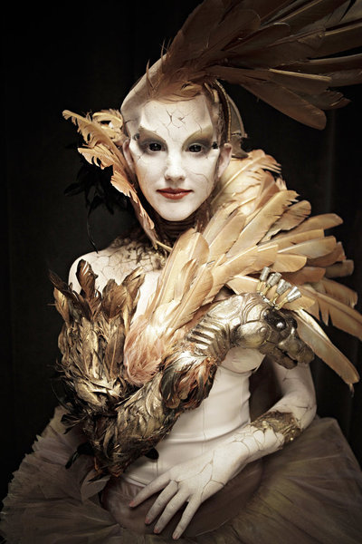
Face Off is an original series from Syfy, a talent competition for make-up artists and creature designers to compose special effects transformations for movies.

Watching the show and being completely engrossed by the work produced, I wanted to take a step back from the American, fast-paced competitive nature and take a moment to really appreciate the products of these creatives.

https://s-media-cache-ak0.pinimg.com/originals/c4/9f/84/c49f849606cfb2f97a06bbb3154c0ea4.jpg

The judges often use the word 'silhouette' when talking about the shape of the costume and make-up. When cast in shadow, the make-up and costume can help to create a very strong outline.

The competitors are challenged to consider and alter human anatomy. Working with a human model, the contestants attempt to add, disguise or accentuate features in order to change the personality and movement of the model.
I find the most successful make-ups to be the ones that allow the actor to still emote but that change the nature of the human underneath. Several attempts end up interfering with the actor's face, making a static expression that cannot change with the model's. 

https://36.media.tumblr.com/64fa623b2c11fb613a7e64ab54a255ec/tumblr_n4r3fzT2JS1rd4552o1_400.jpg

I find it especially exciting when the contestants do something completely unique with the make-up, creating a hybrid or cosmic creature that is unlike anything else.

I'd love to work on this kind of scale. The prosthetics applied to the face are sculpted first using clay before being molded and cast. 
The hair is 'laid' onto the face and body, creating realistic fur.

I'm not particularly enamored by the body painters or bloody, gory special effects - just down to personal taste! I'm most attracted to the fantasy creations and theatrical transformations. I enjoy the beautiful, the weird and the inventive.

Thursday, 28 January 2016

3D Crafting - Super Powers

Queen of the Realm

I love love love love LOVE costume and special effects.
NEVER MIND SHAPE AND TEXTURE, this is the real stuff! Actual physical shapes and textures and materials. THREE DIMENSIONS! WOO!
I'm a big fan of puppetry and theatrical costume, so this task made me weep tears of joy.

I WANT TO MAKE MAGIC.

Plan
Queen of the Realm - me, dressed up as a fairy Queen summoning my woodland fairy folk. I will be wearing a fairy costume complete with a crafted pair of transparent wings and a crown. Maybe a staff.
At least three fairies (pixie dolls I make ALL THE TIME) with wings, hanging from trees with fishing wire.
Location - woodland (if it stops raining).

Costume & Props


Making the crown/tiara. Just playing with wire and bits of sparkly jewelry I have in my bitsnbobs tin.
Not sure whether to go with the oriental low hanging jewels or the more regal standing spires?


Going with upright spires for now, it's more QUEEN-like. The florists wires I have been using are quite sharp and it huts to wear the crown. As this is just for me, that's okay, but if I was making it for someone else or if I was using a model to wear it I would need to make sure that it was comfortable!


Is this concept too generic? Is it too easy? I've been watching 'FACE OFF' (I'll upload a blog post about this later) and they make prosthetics and amazing animatronics! It would be so cool to completely transform myself using silicone molds. Too late now and I am enjoying this way too much, just keep going kiddo.
THIS PROJECT DON'T HAVE TO END HERE. Pick it back up later and keep pursuing your interests dude. You want to have a go? HAVE A GO, LAD!


I really struggled to find the PERFECT fairy outfit. I was rummaging through charity shops in search of a really specific dress: must be floaty, must be plain (ish), must be a light colour (preferably cream).
I was about to give up and just wear a black dress when I found THE ONE! 99p in a charity shop in Harrogate, the above left photograph is my pride and joy. 99PENCE!!!! Too big for me and needs adjusting but proper happy with that, exactly what I was looking for.

Above, right is my ear folded with tape to look like an elf ear. I watched a YouTube tutorial of some other loser making themself into an elf (I'M NOT THE ONLY ONE).
Not totally convincing because the tape is glossy so doesn't look like skin, but can cover it with concealer? The tape doesn't take make up too well and goddamit I caught so much hair in the process, THERE HAS TO BE A LESS PAINFUL WAY.
Wondering if a different kind of cellotape would work? 'Ow about masking tape?
No, too bulky.
SCOTCH MAGIC TAPE! YAS! Matte finish, 'invisible' and less sticky-ouchy.

Wings


First attempt at fabricating the wings. Ma lil' bro modelling them like a trooper.
I really wanted to use clear cellophane and try melting it to get a liquidy, fluid look. Also tried some embossing glitter, but with a very basic wire frame, the cellophane didn't really look too exciting. Just looks like one single feather. Needs more detail in the under-wire structure.
Tried to reuse these wings and cut them up before re-glueing them as smaller feathers.
TOO ANGELIC, I WANT FAIRY!


Change of design - going INSECT. Studied some anatomical butterfly diagrams and followed the structure in fabricating my own. Used a thin wire to build the frame, then hot glued it down to cellophane.
WE RAN OUT OF CLEAR! I used some yellow stuff from the cupboard (a little garish but really bold and bright. Maybe just use these as a test if it looks too awful before buying some more clear stuff. 
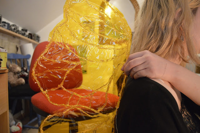


They came out alright! They aren't totally symmetrical but I figured that in the photo you won't be able to tell so much. Struggling to get them to stand on my back without support, should have used a sturdier wire. I love how the light shines through but need to see how they go with the outfit too. Always have the option to paint over them to give more detail too.


Strapped them to stand just right on my back. Happy with them now, way better than those horrible angel wings. They read really well on camera too! No need for glitter, the cellophane and hot glue looks wet, shiny and sticky. Mmm. Just right.

Fairy Dolls


Okay so I make these lil' things all the time. I use a polystyrene ball, paper mache features and then add hair and clothes.
Since I've been making these for like half a year now, I'm really familiar with the process and can do the sculpting with my eyes closed. They are so simple yet really catch the eye, so thought they would just be the perfect thing to add to this task. It doesn't feel like a challenge to me because I make them every day, hence why I decided to make myself a costume too and just use these dolls as 'props'.
Used some funky coloured wool for the hair, added some wings (I don't normally put wings on but they look so much better with these ones! Mini versions of my cellophane ones. I'm going to make them more often).


Just a little concerned about how they will turn out on camera in proportion to me - will you be able to see them at all? Will the detail pick up? 
ALSO, THE COLOURS! AGH! I now have bright yellow wings, will that clash with the pink hair??


Thursday, 21 January 2016

OUIL 405 Visual Narratives END OF MODULE EVALUATION


1. Which practical skills and methodologies have you developed within this module and how effectively do you think you are employing them within your own practice?
·        I have developed digital skills for InDesign and Photoshop, which have helped me to produce high quality designs ready for print. I utilized these skills by transferring photos of the felted landscape I made into a concertina book document on InDesign that I then printed digitally. I would not have been able to do this without the skills I learned in the tutorials.
·        I have been inducted into digital printing and screen printing. I've used these image-making methods before, but this module has challenged me to produce prints to a professional standard. 
·        I tried to develop some of the practical skills I have explored in Visual Language, including Shape and Texture, applying these to the work I made in response to research.
·        I also taught myself additional skills in model making and felting which has made my work more interesting and has made me more versatile as a practitioner.
·        I have practiced ways of telling stories without any lexis, such as sequential illustration, varying perspectives and considering pacing.

2. Which approaches to research have you found most valuable during this module. How have you interrogated your research to identify appropriate ideas?
·        We were introduced to the Visual Journalist brief as 'flaneurs' and I have tried to adopt this role throughout the module, continuing to explore and gather information.
·        I approached research in several different ways, including searching the Ripon Archives and collecting ephemera. Taking photos is a useful mode of primary research but it only captures one view.
·        Compiling research from a range of sources has made my understanding of the subject more thorough and provided me with a holistic view.
·        I valued being encouraged to collect ephemera because I love collecting things!
·        The research has been fuelled by my own curiosity and I have enjoyed discovering more about How Hill.
·        The more interested I am by a subject, the more responses I will have. Responding to the research through drawing and writing, I could then identify which topics and metanarratives I was most intrigued by as to which idea spurred the most response.


3. What strengths can you identify within your submission and how have you capitalised on these? What aspects of your submission are you satisfied with?
·        I have conducted a lot of research, which gave my book a strong foundation based on factual information.
·        I think my strength lies in the passion and interest I hold for this subject. I have committed myself to the task and enjoyed the research process. As a result, my book reflects this personal connection I have with the subject and is charming in tone.
·        I produced a very different body of work to my peers as I didn’t just stick to drawing. I looked for new methods of image making, attempting to be more innovative and exciting in the book I made.
·        I’m proud of the result as an atypical approach to illustration that attracts attention.

4. What areas for further development can you identify within your submission and how will you address these in the future?
·        I really struggled with technical competence in cutting and binding my book.
·        I want to improve my skills in this area; I hope that I will improve with practice, but I could also attend classes to learn how to add a professional finish my products.
·        My roughing wasn’t as vigorous as it could have been. I didn’t spend much time developing my roughs because I got so caught up with research. I need to ensure that I do not neglect any areas of practical work in future modules.
·        I didn’t produce as much drawing as I should have. Even when making models, these structures should begin as drawn plans and concepts. I need to use my sketchbook more in the next module!

5. How effectively are you making decisions about the development of your work?
What strategies informs this decision making?
·        Taking part in group critiques gave me the opportunity to pitch my ideas and get feedback from my peers. The responses that I received helped me to decide which of my concepts were the most popular.
·        Tutorials with Matt, Jamie and Ailsa provided me with the opinions of real, working practitioners. I found it useful to get feedback from those who have ‘been there’ and have experience in the industry.
·        I’ve tried to reflect on my own progress and have used my blog to discuss the work I make. A lot of decision making is about trial and error, finding what works and doing it again, only better. My blog has been an incredibly useful space to analyze my development and compare these attempts before moving forward.


6. How effectively have you managed this project and organised yourself during this module?
·        This module has required a lot of independent studio development time and I have tried to organize my time by making ‘To-Do Lists’. This has been successful in that I have given myself dedicated goals for each session.
·        I do find the concept of prioritizing tricky, as when faced with impending deadlines for several modules, I don’t know where to start.
·        I solved the issue of prioritizing tasks by making timetables and calendars that showed me which work was due immediately and how much time I should offer to each task.
­­­

Tuesday, 19 January 2016

The Group Crit

Feedback:
On felting/aesthetic...
'So much crafting and time put in, the lighting is really warming and cute.'
'Really nice use of texture.'
'Amazing stuff Jay! I love the models!'
'Great to see you exploring materials beyond drawing.'
'I love da deer!'
'That's lovely, I just want to take a siesta on that landscape!'
'The felt idea is amazing and so engaging.'
'Really well considered - amazing technical work. Love it!'
'Yes! Lovely! Craft! Stock! Nice! Sterling job Stelling!'
'So much craft gone into this. Photographs look ace as well.'
'It's amazing, everything is created and made with wool'
'Very brave I really like it.'
'Love the dreamy feel it has to it.'
'Choice of materials is well considered'
'Great at the scale'
'Beautiful use of models.'

On the product...
'Prefer the smaller version on the fancy paper.' - 'Really lovely stuff Jay, I'd have to agree.'
'Good consideration of stock also, what the hell is that paper? It's great and retro looking.'
'So different - media is lovely and good stock!'
'Feels like something straight out of a TV show'

On the concept…
'Most interesting book I've seen!'
'Things work together really well.'
'Not too sure on the narrative.'

'You've just been sat in that corner, hidden away, making magic.'


Is this what I intended/hoped for?
OMG YES. So pleased that people could read the 'dreamy', 'magic', 'warming' themes. I didn't think they would be too obvious, and might just read as plain 'cute' and void of atmosphere, but my book was successful in communicating the mood of the landscape. It was relatable in this way.

 My peers appreciated the amount of work I have put into it. So I haven't painted a photo-realistic portrait, but I have made a (not so) little scene and they accepted this as 'illustration'.

A lil' surprised that people preferred the weird A4 stock? It was just some random laid cream 100gsm paper, but I got several comments about its 'retro' quality that matches my artist case studies (70's children's television). MAYBE I SHOULD USE THAT INSTEAD? Can a professional print be achieved on this stock?

What have I seen that I want to learn from?
Simple ideas, executed with careful crafting. HOW DO YOU GUYS CUT PAPER SO NEATLY? TEACH ME YOUR WAYS.
People are so good at COLOUR, something that is often the last thought in my creative process. Want to get better at colour.
Alicja's book looks so good in printed form! Saddle stitch makes a much cleaner product. I WANT TO BUY A COPY OF ALICJA'S.

HOW DO I FEEL?
Much more positive. Proud. Maybe. Feels great to finally get this work out and let people see what I've been working on in silence for so long! 
It's gratifying to hear people enjoying my work but the silly little Jay that I am still thinks 'I COULD HAVE DONE BETTER! IT'S NOT GOOD ENOUGH. DON'T LOOK AT IT.' But there is still time to tweak the book production that I am disappointed with, SO I CAN SOLVE THAT, and put the actual content to one side as FINISHED & AWESOME.
I'm celebrating and buying a Greggs donut on my way home. Yasss.

Monday, 18 January 2016

Print Zone

Using InDesign
I have only ever used this programme once before having my tutorial. Tutorial made me feel a little more confident about using it but STILL NOT COMPLETELY SURE WHAT I AM DOING.
So glad I saved my notes on that tutorial to the blog! Just followed them eyyy.
Bloody technology.
I made the document (yay! Not TOO hard…) and had SEVERAL issues with the programme crashing, corrupting and then needing converting for use in college. But I got there.
I just know that whenever I use these things, I make some really stupid mistake and ruin everything.
BUT THIS IS A LEARNING PROCESS. IT'S OKAY TO MAKE MISTAKES. JUST LEARN FROM THEM.

Printing
Cost me £12 to make ONE COPY! I expected it to be pricey but KNOWING that I would ruin it/not be happy with it meant that £12 felt like money down the drain. Print quality is impressive and makes so much difference to printing at home/on a basic printer.


Cutting
Instantly chopped a wonky line. Ugh. SHARPER BLADE? Maybe just a quieter, bigger space than my little desk in the studio so that I don't get distracted or interrupted.

Sticking
Of course, I got glue on the front cover! Horrible little black blobs. Attempted to fix with a rubber. BIG MISTAKE. Got in a bit of a state and went home. There are NO MORE PRINT SLOTS AVAILABLE but I can make do with printing at home or in town. Maybe it was meant to be. I need to practice cutting and sticking, maybe I should go back to Nursery.

Printing at home
Okay so my max page size at home is A4 BUT I can use any stock I want and do it at my own pace and not have to pay or feel embarrassed for being an idiot. It's not professional quality though. ):


HAVING ISSUES WITH MAKING THE BOOKS!
What is it that I struggle with about paper construction?
My fat fingers
Creasing the paper
getting glue EVERYWHERE

Had a chat with Matt. His suggestions:
use proper glue you fool! Pritt not knockoff brands.
Stick the pages together before trimming!
BEST QUALITY PRINTS POSSIBLE.

Sunday, 17 January 2016

The Creator

I'm printing MONDAY MORNING. Time to make sure that I'm ready for print.

AMENDMENTS after Final Mockup:
Need to make the scene longer.
Creating the illusion of night is difficult because of lighting. Need clear, bright lighting to make the photo read well. Can a moody be achieved through Photoshop?
It's become a lot less spooky, but still mysterious and spiritual - early morning, not night time
IS IT BECOMING TOO CUTE?


Moved my room around to accommodate for the longer scene - it's now more like 3 metres long and I have spent SO MUCH money on felt and needles. Beginning to regret my creative choices. HEY, YOU'VE NEVER USED NEEDLE FELT BEFORE? WHY NOT MAKE AN ENTIRE PICTURE BOOK USING IT? Great idea, Jay.
How do you stop kittens stealing trees?


It's SATURDAY and I still only have about 12 trees. I need more to make it look anything like a forest. This process takes too long. Maybe I should just have stuck to drawing! Debating an all-nighter (not a typical Jay move, I like my early bedtimes) in a desperate attempt to make at least double the amount of trees I have currently.


First attempt at transforming the landscape into night. I had never done this before and followed a YouTube tutorial video to learn how to apply the effects and layer masks.
It looks so magical! I really like it but it's too dark, can't make out the details at all.


How to take a photo of the entire scene... until now I've just taken it from far way with my tripod and then chopped it to fit. Had a go at taking photos closer up and then stitching them together on Photoshop. First try, a total mess. The perspectives have distorted. Need to work out a way to keep the tripod angled at the same position when moving for each photo.
CAN I MAKE A DOLLY/CAMERA BOOM?


Used my wheeled desk chair to move the tripod along evenly. YAS!
This is looking better, seams need addressing though.

Dad said it looks like postman pat lol

I love the original Postman Pat scenes! Look at the detail in the CRAFTING. Makes my face happy.

Friday, 15 January 2016

Making ANOTHER Tower

Um so I've lost count of how many towers I've made…
but this one is at the right scale to fit the scene.

Spoke to Jamie about how to colour it. I think it should be textured and have a brick pattern on the walls, but Jamie said that the white stood out against the busy landscape. Either way, that masking tape finish isn't going to cut it. White acrylic cover will do for now.

MORE TREES! MORE TREES! Bigger ones. These are taking so long but they are just so fuzzy and fun to make. It's therapeutic and the finished felt looks so inviting and tactile. COULD I MAKE THESE AND SELL THEM? LIL' CHRISTMAS TREES! A plant for my desk that I don't have to water!
Umkay shush.

IS THERE A WAY TO STOP THE NEEDLES SNAPPING? I googled it and people say that it just happens… Might be that I am putting on too much pressure and hitting the base of my needle fettling mat with all this stress lolzzz. Requires a steady hand to avoid stabbing.

Deer

Yay! It moves! Ignore the wobbliness and the missing antler.
I intended to make lots of little rabbits but this chap was tricky enough and he is much bigger!

Trees

That's the blank canvas! Just need to fill it in with THINGS.
There needs to be enough going on in each frame to make a page, but also an even spread to work when viewed as a whole landscape when unfolded. Use the camera lens to check this and balance out the spread of objects/trees.

Made some trees, need to alternate the size and form so that it looks more natural. Prefer the grass felted down, looks a little less chaotic!

I am really enjoying the process of felting. It is so exciting to see these objects taking form and standing on their own. What was once a pile of loose fibres is now a sturdy tree! I keep feeling like I'm not doing the right thing because everyone else is drawing, but I am proud of myself for doing something different and learning a new skill.

And there's the deer in the scene! He looks way too big compared to the trees, must make some bigger ones to fix the proportions. I should have determined a set scale before I started.
The tower looks so wonky and there is light leaking from the bottom. need to make a base to go underneath.

Doesn't look quite as spiritual as I would have liked, can I fix some fairy lights to the wall? Some LEDs? Does it need the silhouetted monks? Hmm...

Wednesday, 13 January 2016

Product

The picture book as a product - what I am proposing:

Basic Concept:
A picture book based on How Hill and its enigmatic history.
A concertina book showing the landscape as a journey from Studley Deer Park to the tower.
Using no text at all, but including visual cues and collected ephemera from my walk taken directly from the location (stones, ceramics).
A spiritual tone of enlightenment and pilgrimage.


Storyboard:
12 page concertina book portrait format. 11x6cm. Scenes built in felt.
Printed digitally onto matte paper (100/120gsm).


Intention:
To INFORM - this tower exists, go and show it some love!
Hopefully make some sales...
TO MAKE A BOOK THAT DEMONSTRATES THE MAGIC OF THIS LIL' BEAUTY!
To make people wonder and want to go exploring.

Monday, 11 January 2016

Picture Book Group Crit

Pre-Crit

I HATE GROUP CRITS
but my last one was really productive and went well, so what is there to worry about?
My main concern this week is people stealing my ideas.
It seems to stupid but I worry about people hearing what I'm doing and then doing the same thing, only better. In my Foundation I would often just run away or not speak and often not get much out of the critiques at all.

WHAT I WANT TO GET OUT OF THIS CRIT:
Feedback on my storyboard - does it make sense? 
Do they like the theme? Is it interesting? 
What is the atmosphere?
If I'm feeling brave enough to show and talk about my felting… is it illustration? Do they think it is appropriate?

Post-Crit

WHAT I GOT OUT OF THIS CRIT:
Have some confidence! So what if someone else does the same thing? It will never be an identical match to yours and you will always have your own take on something. Just make and stop thinking so much.
Storyboards are looking good, I have lots of research and it is obvious that I am enjoying my project.

Steven had a really ambitious concept, so it made me wonder whether I am doing enough! Should I have more pages? BUT YOU NEED TO BE REALISTIC. TIME FRAME AND MANAGEABLE EXPECTATIONS.

Ailsa (visiting tutor today - remember to check her work out later) was lovely and although I was nervous about talking to someone I hadn't met before, she was really helpful and gave honest opinions. Good to have an 'outside' perspective from someone who hasn't heard me whittling on about the tower for the past month already.

Felt confident enough to talk about my felting; positive feedback 'it's charming', 'it's such a different way to approach the brief', 'it's still storytelling, whatever media you use. It is illustration if you put it in that context'.

STOP PLANNING, JUST MAKE!
WHAT ABOUT A BACKGROUND?
I hadn't thought about the background, do I use material or paper or board or just paint? 
Ailsa suggested printing textures and making a wall of interesting marks but would this take away from the scene? It is already a very busy view!

PRODUCTIVE GROUP CRIT
GAVE ME LOTS OF ANSWERS
...AND SOME MORE QUESTIONS
Propaa proud of myself for feeling confident enough to show everyone my work and to accept the feedback I was given.
STAY JAY. Keep doin' what you doin' and stop worrying about other people.
YOU ARE HERE TO LEARN. 

Sunday, 10 January 2016

ARTIST CASE STUDY - BENJI DAVIES

An illustrated book with a similar theme to my picture book: 'On Sudden Hill'.


The location and setting of the book is a hill (of course), matching my own. 
I wanted to investigate how the illustrator Benji Davies interpreted the location into a visual image and how he imbued tone within such scenes.
Although this picture book is intended specifically for children and centres around themes of friendship, I think that studying this book will help me to see how picture books can be presented and how another illustrator tackled a similar location.

I'm not sure how much factual research this story is based on. My project is driven by factual information, whereas Davies might just have been working to the brief of the author and publishers.


Davies uses gouache which brings a flat, opaque colour to his illustrations. I think that his application is appropriate in representing the natural elements. Brush strokes are used to communicate the varying textures in the pages, from tree bark to hair. The scene looks bright and full of energy, especially relevant to the themes of childhood in this story.

My hill will be cased in twilight and have a much moodier atmosphere than On Sudden Hill, but the natural beauty of this setting is still similar. I would love to make a scene as lush and natural as this.

I really love the typeface used for the masthead on the front cover. Is it hand-written or a computer generated type?


Benji Davies has a great talent in making noise in his drawings. He fuses quiet scenes, a remote hill, with childhood laughter, all in one image. The pages speak without the need for the words from Linda Sarah.