Monday, 7 November 2016

SCREEN PRINTING

The last of the inductions!
Again, I HAVE screen printed before but I have yet to thoroughly enjoy it/want to do it/know what I am doing. I've done the process before (several times), so in theory I should know HOW TO SCREEN PRINT. In practice, I don't. Lots of worries as I entered the room. Lots of worries whilst I prepared my screen, and then all of those worries piled into bad pressure from shaking, weak hands, a muddled head making me forget everything I actually know and an anxious mood making me a pain to work with. Just the usual then.

INTENTION:
Make a rough print of my house. Only printing A4 size so not room for all the flaps, plus can only print one side of the publication today, but it will be useful to see how it prints and whether the final thing could look the way I want if I used screen print.
SCREEN PRINT IS PRECISE AND NEAT, OFTEN USED IN MASS PRODUCTION. WILL IT HAVE THE SPOOKY, MYSTERIOUS LOOK I WANT? WILL IT LOOK TOO CLEAN? TOO TIDY?
My positives look a mess, but I think they'll look okay when printed together...

HAPPY ACCIDENTS:
We were told to make one ink pot each, so I made black but then I realised that I should really be printing light-dark colours, so I needed another pot for my first layer. Raided the scraps, found a pre-made blue but there wasn't enough! Made do with it until it completely dried out but didn't have enough to finish the nice paper prints.
SOLUTION:
Found another pot (a lighter, aqua colour) and blobbed it right into my reservoir. NOT ENOUGH TIME TO CLEAN MY SCREEN! Ended up making these weird marbled-effect prints with random swirls of both colours. Maybe with any other print, this would have looked wrong and just bad but I think it actually adds to my 'ghostly' aesthetic.


By the end of the session I was feeling so much better. PROUD of what I've made! Happy with how I overcame the issues I had. NOT too scared to go back down there again. Improvement!

Sunday, 6 November 2016

LINO INDUCTION


Lino is great, but lino STAMPS are even better. So much fun! I made some little raven stamps and printed some patterns with them. This could work well for making patterned wallpaper to go inside the Poe House?


Has that grainy print quality but also very bold and graphic.


Friday, 4 November 2016

House Book

Since I had a bit of a change of direction for this project, I thought it might help to revisit the research stage and find some prints better suited to this format and see how I can take inspiration.

https://s-media-cache-ak0.pinimg.com/564x/46/4c/a3/464ca378ff4f71f1c70dbf82f47227e5.jpg

Not the same tone as my publication since this is much more upbeat (high key colours, twee/kitsch scene), but the actual content of the houses is what I wanted to look at. Mark-making to describe the different materials (wooden pannels, steps, pavement, glass windows, tiles, brick). Simplistic shapes - long oblong houses, symmetry, varying forms.
No suggestion of life from the windows. Black, doesn't overcomplicate the image and keeps things simple but does make the houses lack life/homeliness.

https://s-media-cache-ak0.pinimg.com/564x/75/3f/d8/753fd8bec17947dd45717f4cac1c0746.jpg

A look-inside-the-house cross section illustration. Doesn't make much architectural sense but is charming in that it gives you a glimpse into the home. Consider wallpaper, furnishings, flooring etc.
CAN JUST ONE SCENE LIKE THIS tell a WHOLE STORY? There's a lot going on in that house just in this illustration! The mouse is asleep in the bed, but it's obviously day time. The Rooster is sleeping too, in a room without any windows and the little red hen is cooking something. Add text/narrative around/inside the building?
More info under flaps - more interaction!

https://s-media-cache-ak0.pinimg.com/564x/71/1f/4d/711f4d1509ebc6101097d063409b816b.jpg

This one excited me because it's a similar SPOOKY tone to what I'm going for. It's for kids but focuses on haunted house/ghosts. Maybe a little more toned down than what I'm intending (Ghosts don't smile!)

https://s-media-cache-ak0.pinimg.com/564x/6a/47/04/6a4704741f5f840bfc53c24ab9299fbf.jpg

It's a screen print but they've printed black on red paper! I hadn't thought of that before, I just thought of the stock being white (and this is the third colour). The WHITE of the ghosts is achieved through a final layer of white printing, and adds much more depth/interest to the scene. Ghosts are supposed to be transparent, so by mixing a lot of printing medium with less ink, the bulk will be slightly less opaque, especially with it being a light colour on top of dark colours like red and black.
I think this is so clever and I would really like to have a go at printing onto coloured stock with white like this.

Thursday, 3 November 2016

Lift-the-Flap House


I've spent quite a while today measuring, drawing and planning the house structure and it actually works! On a duplex-print A3 page, I should get the inside and outside of the house, plus opening walls, a roof flap and a basement flap.
I don't know if this counts as a print or a publication. I think it's a publication because it's something you'd buy as a product rather than a print to hang on a wall. It has more function than a print?
Needs spookifying, it's not scary yet! HOW SCARY TO GO?

My little brother (TARGET AUDIENCE. AGE 8. Only knows of Edgar Allan Poe because of the Simpsons. Loves Treehouse of Horrors/Goosebumps books) says it should be VERY GORY. Bodies in the basement/fingers in the flowerbed. Wants to see explicit pictures/blood.
I don't know, part of me wants to make this much more about Poe's romanticism and camp nature, with charming little ghosts/undead characters, but I also want to be more unapologetically uncensored, gruesome and controversial. A kid's book with the slimygross details.
Something to think about.

Roald Dahl

Brief 
To illustrate iconic characters and scenes from your favourite Roald Dahl children’s stories. The illustrations should appear as if they are part of a published series.

I am a huge Roald Dahl fan and was even more enamoured with his work as a child.
I was INSTANTLY DRAWN TO THIS BRIEF because it would allow me to revisit those childhood passions and make work for an author whom I admire and always dreamed to work with (albeit not technically possible, so making work for his Estate would be the next best thing).
We believe that every child in the world should enjoy Roald Dahl’s stories just as much as we do. If you agree, then we would love to work with you. 

The brief focuses on storytelling and narrative, two themes that drive my work in all areas of practice. This is absolutely the DREAM BRIEF. Everything I want to do as an illustrator and everything I expected it to be when I signed up for it.

http://cdn.shopify.com/s/files/1/0254/9563/collections/quentin-blake-roald-dahl_large.jpg?v=1395236431

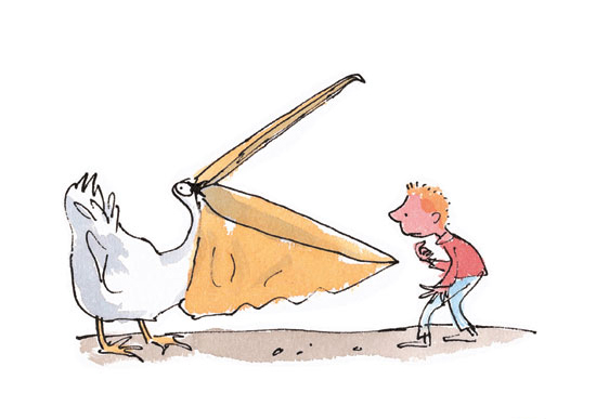
The only concern I have is that Roald Dahl's work has already been made visual, specifically by the iconic illustrations of Quentin Blake. That's a big name to live up to and I might find it a challenge to tackle character design without echoing those well-known drawings that have gone before.

Target Audience 
Our core audience for Roald Dahl’s stories are boys and girls of the future, aged between 5 and 11. They don’t necessarily identify themselves as fans of Roald Dahl – yet! They may prefer YouTube, their games consoles, or messaging their friends on SnapChat. You should aim to make them love Roald Dahl’s stories just as much as you did once upon a time. 
Children's books are the reason I came to study illustration (although since then I have moved to explore other realms of illustration, it is still the communication with young imaginations that excites me), and working with children's books is still my ambition.
Children are an audience I am familiar with and enjoy making content for. My younger brother is 8 years old and definitely falls in the target audience for this brief. This means I have infinite access to feedback from my intended audience, enabling me to get his opinions and thoughts on what I'm making.

http://littlezosienka.files.wordpress.com/2010/10/quentin-blake.jpg

The Creative Challenge 
We invite you to illustrate a series of iconic scenes, featuring at least three iconic characters from Roald Dahl’s inventive, revolting, wicked, or friendly stories in a style of your choosing. None of your illustrations should be boring, safe, or predictable. All styles welcome.
I've already had some ideas for what I would like to make. The concept of constructing a scene excited me and got me thinking about performance, puppetry, set design and costume. There are no restrictions on media or format, so I know that it would be acceptable to take this direction in re-imagining Dahl's work, so long as I am mindful of his tone of voice.


https://s-media-cache-ak0.pinimg.com/originals/29/ae/58/29ae58ab339cbd824f72c800ebfbb832.jpg

Mandatories 
You can choose to illustrate between one and three scenes. Within this series, you should illustrate at least one child character, one villain character and one fantastical creature — whether this be a witch, a giant, an insect or an oompa-loompa!
You can select scenes from a mixture of novels, although the illustrations should appear as if part of a coherent series. 
The illustrations should also compliment our logo - you’ll find some copies of this in the project pack.
I've quite a lot of Dahl's work before and watched all of the film adaptations, but reading through the list in the project pack, I've realised that there are a few titles I'm not familiar with! It would be a challenge to study and work with titles that I've not come across before, but I also think it would be much more a venture for me and may lead me to make more unexpected and inquisitive work.

Wednesday, 2 November 2016

MEGA CRIT / A DIFFERENT IDEA

Before I start, I had an idea on the bus this morning and it's changed everything.
EVERYTHING. I was thinking about the visiting lecturer yesterday (Louise Lockhart, see PPP blog), and her printed products, especially her paper toys, and I thought - these are prints! These are printed pictures, but they're DIFFERENT. They're fun, they're innovative and they're interactive.

http://payload433.cargocollective.com/1/14/467132/10965920/prt_300x300_1461779748.jpg

So I'm thinking: bring back Poe's element of mystery. Look again at his first-person perspective that made his horror so personal and terrifying (thanks Ben for sending me in that direction). Make a publication that is more fun, creepy and adventurous than just some pages stapled together. 
I can't make puppets/dolls (in a 3D form, the way I normally do), so I'm going to have to be a bit inventive with the printed product.


THE IDEA IS to make a lift-the-flap sort of book, in the shape of a house. Readers will be able to look inside the haunted house, under the floorboards and inside the walls. I think this would count as one print, and then I'd have four printed card sheets that go alongside it, with characters/backdrops/clothes/objects to be cut out and played with.
I COULD MAKE THIS REALLY DARK.
I could also incorporate the storytelling and narrative by hiding text within the house or following a character through the house from room to room.
I DON'T WANT TO JUST COPY LOUSIE LOCKHART. I know that other people have made lift-the-flap books before and it's not just her idea, but I am concerned that my idea has come straight from seeing her work. I don't want it to be a copy of her design.


Work in Progress
(photo of what I had laid out on the table)
Lots of work to show today! Feeling good that I have TWO exciting ideas and that I can use this opportunity to ask my peers WHICH ONE (yay, getting other people to make decisions for me!)


I finished a little mock-up of my narrative and quickly photocopied it into a book format so I can have that on the table for people to pick up and flip through.


Feedback:

(for once I'm scanning it and not going to rewrite the whole of the feedback, genius Jay)


Some constructive feedback, very happy with the responses I got today. People really liked what I've done and were impressed by the progress I've made.
I asked the question: to go with the storybook or to follow this new idea - the house?
People liked the house, just thought that the book would be easier.

Magpie: 
(the new name for me looking and seeing what other people are doing, collecting things and hopping away back to my nest).
(Megan NW, Sophia and Printing onto fabric! Is that allowed? They didn't specify what stock we use, so why not? 
Since I'm making a publication, this is probably not relevant for me and it doesn't make sense for Poe, but I would love to make a printed textile raven plush if I could (maybe just as an extra product, not for the brief)

MONOPRINT INDUCTION


Ghostly images and shapes! I especially love the noisy textures, it reminds me of film grain and makes my prints look old/eerie. Definitely works for Poe. I think Screen print/half tones will look too clean/modern, whilst monoprint is more natural.

I've done monoprint and monotype before and I've started having a go at home, but I am still trying to prove to the Jaybrain that it is fun and that I am capable of being a printmaker, so to stop putting it off/start getting excited about prints.

Had a bit of a go with monotype (drawing onto a plate, though I only finished one, seen on the 5th page of the Issuu presentation). Didn't enjoy this as much as monoprint. Don't think my lines are strong enough (too quick, sketchy and weak), I'm better with shape in this respect so preferred making stencils.
The monotype just looks boring and doesn't have the expanse of printed surface like the monoprints do, it just looks like a bad drawing with a fuzzy line? Maybe it would look better combined with the monoprint, e.g. monotpying over the top of an already printed texture to add details.

I wasn't thinking of the prints as images so I didn't pay much attention to the composition. My prints don't make much sense on their own, they're not finished pages and I didn't put much thought into how I was laying the tombstone stencils onto the plate for printing, I wasn't arranging them in any way as though it was a scene, rather placing them all down with enough space to chop them out when I want to re-use them, planning on using them as textures for collaging with later.

The idea of monoprint is that is is all an experiment, but I am very wary of following the rules and 
also feel like I'm being watched/can't truly let myself get into the flow of making and playing. I felt restricted because of the environment.
I DEFINITELY WORK BETTER AT HOME IN MY OWN SPACE.
I felt a bit panicky at one point after cutting my finger on a knife and then feeling like I'd done something wrong/was being looked at/just wanted to get out of the building/general anxiety doom. As soon as I thought the print technicians/peers had had enough of me/thought I was stupid/were angry because I was doing things wrong, the worry lever hoisted me down into the pit of despair. So I took a stroll, got some water and came back. Got on with it. Not a fun time but I did it and got through it. I made some things, did the session and came out in one (shaking, scratching, almost-crying-but-not-crying) piece.

Mucky fingerprints over everything. Need to be more careful.
Keep them clean and safe!
Tried to keep everything I made though, even the scraps of stencil with the print residue.